I’m trying to create a chart with Jira issues.
We have ‘Error’ issue type and one issue has data from a custom field ‘Error date’.
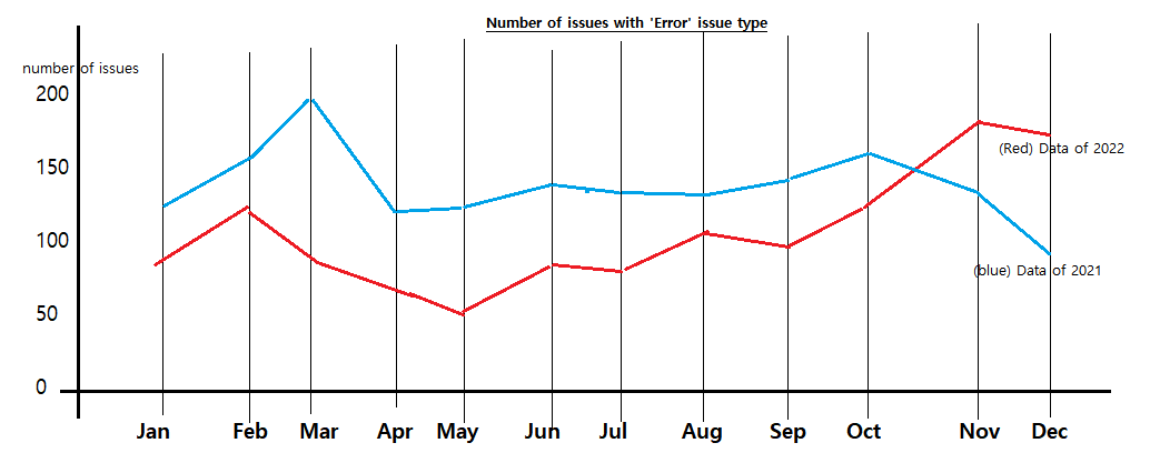
I would like to compare the following two values (number of issues).
The number of issues where the data in the ‘Error date’ field is ‘2021-01’.
The number of issues where the data in the ‘Error date’ field is ‘2022-01’.
By the way, The following image is a picture of the chart I want.
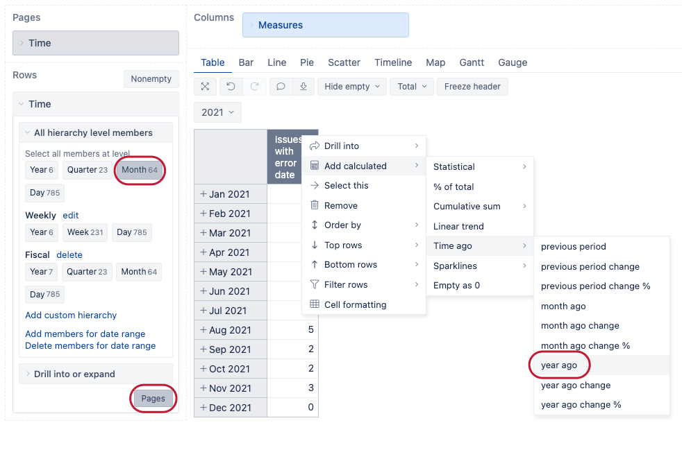
First, you need to check out if the custom field “Error date” is being imported as a measure in eazyBI. Start by Editing your import options, find “Error date” field in the Custom fields section and check the checkboxes for import, save the settings and trigger the import.
When this is done, you can start building your report!
In the Measures dimension, under the Predefined → Custom field measures, you should find a measure called “Issues with error date”, select this for your report.
Add the Time dimension in Rows and click the “Pages” button to have the Time dimension in Pages as well so you choose the exact year for the report. In Rows set the Time dimension to “Month” level memebers.
Finally, click on the “Issues with error date” column and add a new calculated measure by clicking Add calculated → Time ago → year ago.
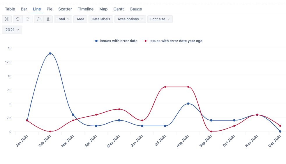
When all this is done, switch to Line chart and your report is ready!