Hi @xiaofeng ,
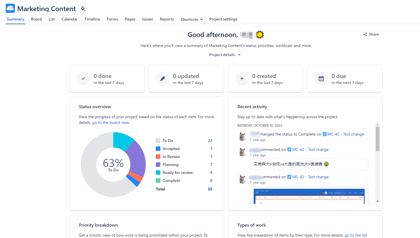
When you have created reports and charts, you can create dashboards that show several reports on one page. We offer a lot of reports and dashboards. You can see them in our DEMO account.
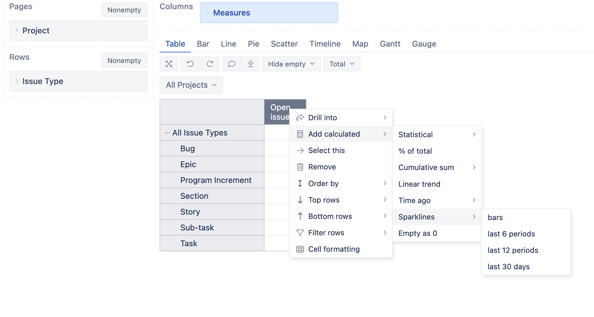
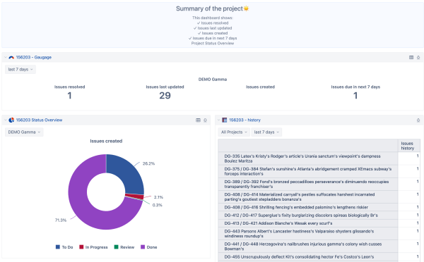
If you want to create something like in the picture you added, you need to create a new report, that will use pre-defined measures (1.) and one new calculated measure (2.) with the Gauge option:
- For Done, Updated & Created in last 7 days
- choose Time in Pages & project in rows
- choose measures: Issues resolved, Issues last updated, and Issues created in columns.
To select the last seven days, in the Time dimension, define a new calculated member"last 7 days" using this formula:
Aggregate( [Time].[Day].DateMembersBetween('7 days ago', 'today') )
- For Due in the next seven days.
Aggregate( [Time].[Day].DateMembersBetween('today', '6 days from now') )
- In the Columns under “Measures” → “User defined” define a new calculated measure, “Issues due in next 7 days,” using this formula
( [Measures].[Issues due], [Time].[next 7 days] )
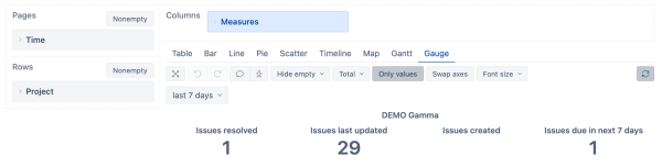
- Select just created calculated measure, go to Gauge, and choose values only. Save the report. Your report should look like this:
For the “Status overview,” create a report with Status in rows and measure Issues created in columns. Choose Pie Chart (and then Donut, to have a hole in the middle). Add data labels (percentage or value).
Also, we can’t give you a report that shows who last commented on the issue, but we can list issues that have changed in the last seven days. To do that, choose measure Issue history in columns and Issues in rows. Add Time dimension to pages and select “last 7 days”.
Now it’s time to create a dashboard to show all the reports we just created.
Add Title to the dashboard (using add Comment, format it using Markdown formatting, and add emojis.
Add reports, and you will get something like this:
We have a lot of predefined reports (and dashboards) in our DEMO account to get inspiration. If you found something you liked, export from DEMO and import them into your account.
Kind regards,
Ilze Mezite support@eazybi.com