Hi,
I have a list of initiatives. Some have a Red icon when they are at it risks and others green when it’s not at risk. I want to calculate the % of how many Initiatives are at risk and how many are not and display it in a gauge
At risk: 20 %
Not at risk: 80 %
How can I do this using the icons color ?
Hi @Karim_Momo,
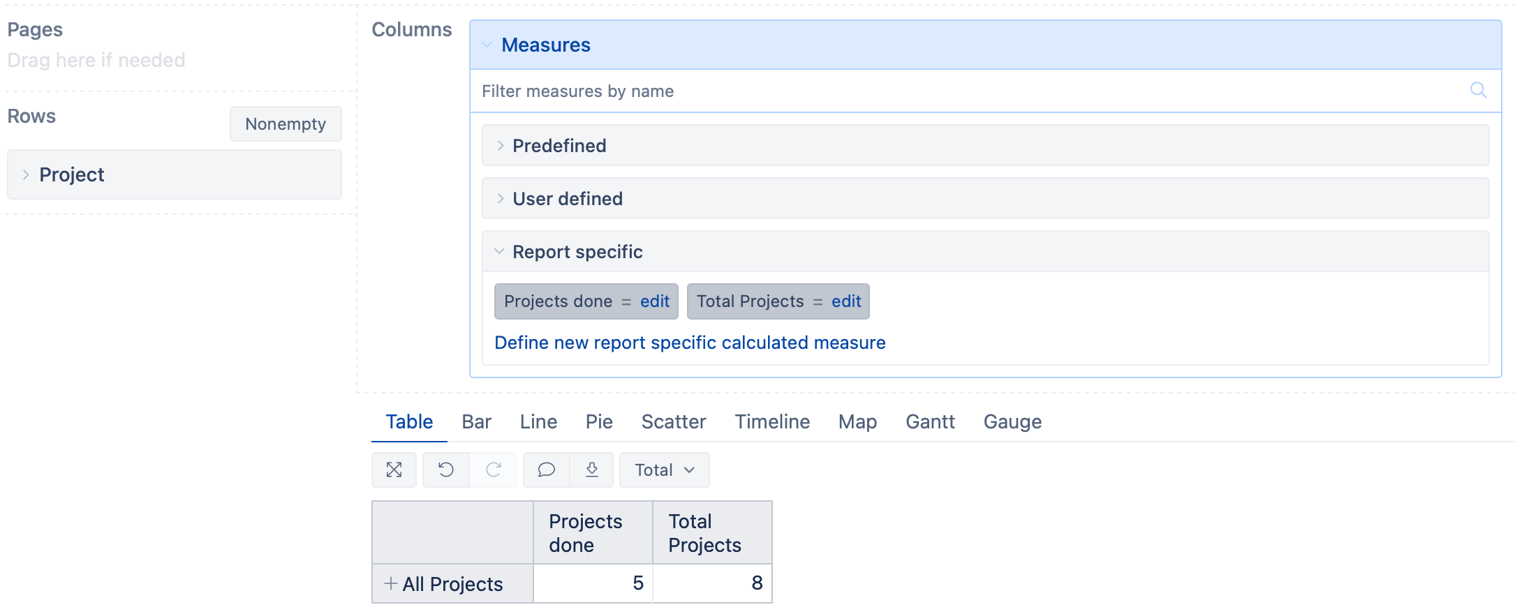
To view the information in a gauge chart, you would need to define at least one calculated measure. One is to return the number or percentage of items at risk, and the other is the total number of items to consider. If you use percentages, then you can do without the second one. The table report could look similar to the one below:
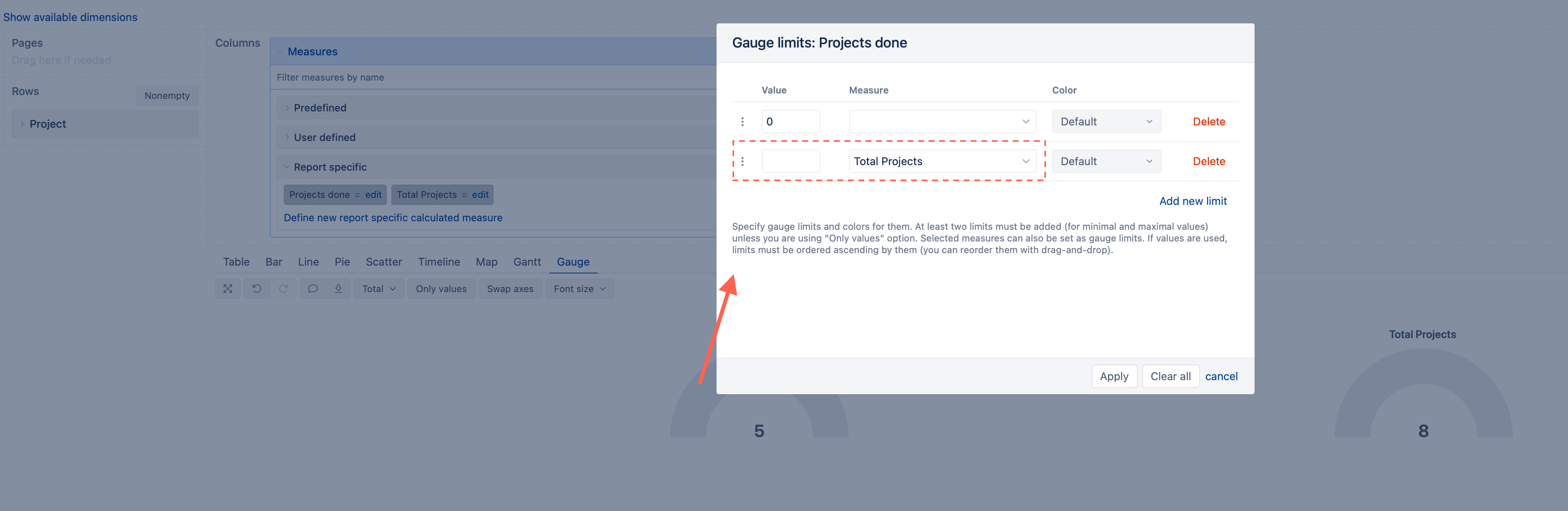
In my example, there are five projects done and eight in total. After switching to the “Gauge” chart, I clicked on the “Projects done” gauge and specified the upper limit to be the measure “Total Projects”. If you use percentages, you can ignore the second calculated measure and specify the value “1”:
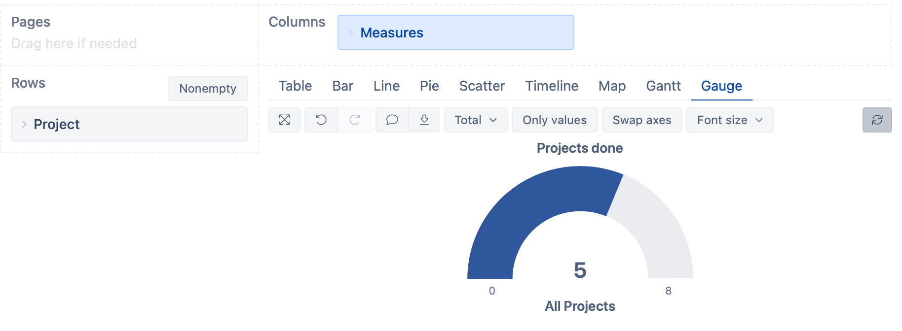
The result could look similar to the one below:
The calculated measures you need to define depend on how you calculate the color in the cell formatting of “Overall Metric”.
See more details on how to construct Gauge charts here - Create charts.
Best,
Roberts // support@eazybi.com