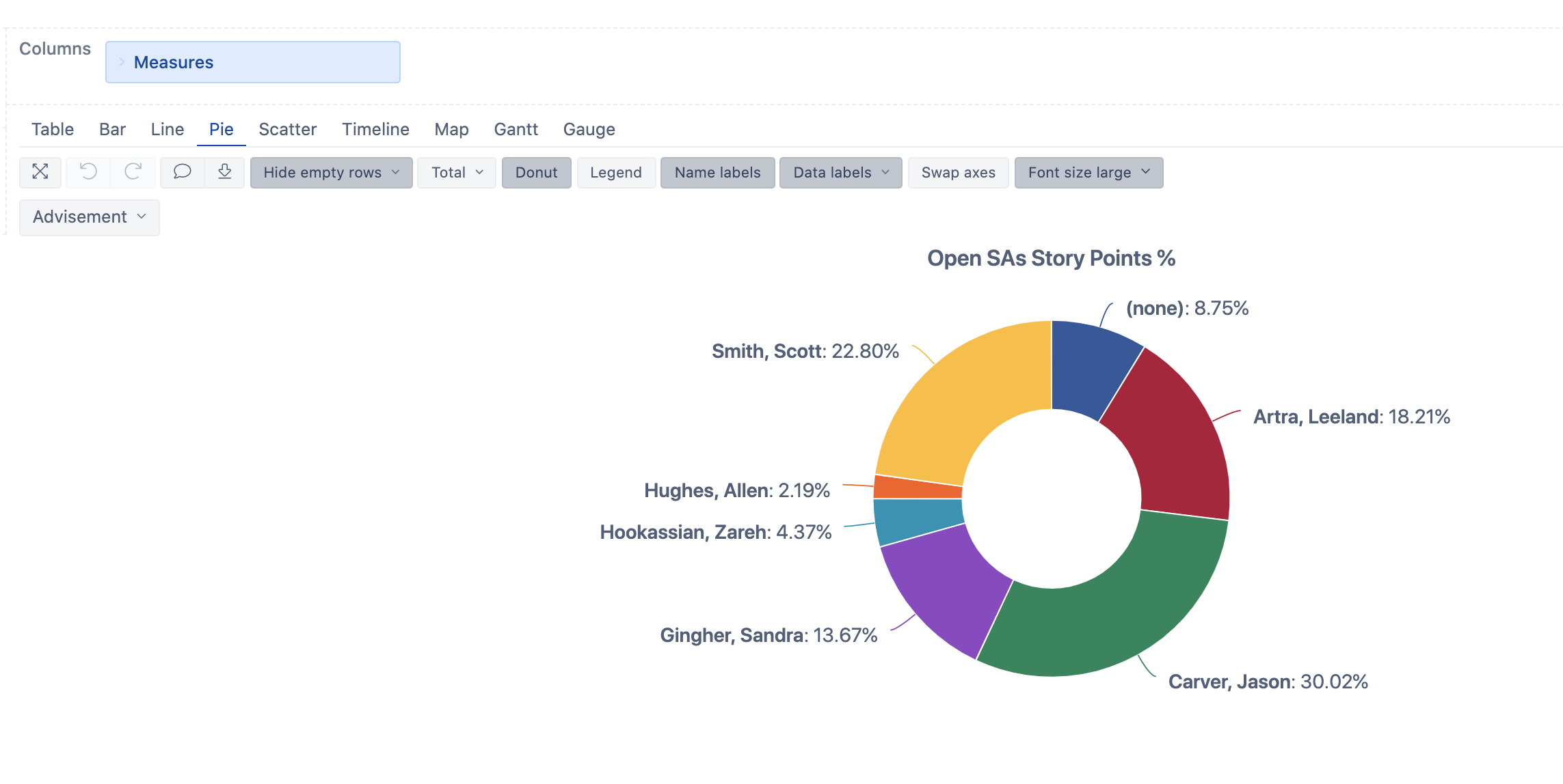
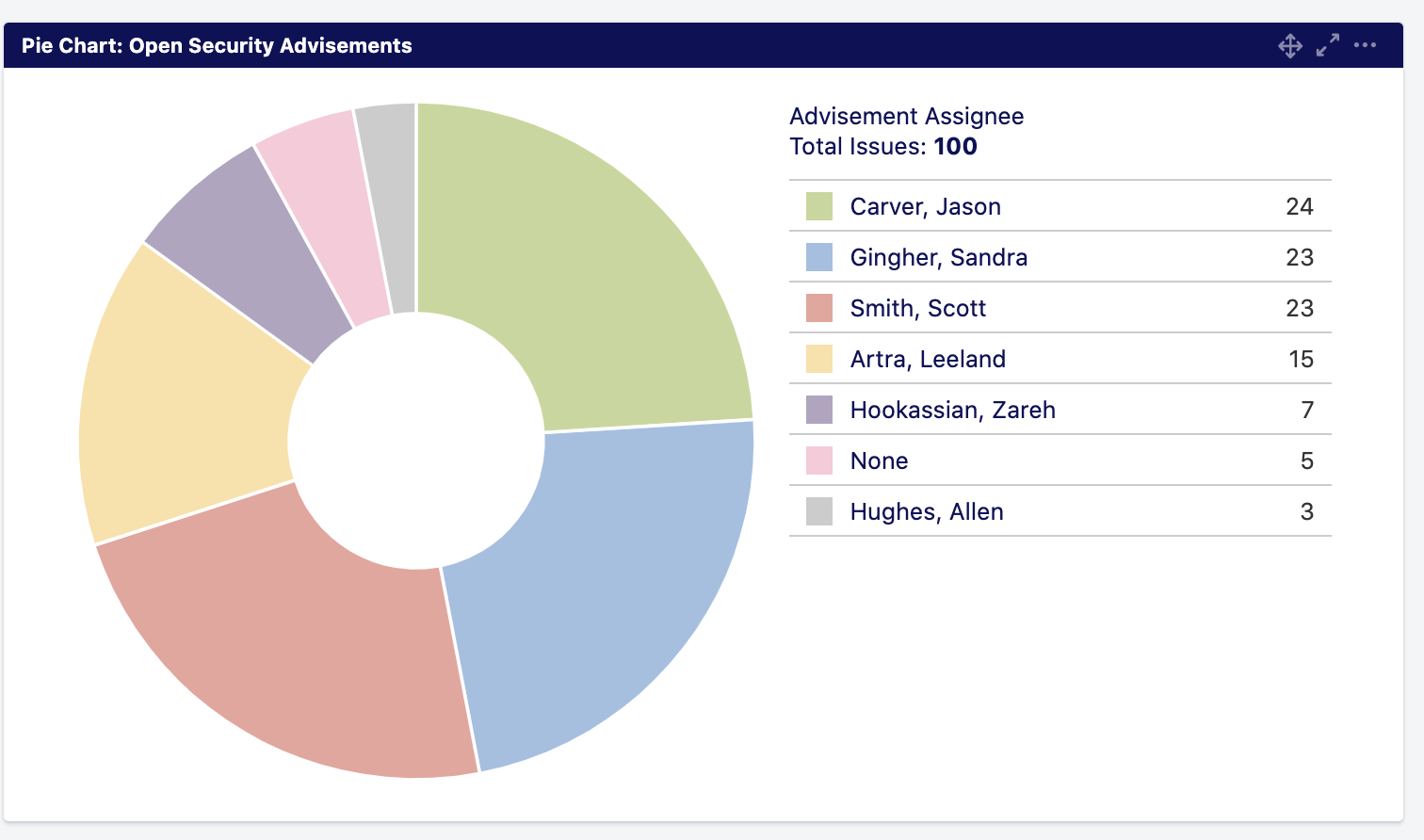
My boss is telling me the new charts with EazyBI are not good because they are not as useful as the JIRA dashboard. It comes down to the missing summary legend/table style. I can’t find a way to make the same data in one dashboard. If I make two dashboards, sure. But, then when we put those into JIRA they are separate widgets and don’t show side-by-side. Is there a way to turn this:
eazyBI does not have an option to add the summary table to the Pie chart. You can use the option to create two reports. Or add more reports to show the same data from different perspectives. Then I would suggest combining them into one eazyBI dashboard. You can use common pages in the dashboard. This will allow making changes in selections and data in all reports published on the same dashboard will change accordingly.
eazyBI has the option to publish individual reports or dashboards in the Jira gadget. The dashboard could be more useful if you would like to have a more controlled positioning and common pages selections.
Thank you for this concept. I wanted to make a dashboard with a common set of controls for selecting the months. I’m searching for documentation on how to do this. It is not something I recall from any of the training videos or docs.