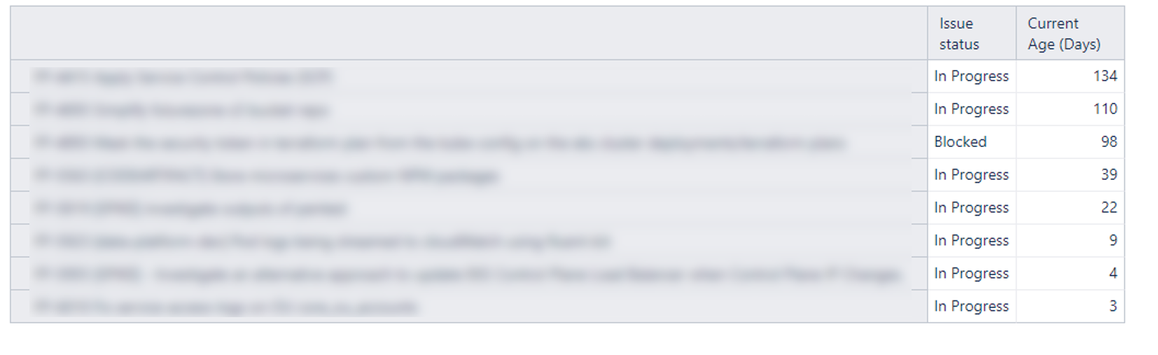
We have three ‘In Progress’ statuses in our workflow of In Progress, Blocked, In Review. I want to show a scatter plot where a dot represents each item and it’s current age (no. of days since first going in progress). My data looks like so:
I want to get it to look like this chart - how would I do that?
Hi,
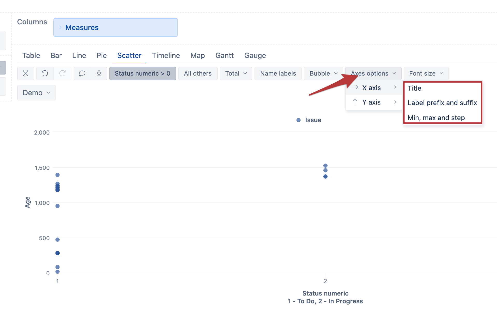
In eazyBI, the scatter chart is intended for the use between two numeric values. Therefore, the closest workaround for your case is to translate the Issue status into numbers and then switch the report to the scatter chart:
I tried the following custom measure for that:
CASE [Status].[Status].getMemberNameByKey(
  [Issue].CurrentHierarchyMember.get('Status ID')
)
WHEN "To Do" THEN 1
WHEN "In Progress" THEN 2
END
I used the following formula for the issue age calculation:
DateDiffDays(
  [Measures].[Issue created date],
  Now()
)
Now I can have the report with two numeric values and switch it to the scatter view:
I can adjust the X-axis with the proper min, max, and step value and include the legend in the X-axis title:
Please, find a similar example in our Demo account:
https://eazybi.com/accounts/1000/cubes/Issues/reports/261774-issues-created-per-status-category-and-priority
Kindly,
Janis, eazyBI support
1 Like

