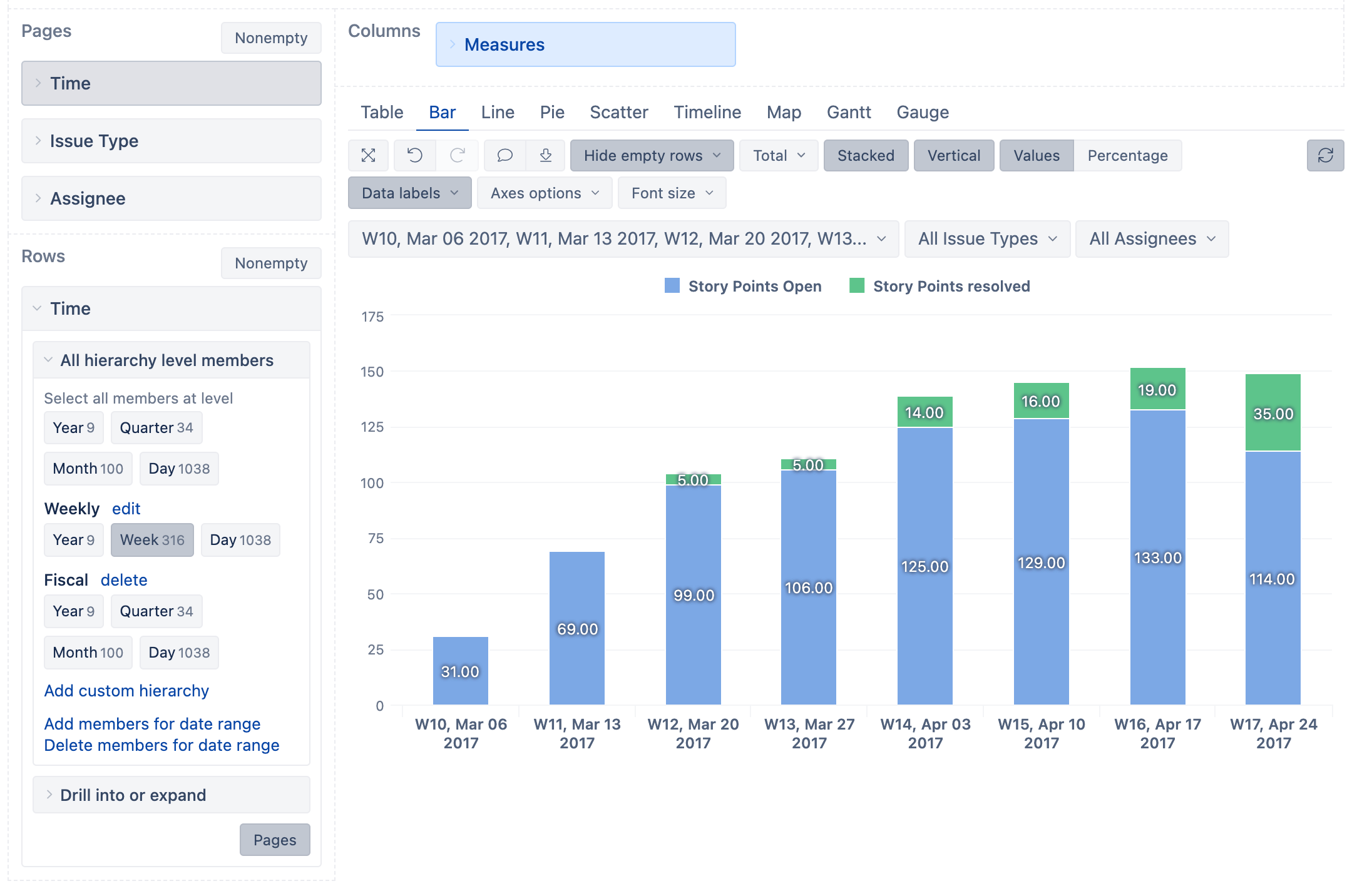
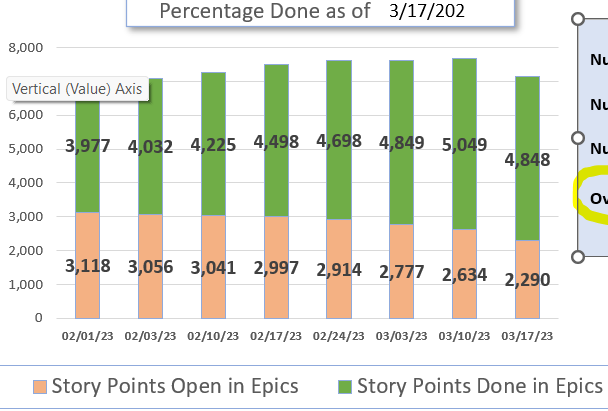
I have a large table report with totals that is basically a very useful report of EPICS - Percentage DONE Based on Child Stories. Not everybody wants to scroll through the entire table that has ISSUES dimension on the ROWS… the columns are very useful such as Number of Stories in Epics, Number of Stories Done, Number of Stories Open…many people only want to see the bottom line aggregated totals in a stacked bar chart like I was able to create in Excel from the exported data. (see image)
Here are my table columns:

After much experimentation, (not having rows be ISSUE DIM, introducing other Rows choices such as TIME, swapping rows and cols, etc., etc., I have not been successful.
Table is perfect and accurate just way to long and I need a visualization of the bottom line totals of some of the columns.
My question is: how can I adjust my rows (Issue DIM) and columns (all the individual members) to just turn a few of the column totals into a stacked bar chart?
thanks,
Ed