It would be great to have a map chart with bubble sizes or colours (e.g. Red Amber Green like conditional formatting in Excel) to represent the number of issues per map location.
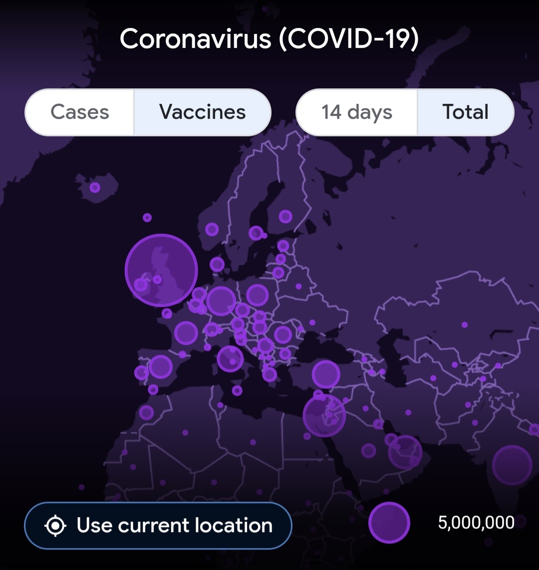
Below is an example showing covid vacination numbers per country:
I’d use this functionality to show numbers of open incidents (i.e. issues) by location. This would be a great visualation.
Hi @MarkWheeler
Thanks for the feature request. I have seen this map chart type recently in different covid articles, but personally, I don’t find it very helpful or more helpful than using color intensity heatmaps (see example here: Sales - FoodMart Demo - eazyBI)
Anyway, I registered this feature request on our backlog and upvoted it for you. But I can’t give any estimates of when this feature would be released.
For sure you will hear from us when there is some progress with this.
Martins / eazyBI team.
1 Like
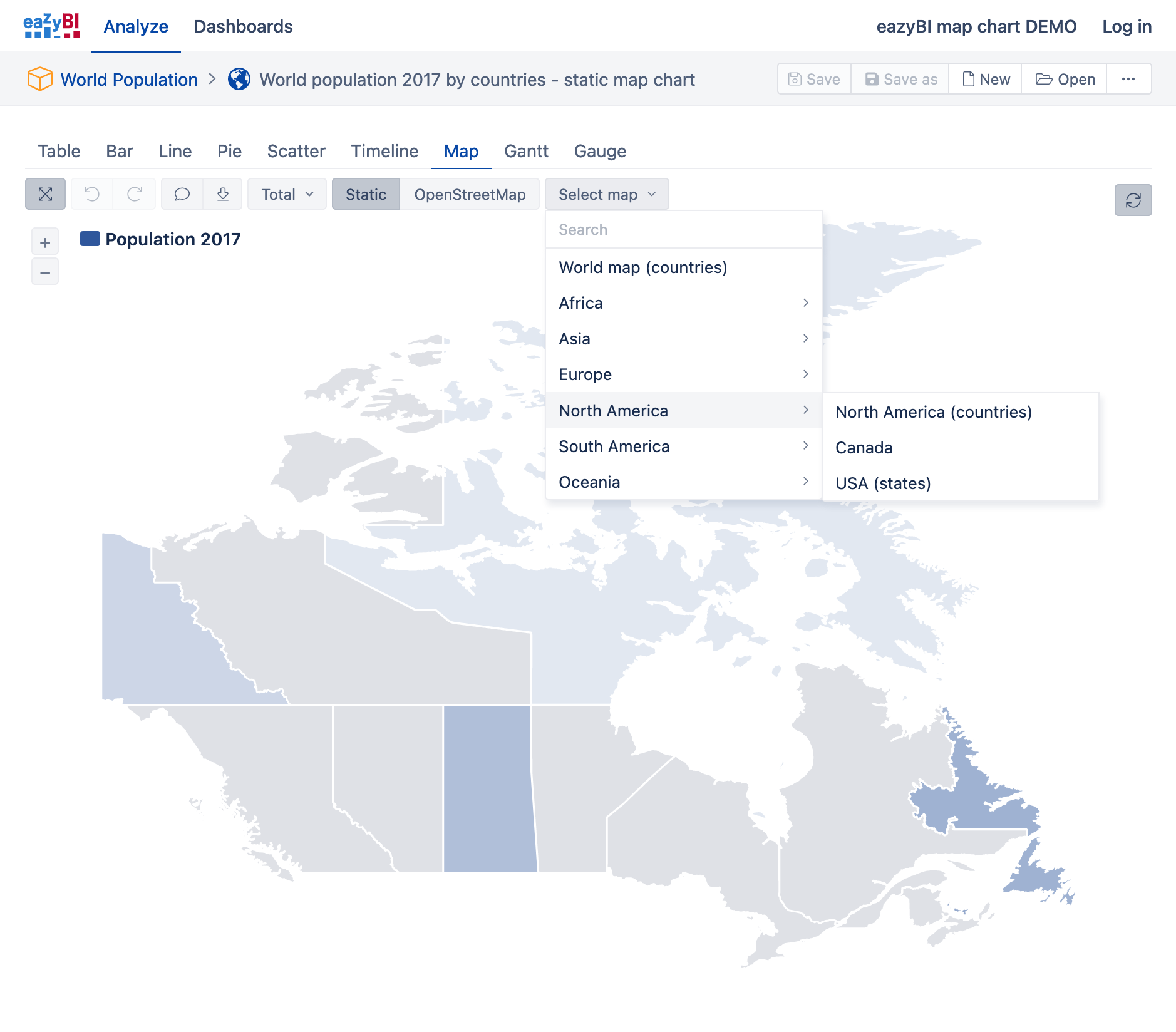
Hello Martins,
The static map looks fantastic. I was wondering if there was a way to narrow the scope on the Canada Map to just the Province of Ontario.
1 Like
@orangesux
Thank you for the suggestion.
Currently, there are no plans to add provinces of Canada as separate maps in eazyBI static maps.
Perhaps you can try using dynamic maps in eazyBI instead.
Martins / eazyBI
Since version 6.5.0 eazyBI has more statistical maps. You can also get a municipal division for several countries, including Canada.
Best,
Zane / support@eazyBI.com
1 Like