Hi, I’m having trouble creating a dashboard that shows the priority value of a task in each quarter.
I need to figure out how to display tasks that have had their priority change over time - I need to show this on a graph of quarter - priority in that quarter
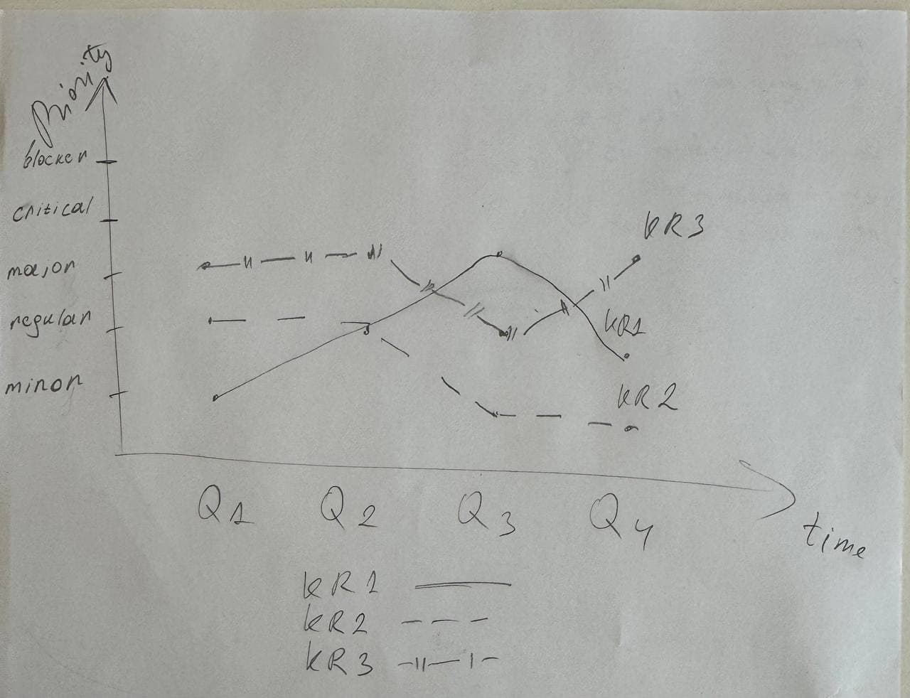
It would be great to show it with a line/column to show the priority level in each quarter from the time the task was created until the end of time.
x-axis - time expressed in quarterly intervals. The y-axis is the priority value (blocker, critical, major, regular, minor). The lines are the tasks that have this priority changed, I tried to create a measure that would meet this condition.
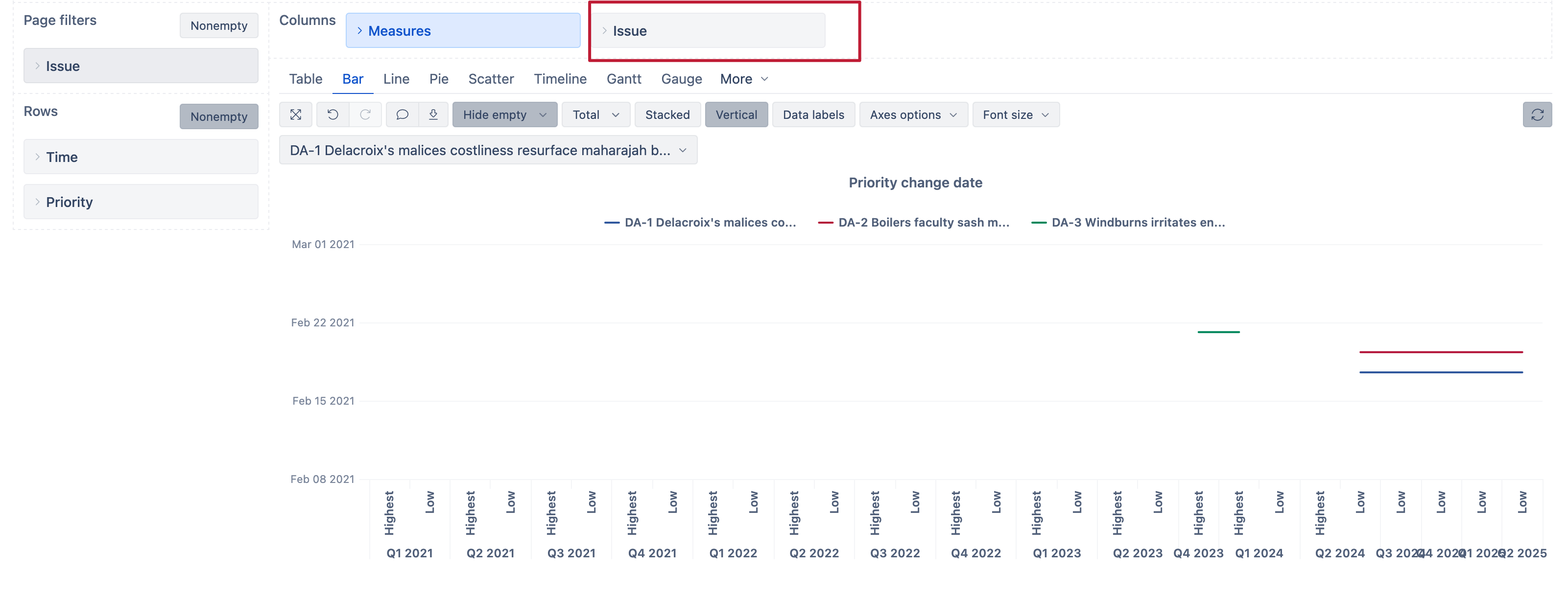
I will also attach a screenshot of the dashboard that I got.
The dates go from earlier to older, I would like to see the history in reverse - what priority the task had in the beginning and what priority it has now
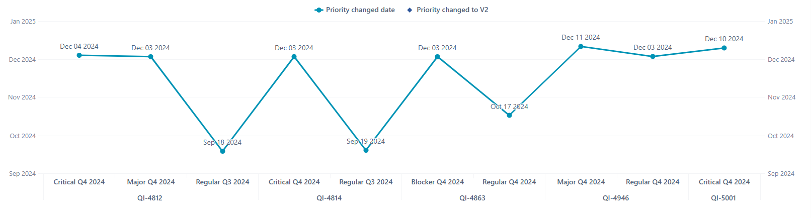
This line connects all tasks (Priority changed date), it is necessary that the line connects only points within one task, but it connects all tasks. That is, in QI-4812 it connected only three of its points and did not go to QI-4814 to connect 3 December 2024 and so on for all tasks.
Sorting (order by on measure) for the first case does not help - the current formatting goes away and it becomes impossible to read the chart
I used these measures to create my report:
CASE WHEN
[Measures].[Transitions to] > 0
THEN
[Priority].CurrentHierarchyMember.Name
END
TimestampToDate(
(
[Measures].[Transition to last timestamp],
[Transition Field].[Priority],
[Priority].CurrentHierarchyMember,
[Time].CurrentHierarchy.DefaultMember
)
)
Colleagues, please help me! Tell me how to implement the outline variant or tell me what I need to do to solve problems with my current variant, please!
This change, however, can impact other things in the report.
Please share the report definition, so I can see the full details on how the report in configured. That could give further ideas on how to adjust report according to your requirements.
Janis, Hi!
I apologise for the long reply, I tried to figure it out on my own following your advice, but as you said - I have affected other settings and now I don’t understand which way to dig to create a report.
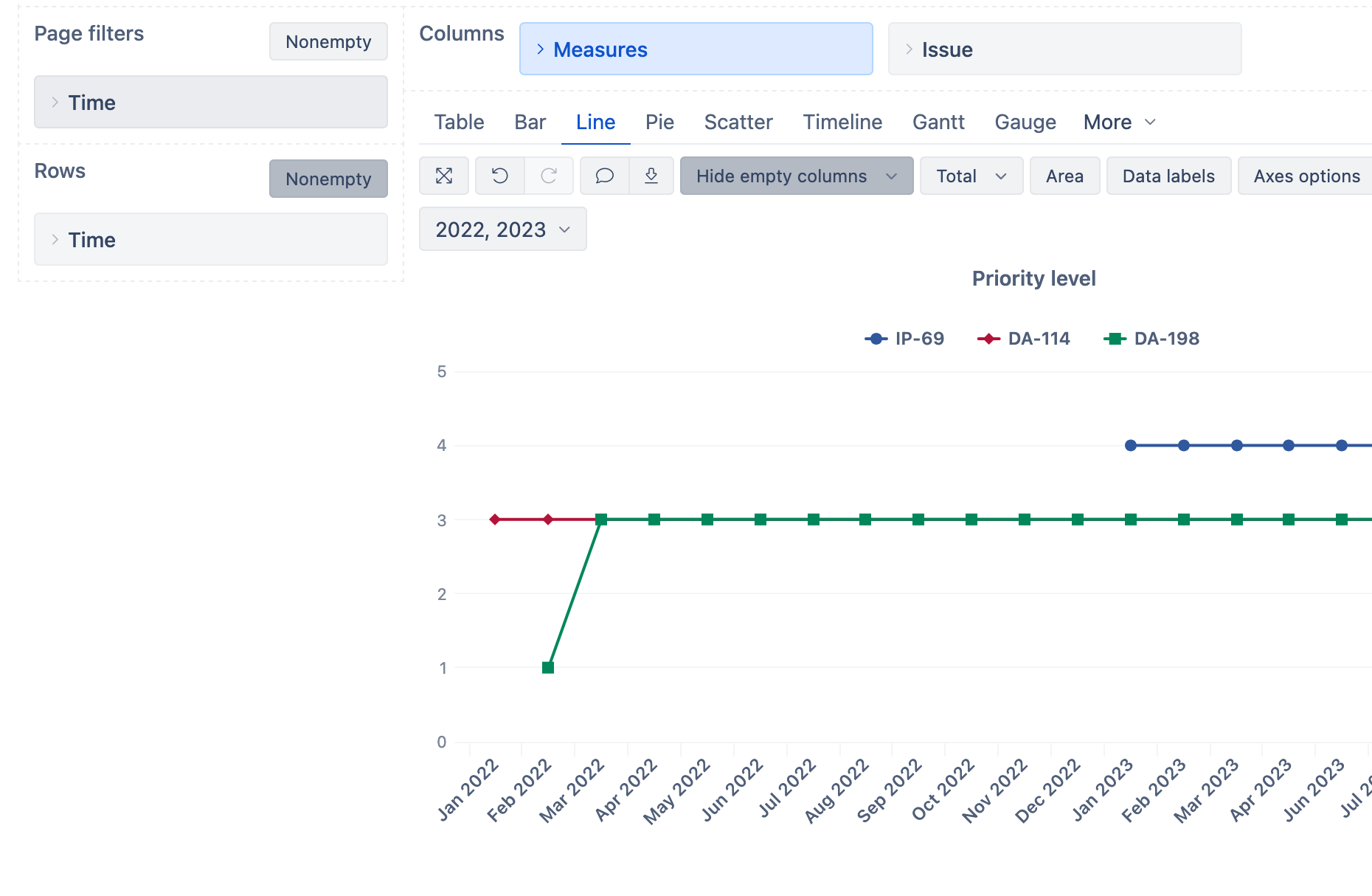
The point of this dashboard is to track the change of priority of key tasks on a quarterly basis, that’s what the dashboard should show. As I described above it would be nice to be able to have a separate line for each of the tasks in the current chart view, but in my example for some reason I can’t show this line and it duplicates the same values for all dates, which is strange.
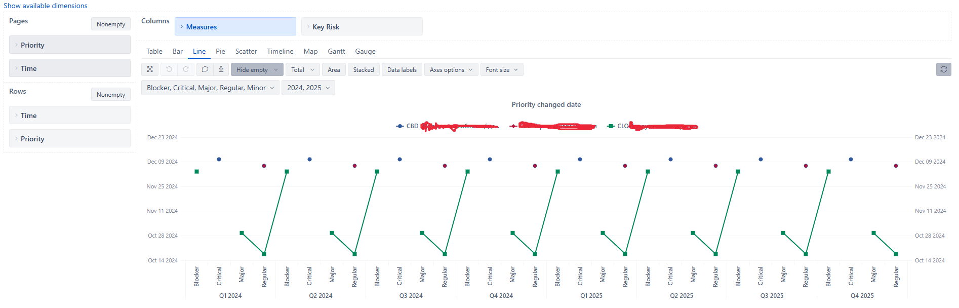
There is a separate task type that categorises these key tasks - that’s what I was trying to use. I’ll show you what I got and also an example of what I’d like to get. In my sketch I changed the axes for priority and time, but the essence is the same. Both are fine for the task at hand.
I used the following measures for showing the priority level:
CASE WHEN DateBeforePeriodEnd(
  [Measures].[Issue created date],
  [Time].CurrentHierarchyMember
)
THEN

  CASE
    Filter(
    [Priority].[Priority].Members,
    [Measures].[Issues history]>0
  ).item(0).Name

    WHEN "Lowest" THEN 1
    WHEN "Low" THEN 2
    WHEN "Medium" THEN 3
    WHEN "High" THEN 4
    WHEN "Highest" THEN 5
  END
END