I am working on a report which has a Month dimension in the Column along with Measures. Month dimension has 4 calculated measures Q1, Q2, Q3 and Q4 which are the aggregated values of a 3 months each. We want to track a calculated measure in measures for Q1, Q2, Q3 and Q4. We want to compare the cell values between the Q1, Q2, Q3 and Q4 dynamically and show the trend using up/down arrows. Can anyone please help.
Hi,
The first recommendation is to use as much as possible the Time dimension instead of creating dimensions duplicating it. The Time dimension has many built-in features for easier implementation of the trend analysis, comparison to the previous periods, etc.:
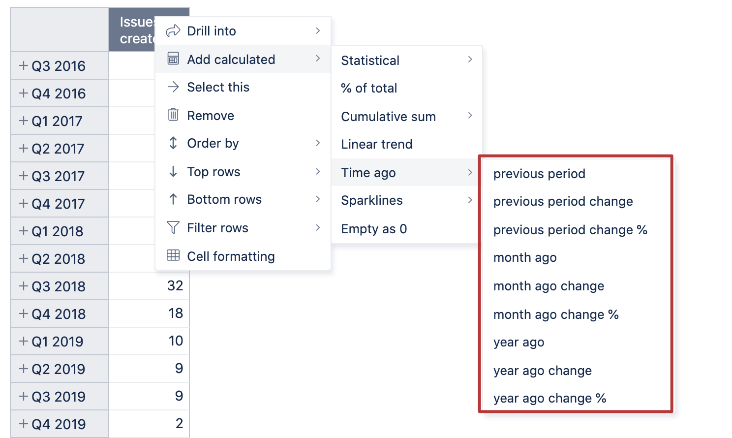
The trend calculation of values between calculated members can hardly be dynamic; we need to hardcode the logic of the members’ order in formulas. Perhaps, a reasonable trend representation could be using the sparklines feature. That is one more option for the Add calculated, and it can be custom created with the function.
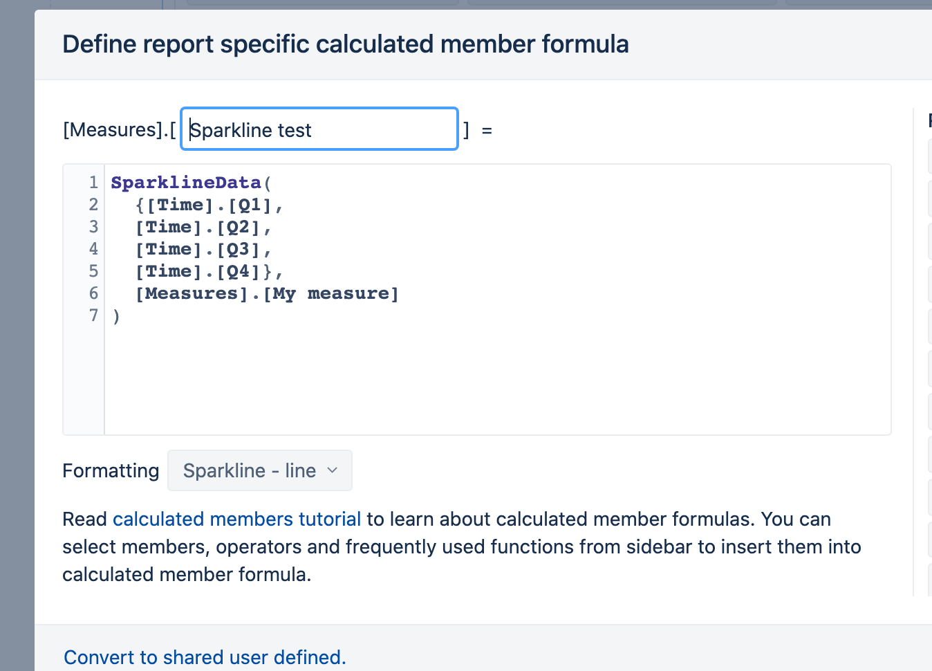
I used the Time dimension in my report with calculated members and created the following formula for the sparkling:
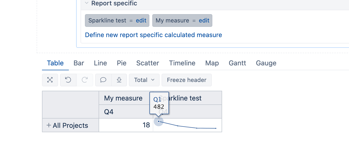
My trend report is the following:
Kindly,
Janis, eazyBI support