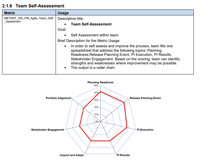
To add a little more detail as to why we need it. Recently our organization started implementing a lot of changes so that we are more compliant with SAFe. To track the progress of teams, management defined a set of metrics which should be applied to all teams.
We were able to create all the other ones using eazyBI, except this one (attachment added).
We are also SAFe users and this would be an important feature for us too. Any news if this was put in backlog or it is already under development?
Thank you
This idea is still in eazyBI backlog, but, unfortunately, has not been upvoted for development for now. I added your vote to it and will post in this topic if there will be some news about adding spiderweb chart type to eazyBI.
Yes, this chart idea is still in our backlog. I did upvote it for you and we will update the community post whenever there are some good news regarding it.
How’s it coming along with the chart idea? Any chance of it reaching development? We would also greatly benefit from having such a visualization in eazyBI.
@Matthew_Vance, Thanks for your vote; I registered it in the backlog item as well. Sorry to say that there is no news regarding adding this chart type to the eazyBI quite yet.
Lauma / support@eazybi.com
Is there any news about this chart idea? Is there some date we can expect the spiderweb chart?
We are currently developing some reports to analyse the evolution of our teams in some themes, and it would really help us simplify the view and analyses. For now we are going to extract the information and build it with excel, but I would be really happy to use it within eazyBi
This idea is still in our backlog. However, I see your point - having all charts and analysis in one app is much simpler. I added your vote to the item, and we will update this issue once there is some news.