Hi,
is there a possibility or workaround for creating one chart with different columns colour for the same dimension?
What do i have:
Table: 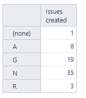
Chart: 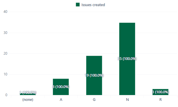
What do i need: 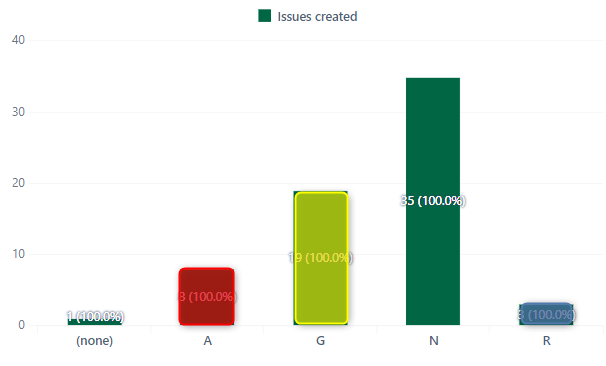
Hi,
is there a possibility or workaround for creating one chart with different columns colour for the same dimension?
What do i have:
Table:
Chart:
What do i need:
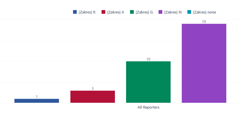
I’ll leave my answer in here for future:
I’ve created User Defined measures for every metric like:
[Status zakres].[R]
[Status zakres].[A]
[Status zakres].[G] and so on.
Which gave me table:

And chart:
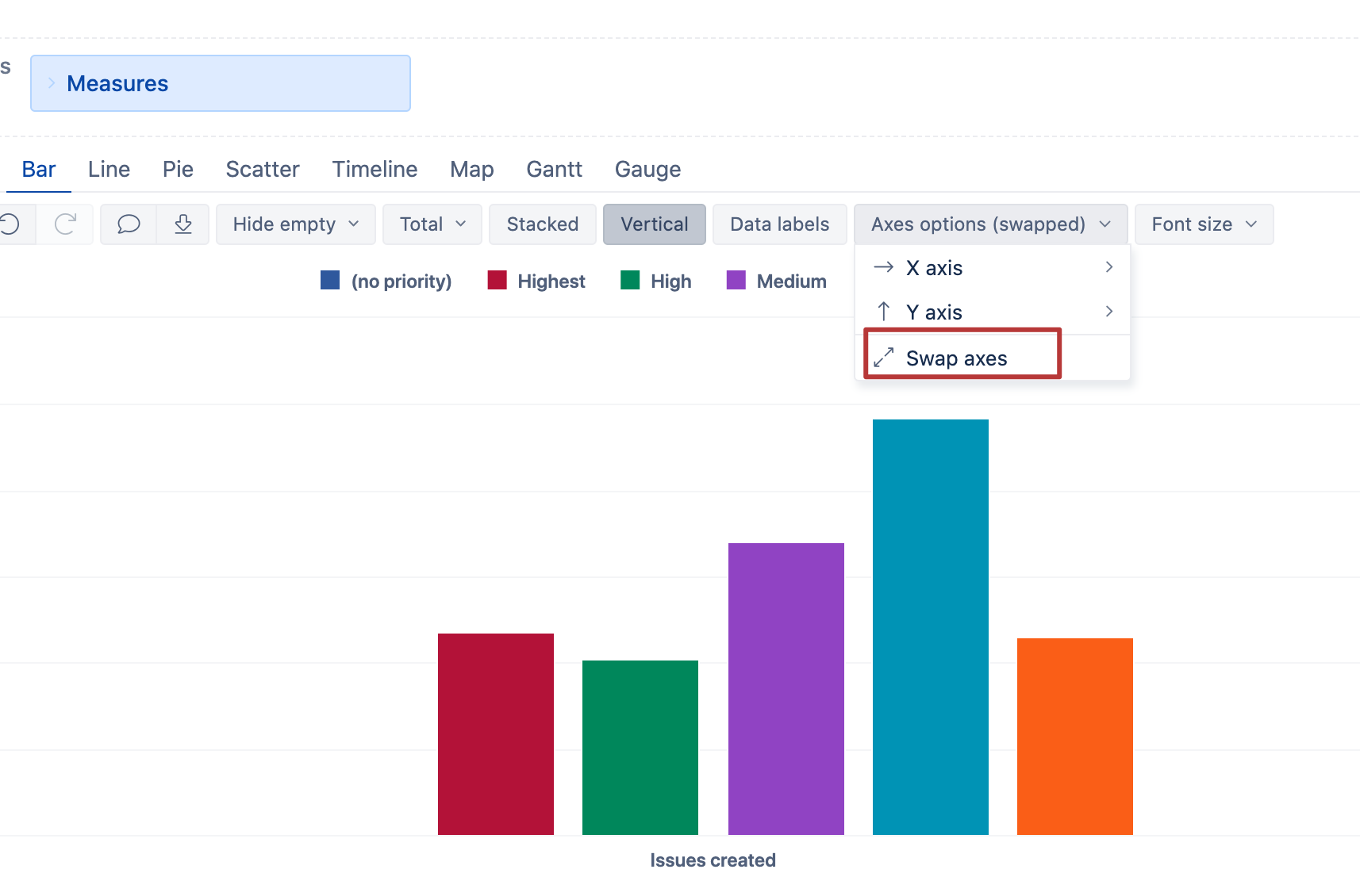
Hi,
right the separate measures is the solution.
Perhaps, a bit simpler solution is to swap the axes:
Kindly,
Janis, eazyBI support
You’re completely right… I use this option on daily basis and have no idea how it came i didn’t use it this time