Hi everyone,
In a report, I’ve got 4 pie chats in one row (displaying 5 values per pie).
Now the name labels of each pie are overlapping, which makes them not readable.
How can I change this to be readable again?
Is there a way to arrange the pies vertically?
Cheers,
Kevin
Hi @kwagner_sc,
Thanks for posting your question!
I see the issue, and I have added it to our backlog. At the moment, I cannot advise when this could be fixed, but we will let you know when there is an update on it.
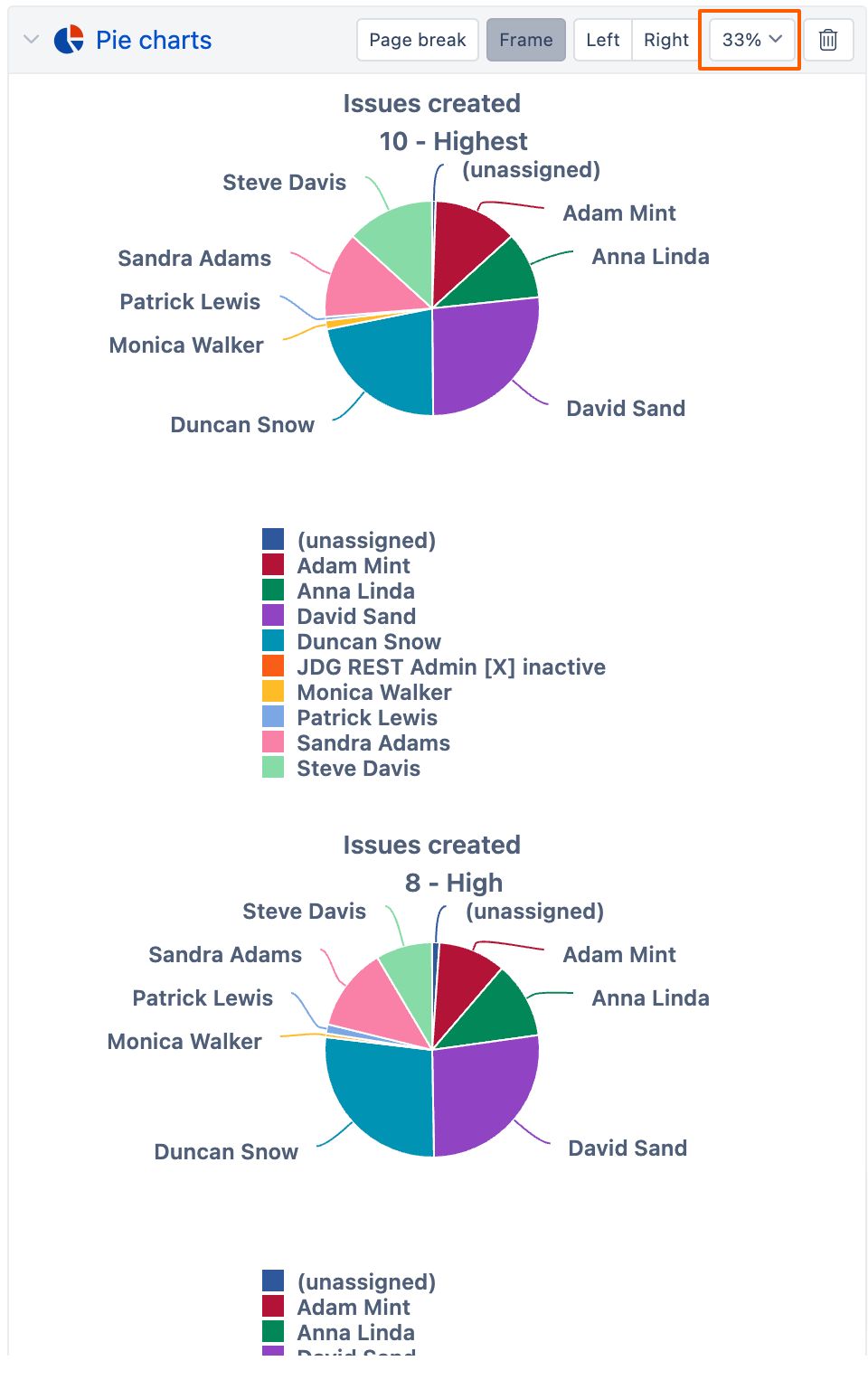
In the meantime, as a workaround, you can publish your report in the Dashboard and adjust the report size to 33%. This will enable you to display the pie charts vertically, as shown in the example below:
I’m sorry for not having a better answer to this.
Best,
Marita // support@eazybi.com
Hi Marita,
thanks a lot for your answer!
I can’t see the option suggested by you.
We are working within Jira Data Center. I wonder if that is the reason?
Thank you upfront!
Kevin
Hi @kwagner_sc,
Here’s an instruction on how to create a dashboard: Create dashboards
If you have access to create reports, you should be able to create a dashboard too. If you encounter any issues, let me know.
Thanks,
Marita // support@eazybi.com