I have a column that lists only Pass or fail. How do create a pie chart out of this that shows the count and percentage of pass and fail?
Hi @hari_ramadasan,
You should select chart “Pie” and select data labels “Percentage”
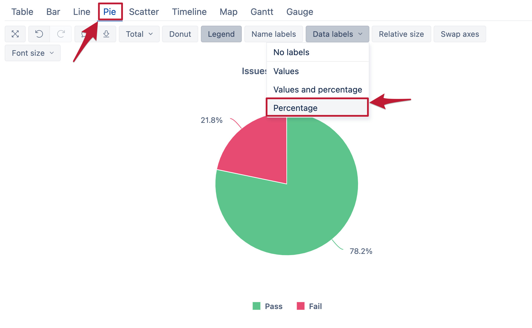
See more about customizing charts in training episodes 4 and 5: Training videos
best,
Gerda // support@eazyBI.com
Thank you !
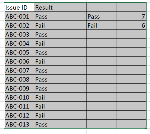
In the example shown in the image, for each new issue that gets added (in JIRA), there is a Pass/ Fail result calculated based on set parameter. How do I get a consolidated count of pass/fail?
Thanks much
Hari
Hi @hari_ramadasan,
the best option would be to import the “Result” as a dimension, which will aggregate the values automatically: Data from Jira
The dimension would have values “Pass” and “Fail,” and together with the measure “Issues created,” you would get the report you are interested in.
best,
Gerda
Thank you Gerda,
The results are user defined measures on easyBI and not from JIRA. My apologies, must have mentioned earlier.
Thanks
Hari
Hi @hari_ramadasan ,
In that case, you can create a new calculated measure with function count() and count how many issues have a particular value:
Count(
  Filter(
    Descendants([Issue].CurrentMember, [Issue].[Issue]),
    [Measures].[Issues created]>0
    AND
    [Measures].[Issue Result] = 'Pass'
  )
)
best,
Gerda