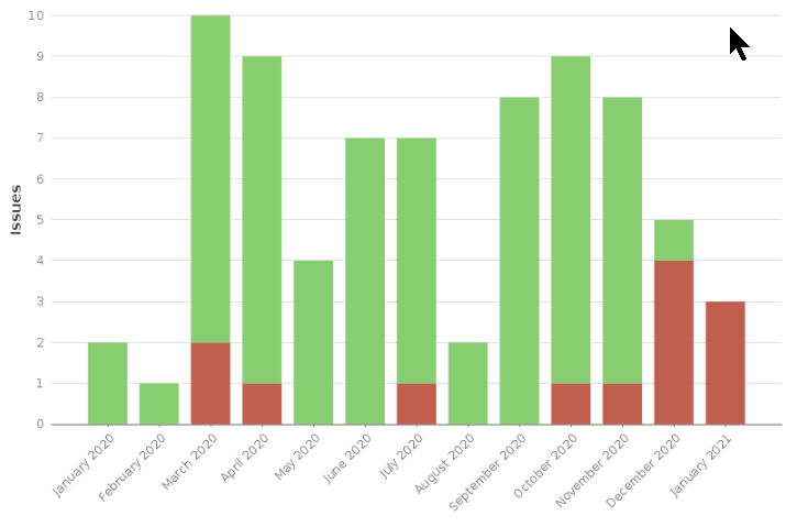
Hello, I would like to generate similar graph “recently created” chart like it is provided within standard Jira report. I would like to have a bar chart were the number of issues created each month is shown. The current status (closed = green, open = red) shall be shown inside the same bar.
The Created vs Resolved samples I find in EasyBi “just” shows the number of created and the number of closed tickets per period. I want to see just the created ticket inside the period and the current status by color coding (red, green).
Many thanks
Christian
Hi @Christian1
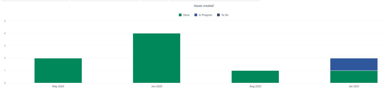
Try the sample report from your account:
See one on our demo account.
It groups issues under the status categories and show result over time
You can even create a calculated member in “Status.Category” hierarchy that aggregates two categories
Martins / eazyBI support
Thank you @martins.vanags
that helps a lot. I have not recognized that sample report before.
Is there a way to display always all 12months on the bar chart, even “empty” months - where there are no issues created?
Thank you
Hi,
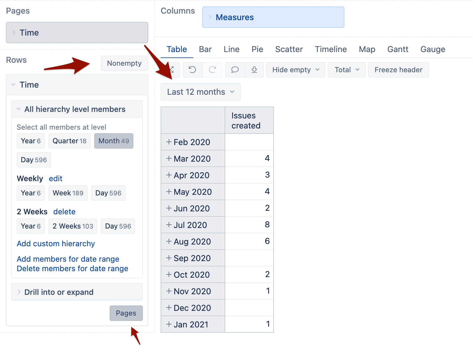
Try selecting the member “last 12 months” from the “Time” dimension and make sure that “Nonempty” cross join is disabled.
eazyBI would display all the months (imported) that belong to last 12 months
If some of the months (without any activity) do not appear, you would need to manually add them to the “Time” dimension.
Martins / eazyBI team
Thank you @martins.vanags that answered my question.