I have in excel a data table and his corresponding chart:
- Chart:
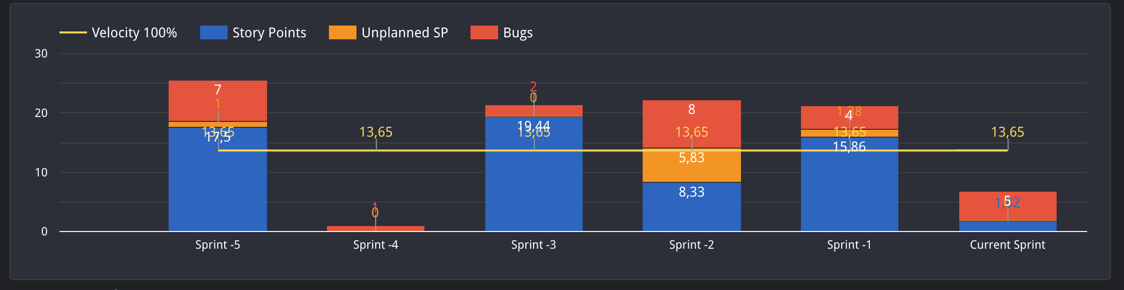
I want to do the same chart using the eazyBI but the closest way that I have successful is with the next data table:
The problem is that I remove one item (as “All issues Type”) in the “Issues created” column, then it is removed in “Norm SP” column. How can achieve to have the same chart as I have with excel?
Any help or advise will be thankful.
Thank you very much for your time
BR.
Francho