Hi @chawla.aakash92 ,
Thank you for the details. Projects being Jira issues makes the whole thing easier. You can ignore the comment regarding Projectrak, as I assumed your projects were Jira Projects.
Select the Issue dimension in the report rows for the first report. If required to filter by a specific Jira project, use the Issue dimension also in report pages. Next, add the issue property returning the stage 1 date. You can find it under Measures with the name “Issue CUSTOM FIELD NAME”. It should also be imported as a measure with the name “Issues with CUSTOM FIELD NAME”. Add the measure to the report. You can filter the report rows by this measure to return only relevant issues and then remove it. See more details about custom field import in eazyBI here - Jira custom fields.
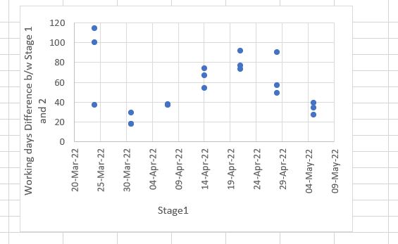
See some of the suggestions in the picture below. I use the field “Target start”. Thus the property is called “Issue target start” and the measure “Issues with target start”.
Next, define a new calculated measure that will calculate the difference between the two dates for each issue:
CASE WHEN [Measures].[Issues with Target start] > 0
THEN
DateDiffWorkdays(
  [Measures].[Issue Target start],
  [Measures].[Issue Target end]
)
END
The “Target end” represents stage 2 in your case. Next, update the formula to match your use case. Finally, select the newly defined calculated measure in the report. Next, switch the report to the Scatter chart.
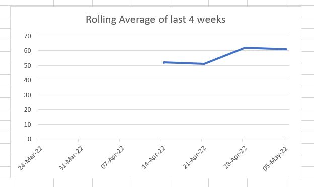
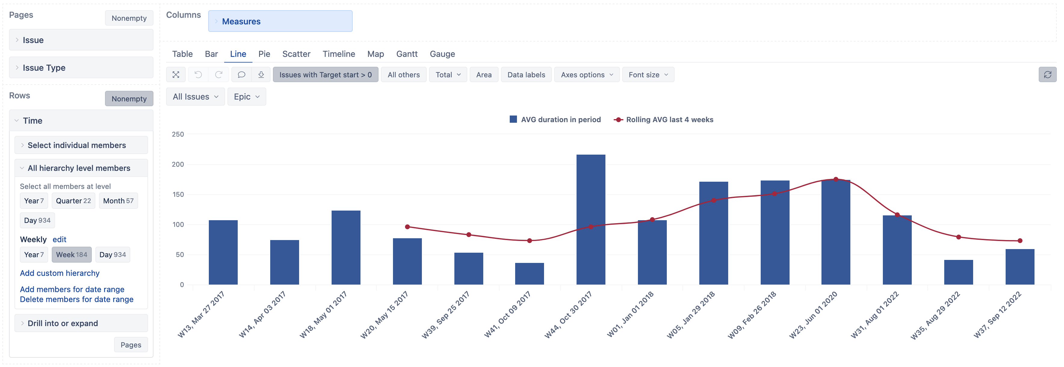
I recommend using the Time dimension “Weekly” hierarchy “Week” members in the report rows for the second report. Again filter the report rows by the measure, in my case, “Issues with target start”. Next, define a new calculated measure to calculate the average. See the formula below:
  Avg(
    Filter(
      Descendants([Issue].CurrentMember,[Issue].[Issue]),
      DateInPeriod(
        [Issue].CurrentMember.Get('Target start'),
        [Time].CurrentHierarchyMember
      )
      AND
      [Measures].[Issues with Target start]>0
    ),
    CASE WHEN [Measures].[Issues with Target start] > 0
    THEN
    DateDiffWorkdays(
      [Measures].[Issue Target start],
      [Measures].[Issue Target end]
    )
    END
  )
Again, update the field property and measure names. Finally, define a new calculated measure to calculate the rolling average. See the formula below:
CASE WHEN
  -- show data when at least 4 periods have data
  Rank(
    [Time].CurrentHierarchyMember,
    VisibleRowsSet()
  ) > 3
THEN
  AVG(
    Tail(
      Filter(
        -- filter last 4 periods in current hierarchy
        [Time].CurrentHierarchyMember.FirstSibling:
        [Time].CurrentHierarchyMember,
        [Measures].[Issues with Target start] > 0
      ),
      -- set the count of last periods for running velocity
      4 ),
    [Measures].[AVG duration in period]
  )
END
The report could look similar to the one below in a table:
and line chart views
See the eazyBI documentation page for more information on defining calculated measures -Calculated measures and members.
Best,
Roberts // support@eazybi.com