Hi everyone,
I’m looking at the following sample report: Sample Jira Software ==> Sprint velocity chart
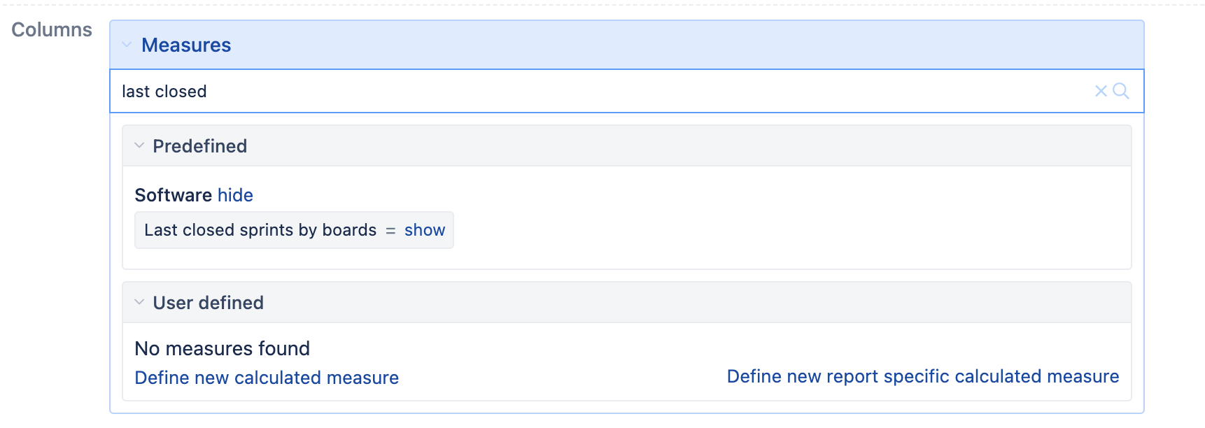
I was hoping someone could explain to me where the ‘Last closed sprints by boards <= 10’ filter comes from. I know about the ability to filter out rows (click on the header ==> Filter row) but that’s a simple filter which looks at numbers in a row and hides anything which doesn’t match. In this case, ‘Last closed Sprints by boards’ feels like a calculated measure of some sort? I guess that’s what really confuses me, I didn’t find a measure with such a name. Furthermore, why does that filter have a name? When I filter out rows, i.e.: ‘>0’, there aren’t any names applied to the filter. Why is this one named?
Hopefully my questions make sense. TIA for your answers!