Hello,
I am trying to generate a Scatter chart in order to demonstrate the status of a few epics (applications) based on two variable and for some reason, chart stays empty and I do not know why,
Here’s how I’m using the data.
Applications are Epics with custom fields.
In the epics, I wish to use the “score” costum field which is basically a note from 0 to 33 and represents the priority of the application. I want this to show as the “X” axe.
Every Epics has 11 “tasks” under them that represents deliverables that can be “completed” or “in progress”. I have a custom field that calculates the nb of Completed divided by total Tasks per epic to have a progression % score and I want this to be the “Y” axe.
I tried many different things, including multiplying the progression % by 100 to have two numbers and not % vs numbers. Still, the chart will stay empty. Based on the information above, can someone help me understanding how these charts work? Is the issue our structure of data (meaning we can’t compare epics info vs tasks inside epics?)
Here’s a visual idea of what we are trying to accomplish.
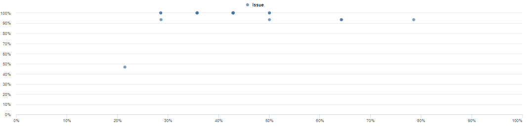
We’re simply trying to positionate Epics in the graph to have an idea of the priority and progress of deployment of the tasks.
Thank you very much for your help!