Hi
I built a Scatter Chart to show the ageing of Bugs, considering the date they were created (X axis) and the Issue Age (Y axis). Plotted it as a Scatter Chart and all is fine.
Then, someone asked me to show it having on the X axis the Status and on the Y the Ageing (in days). This is when I got into trouble: when I choose the issue status as any of the axis, it doesn’t show anything. When I choose the date created and the issue age, the issues are plotted fine.
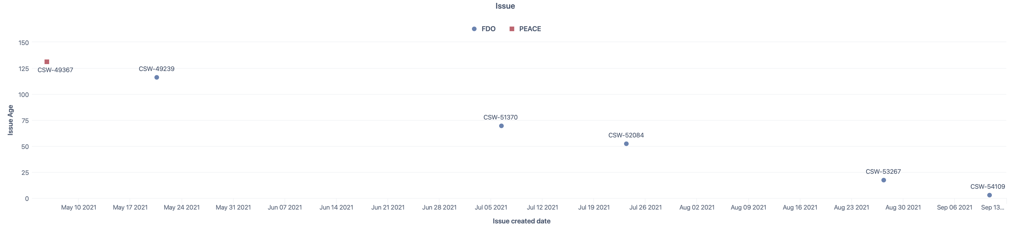
This is what I have now:
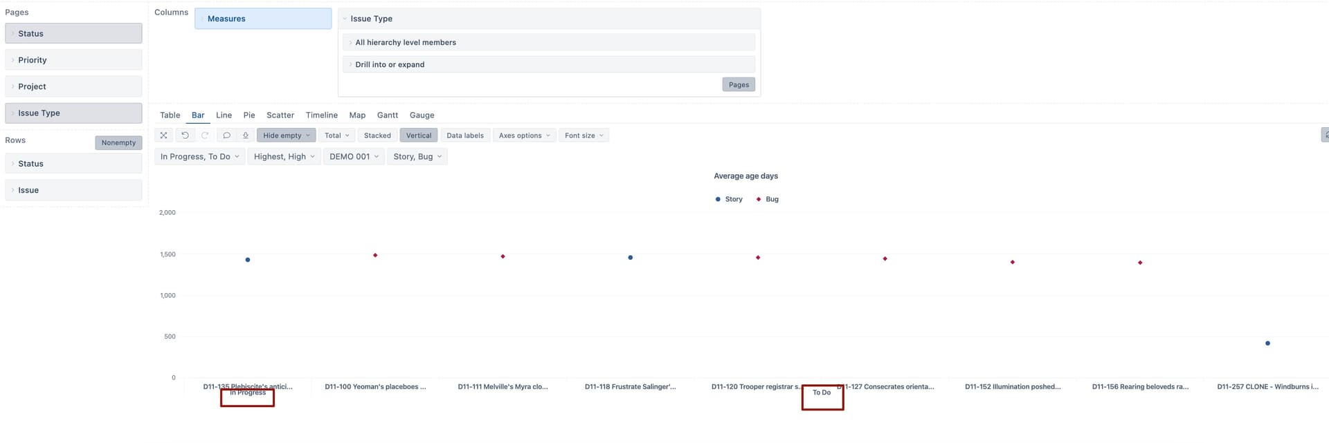
This is what I wanted to have:

Is there a way to show the issues by Status Category (or even by status) in a scatter chart? (I already have it as filters, but I’d like to show the status on an axis if possible).
Thanks in advance.