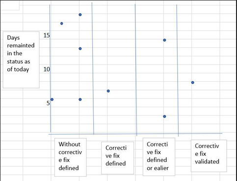
I have 4 custom status groups and am trying to create a scatter plot of the statuses on the x-axis and the number of days in that status on the y-axis. I want it to look something along these lines
Any help on this would be appreciated.
I have 4 custom status groups and am trying to create a scatter plot of the statuses on the x-axis and the number of days in that status on the y-axis. I want it to look something along these lines
Any help on this would be appreciated.
Hi!
You may want to use a scatter chart. To create a scatter, you need to select a numerical value for both axes - the X-axis and Y-axis.
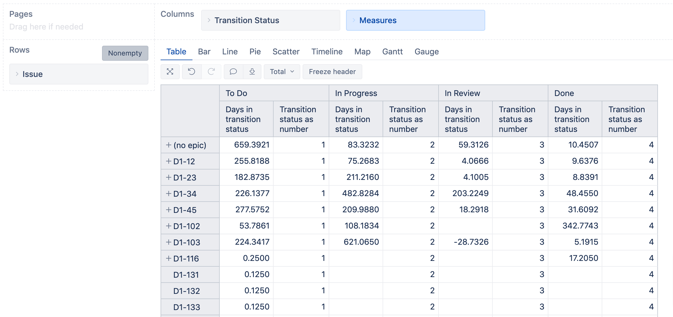
For Y-axis you would use a measure that calculates days in the status; if historical days work for you, use the measure “Days in transition status”. You can use your preferred measure instead.
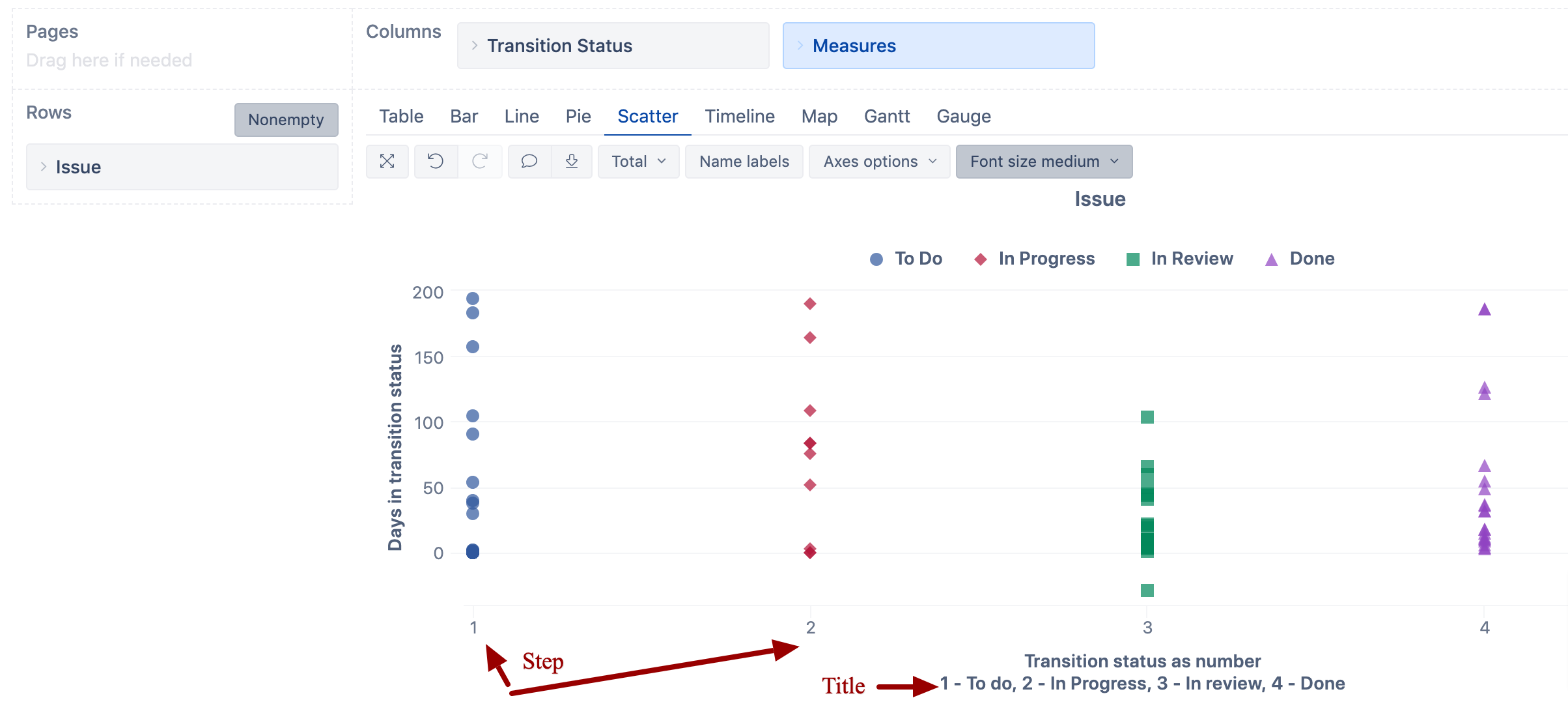
On the X-axis, you also need a number. Therefore, to group by status on Y-axis, you need to map each status to a number (To Do - 1, In Progress - 2, etc). For that, create a calculated measure; if you use “Days in transition status”, you would use the “Transition status” dimension in this measure (let’s call it “Transition status as number”):
CASE [Transition Status].CurrentHierarchyMember.Name
  WHEN "To Do" THEN 1
  WHEN "In Progress" THEN 2
   WHEN "In Review" THEN 3
  WHEN "Done" THEN 4
END
Now, put the report together: “Issue” dimension issues in the report rows; measures “Days in transition status” and “Transition status as number” as well as “Transition status” dimension in columns:
Customize the scatter chart
Hopefully, it would work for you!
You may also watch a video about the basics on how to build a scatter chart: Training videos - eazyBI for Jira
Ilze, support@eazybi.com