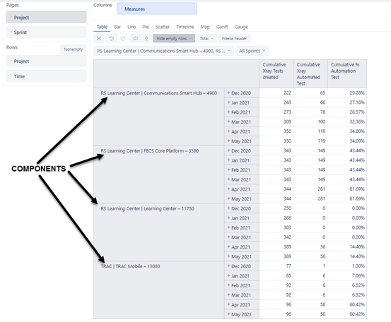
I have data as below:
When I convert this to a line chart, here is how I get it:
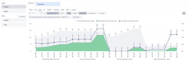
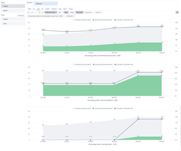
I would like to have the line chart to be as below such that the measures are displayed for each component as a separate line chart (managed screenshot):
Can someone please suggest what options I have ?
Hi There,
I would suggest creating 4 different reports each containing one component (in your case it looks like it’s the project). Once you have the separate reports, create a dashboard add add them at 100% width.
Link: Create dashboards - eazyBI.
Thanks you. These are project hierarchy members (Components in our case) .
The list of project hierarchy members can grow. So when ever a new hierarchy member is added I may end up creating a new report and adding to the dashboard. Hence I see this as a work around.
Are there any other options?
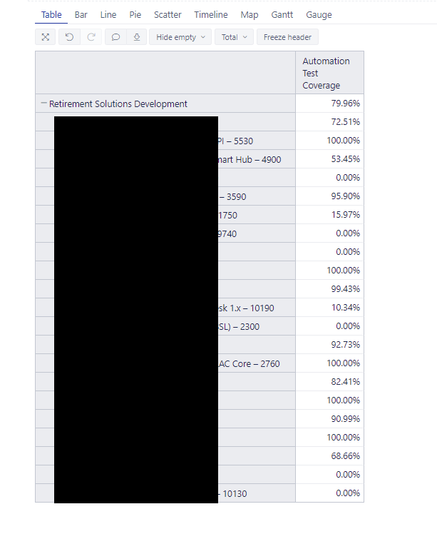
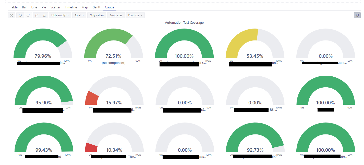
I have another report where I am able to get the expected behavior but that is a Guage with one measure.
Table:
Gauge report:
eazyBI does not have an option to build a nested set of reports. The suggested solutions are the ones described by @eli_solutions and yourself.
Daina / support@eazybi.com