sso
1
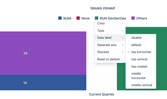
Hello. I am plotting a bar graph with the maximum range set to 100%.
However, the gap between the top line and the categories is very narrow, causing the text to overlap.
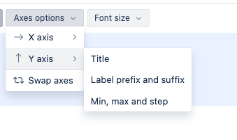
Since the max is 100%, I cannot set the range to 120%.
I am wondering if there is a way to resolve this.
Nacho
2
ey @sso !!
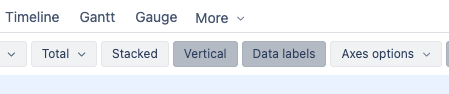
Did you try to have them in Stack way? (Button Stacked on top)
With that, if you click on the color of each measure, new middle horizontal alignment is enabled and won’t collapse with the top legend:
If it is not valid and the visualization of the text has to be on the top.
Did you try updating the “Max value” to 120%?
with the