New to eazyBI and I am trying to build a report that will be valuable to our team.
In our JIRA hierarchy, we have Initiatives that parent Epics that parent Stories. We have a custom field on the Initiative to indicate the Sponsor. I would like to graph (stacked bar chart) story points closed over time stacked by the sponsor on the parent initiative.
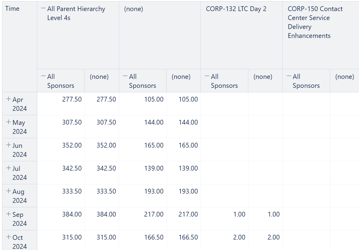
I have tried several approaches but haven’t found a way to do this yet. When I prompt the AI to build this for me, the closest I have been able to get is something like this:
Ideally, it would be something like this:
| Column 1 | Column 2 | Column 3 | Column 4 |
|---|---|---|---|
| Time | All | Sally | Bob |
| Apr 24 | 200 | 100 | 140 |
| May 24 | 350 | 200 | 100 |
| Jun 24 | 400 | 150 | 20 |