Thank you Oskars! This is new to me, and like I said I don’t normally work on these things, so that definitely helps give me a better idea of how things work.
The “Risk Outstanding” value, is a calculated measure inside the app. I will share how we calculate it along with the code and general idea behind the chart.
Our goal is to create a trend line of outstanding risks from month to month so we can gauge how things are going, and determine if we are maintaining, improving or needing to do more work.
We use the priority field of each issue that is to be filtered and included in the chart, to generate a weighted value by multiplying the number of issues with each priority against their associated weight (Urgent Scale , High Scale and Normal Scale ) See Below.
[Priority].[Urgent Scale]  = [Priority].[Urgent] * 10
[Priority].[High Scale] = [Priority].[High] * 5
[Priority].[Normal Scale]  = [Priority].[Normal] * 3
[Priority].[Low] = [Priority].[Low]
These values are summed and stored in the calculated member Scaled Open Bug Count in the Priority dimension.
[Priority].[Urgent Scale] + [Priority].[High Scale] + [Priority].[Normal Scale] + [Priority].[Low]
Then we use this field along with issues created and issues closed, to create two other calculated members in the Measure dimension:
Risks Discovered Scaled
([Measures].[Issues created], [Priority].[Scaled open bug count])
Risks Mitigated Scaled
([Measures].[Issues closed],[Priority].[Scaled open bug count])
And finally use those to calculate the measure Risks Outstanding (which is to be graphed) being defined as
Cache(
  Sum({PreviousPeriods([Time].CurrentHierarchyMember),
      [Time].CurrentHierarchyMember},
      [Measures].[Risk Discovered Scaled Currently]-
      [Measures].[Risk Mitigated Scaled Currently]
  )
)
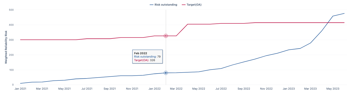
In theory, the chart could change each day (for the current month) as issues get created and closed, but when viewing the trendline over several months we would expect to see the previous months be consistent (as that data shouldn’t change as issues aren’t opened or closed in any month other than the current month) and the trend line cycle based on the Risk Outstanding calculated member similar to the following chart.
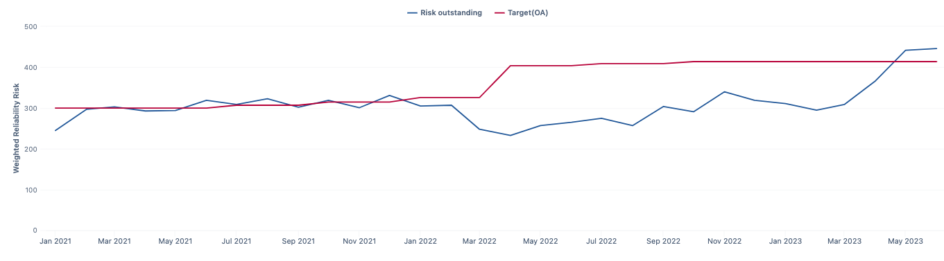
However, after migrating to the cloud, it was noticed the trendline wasn’t behaving as expected. I am pretty sure this is related to the way the chart was created and has evolved over time, and not the migration itself, but was only noticed then.
When trying to use the JQL query used to generate a table of the current issues meeting the filter criteria, that generated the trendline in my initial post which seems to only accumulate the weighted value without removing items that have been closed.
So this is where I have come into the problem, and trying to wrap my head around cube analysis to get this chart working so I can apply what I have learned to other charts that are similar in nature.
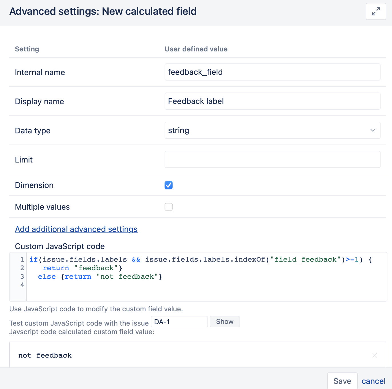
Taking what you have described, I thought that I probably should create new Scaled Measures for the 4 above priorities (like UrgentScaled below) in the measures dimension.
(
([Priority].[Urgent],
 [Issue Type].[Bugs_UX],
 [Resolution].[(unresolved)],
 [Project].[Projects A],
 [Feedback Label].[feedback])
+
([Priority].[Urgent],
 [Resolution].[(unresolved)],
 [Label].[Known],
 [Feedback Label].[not feedback])
) * 10
Then if I changed the Scaled Open Bug Count to use those 4 new Calculated instead of the original ones, the rest would just continue to work. But I am still not getting the same calculated Risk Outstanding value as I do when I manually calculate it. It seems I am missing about 13 issues based on the math, but I could still be doing this wrong and not going about it correctly.
I will need to change my test Report back to a Chart to see how it behaves, as I am currently using only a table to better determine where my numbers are wrong.