Hi,
I’d like to create a report where I can place the datapoints from each time period next to one another directly as a bar chrat, or overlay as a line graph.
The data points would be something like:
X # of widgets produced:
Q1 2017
Q1 2018
Q2 2017
Q2 2018
Q3 2017
Q3 2018
Q4 2017
Q4 2018
This could be visualized as I mentioned via a bar chart or a line graph, but it would allow the report to show the comparative change over timeframes. It doesn’t look like this is currently feasible in EazyBI but I wanted to check in and see if there’s something that I’m missing.
Note: I have thought about creating custom calculated members where I aggregate the members directly for each time period, but this is such a manual process that I was hoping there would be a better way. It also would not allow the timeframe to change particularly easily if, say, I wanted to compare the quarterly performance of 2016 and 2018 instead. Or 2014 and 2015.
If this is not currently feasible with the current tool I’d love to put in a request for a feature enhancement!
Thanks!
– Malik Graves-Pryor
1 Like
Hi,
Your guess is right, to compare the same KPI between periods side by side, you should define a calculated measure. There are several approaches and all if then requires custom calculations.
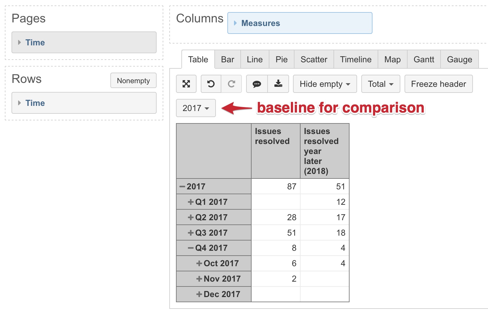
You may create separate measures for each year and represent those measures on a timeline of one year (the oldest). For the oldest year select measure Issues resolved and for other years, you may represent values with a time offset.
For offset calculations, you may use a function ParallelPeriod(). A syntax for the function is this: ParallelPeriod(<time level>,<number of periods between>,<time member>)
Make sure that the oldest year has all months because it is used as a baseline for function. If it lacks some, you may add missing date members.
For example, to get Issues resolved for the year 2018 which starts one year after 2017 (the oldest time period which is also a baseline), you may use a tuple of measure and function ParallelPeriod() like this:
( [Measures].[Issues resolved],
 -- represent measure value 1 year after baseline
ParallelPeriod([Time].[Year],-1,[Time].[Year].CurrentMember) )
Then in a report, set the oldest period 2017 as a baseline for data representation on a timeline, select 2017 in Time dimension (see picture below).
Best,
Zane / support@eazyBI.com
1 Like
Hi Zane,
This works splendidly with year but when I try to use Fiscal Year it doesn’t. Thoughts?
Hi @sconnell,
Time dimension has several hierarchies - default, Weekly and Fiscal. My example is built on default hierarchy and therefore doesn’t work as expected for a Fiscal year.
In formula is used expression [Time] which refers to Time dimensions default hierarchy. To refer to the particular hierarchy, for example, Fiscal, you may change it to [Time.Fiscal] which means Time dimensions Fiscal hierarchy.
The adjusted formula to work with Fiscal year might look like this:
( [Measures].[Issues resolved],
 -- represent measure value 1 fiscal year after baseline
ParallelPeriod([Time.Fiscal].[Year],-1,[Time.Fiscal].[Year].CurrentMember) )
2 Likes
Thank you, Zane! I appreciate the help!
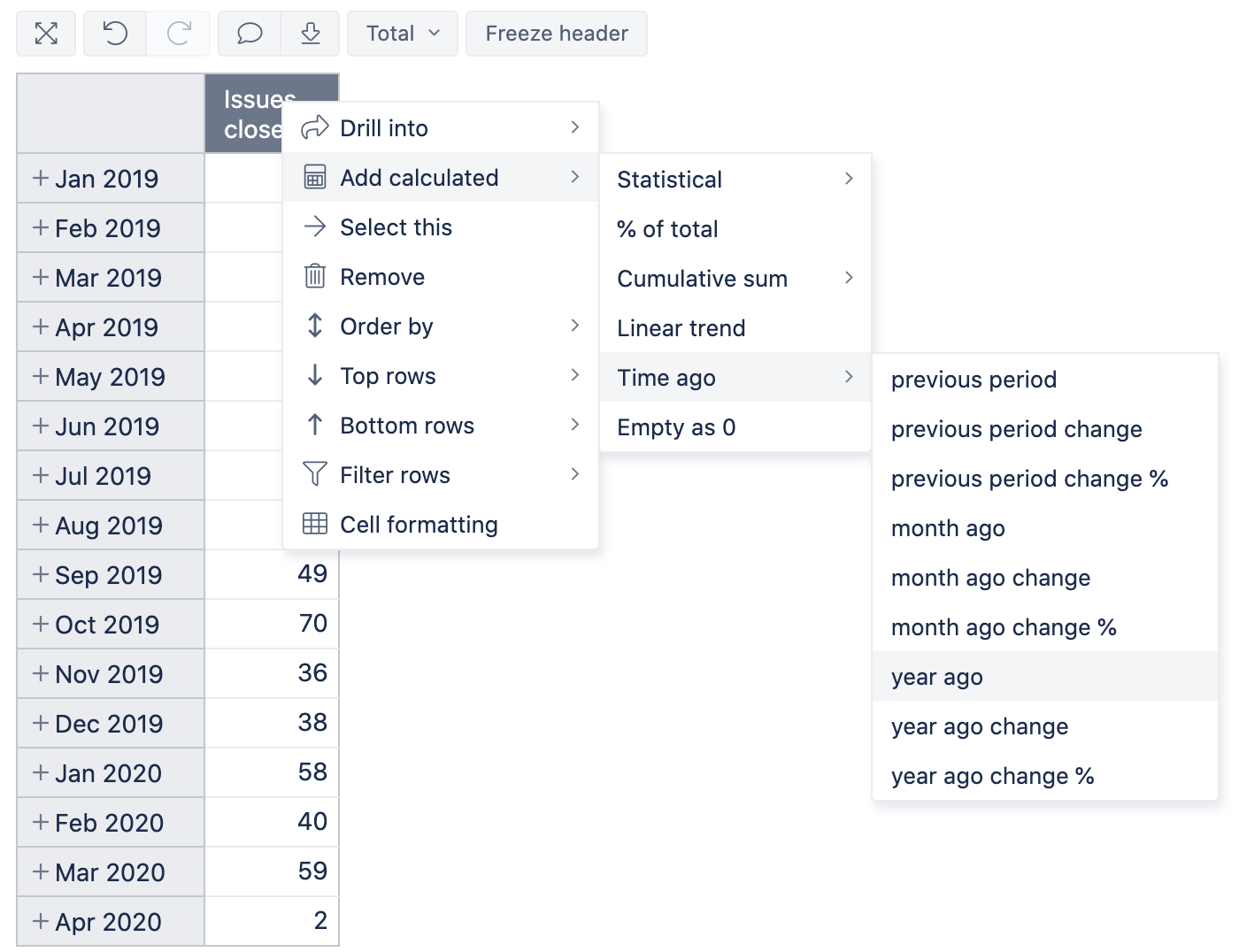
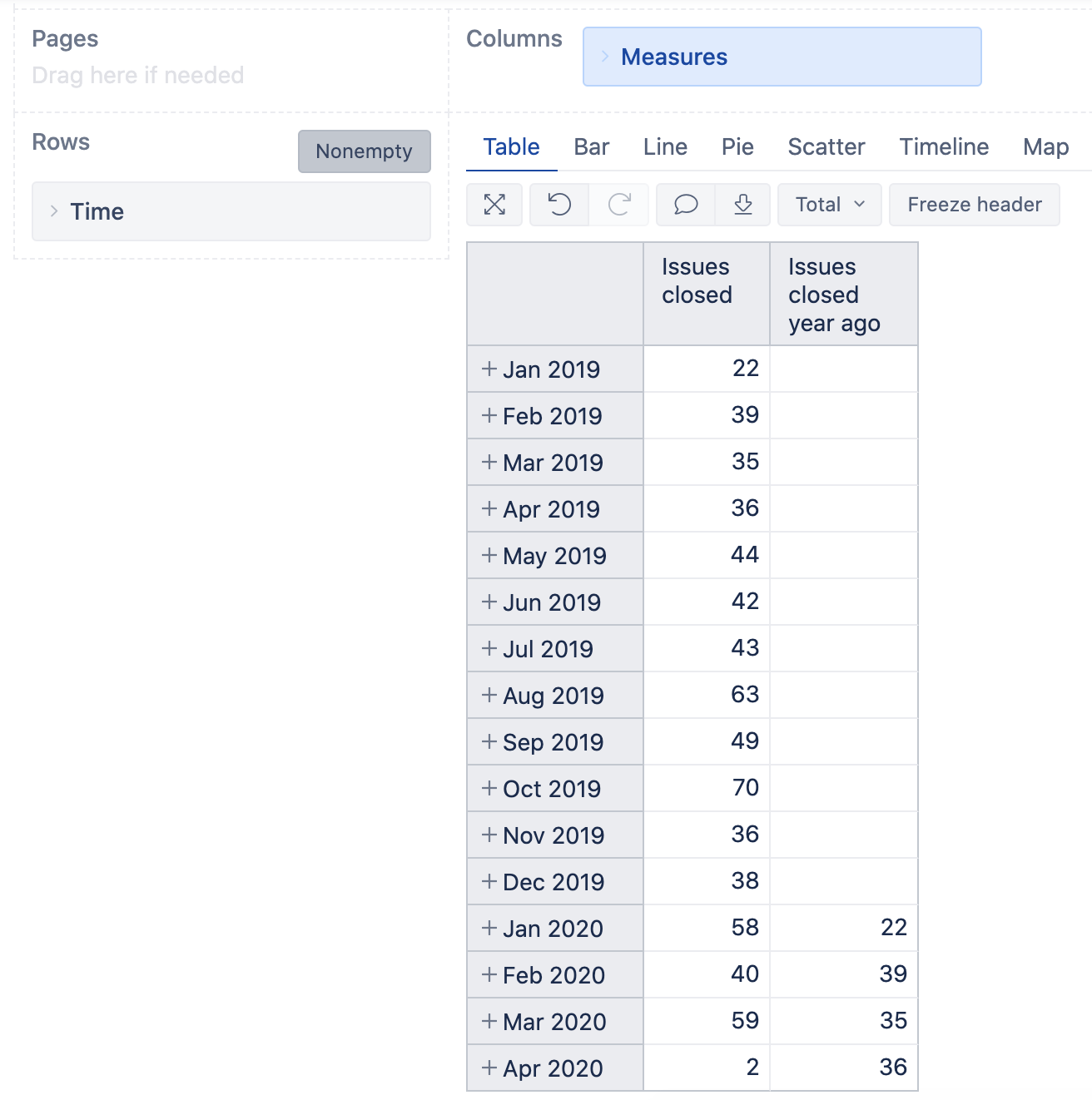
With eazyBI version 6.0 we added default calculations to compare data to previous periods. You can click on header of the measure Issues closed and select option: Add calculated>Time ago>year ago. This will create a new calculated measure (report specific) with the name Issue closed year ago
Here is how the two looks in one report:
Daina / support@eazybi.com
2 Likes