There is one certain graph type that I am not able to implement with eazyBI. I see that in some discussions here, heatmaps are proposed to be used instead. But that one does not really fulfill my need. Currently I am producing raw data with eazyBI, then exporting it and put it to Excel to draw a treemap. Luckily, I only need to update this graph quarterly.
Anyway, would be nice to have a treemap graph in eazyBI. That would help me to kill another Excel!
My requirements:
- It should basically work like the Excel treemap - there is a numeric value that specifies the size of each cell
- There is a value that defines which text is shown in each cell as the cell name
- The color of each cell should depend on “type” column like in Excel (in eazyBI this could as well be a measure column where I would like to then map the measure values to a color)
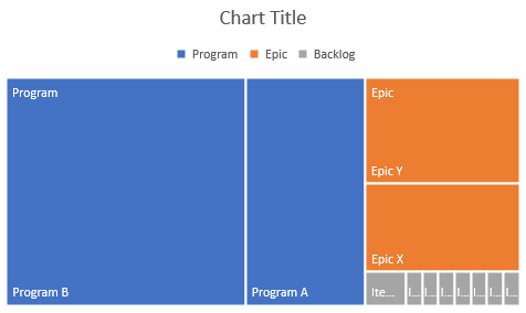
My example data below, which produces the graph attached:
| Type | Name | Size |
|---|---|---|
| Program | Program A | 100 |
| Program | Program B | 200 |
| Epic | Epic X | 50 |
| Epic | Epic Y | 60 |
| Backlog | Item 1 | 5 |
| Backlog | Item 2 | 2 |
| Backlog | Item 3 | 2 |
| Backlog | Item 4 | 2 |
| Backlog | Item 5 | 2 |
| Backlog | Item 6 | 2 |
| Backlog | Item 7 | 2 |
| Backlog | Item 8 | 2 |