Dear EazyBi team,
is there a way to get the exact trend of “Average days till resolution or period end” over all periods?
When I put the measure “Average days till resolution or period end” into Project Overview, it’s showing the target figure, I would like to see in the current period.
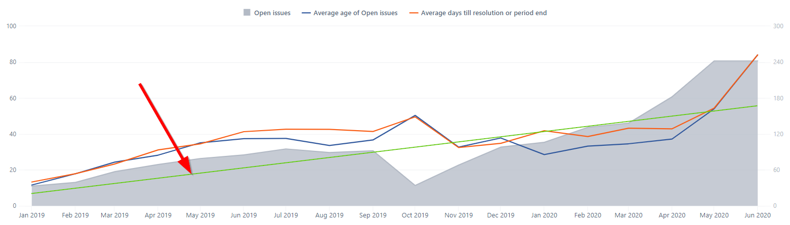
Please see the green line as example in the following screenshot:
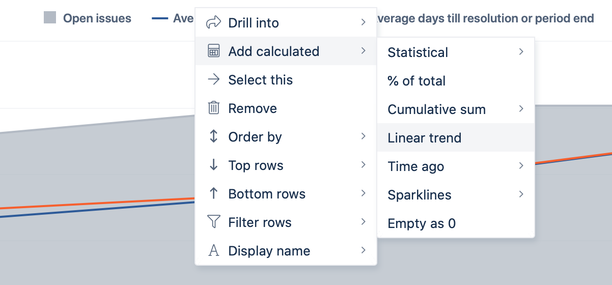
You can use the default calculation Add calculated > Linear trend to the trend of the measure Average days till resolution or period end in the report over time. With this approach, you can draw the green line as in your example.
The report Project overview is a chart to represent the overview. You can check out the example formulas for Issues resolved trend and Issues resolved overview. The formulas in those measures access specified time periods and show the data in all periods (Sparkline) or show the trend (increasing or decreasing arrow). You can use any of those formulas and replace the measure Issues resolved with any other, for example, Average days till resolution or period end. You might consider changing the colors of arrows, though. Increasing value in Average open days might indicate slower progress.