Hello,
I was aware of this, but unfortunately it doesn’t work for vertical bars. They always come on top no matter if I position the measure in the tabel bfore the bar measures or thereafter. For me this seams to be a bug or did I miss something?
Regards
Rainer
Hi @rainerz64
The vertical line in the chart would always be in front of other measures, that is the expected behavior regardless of where the measure is located in the table view report.
Martins / eazyBI
Hello @martins.vanags,
why do you break consistency in UI behaviour this case, when you have established ways to control the behaviour? This is always annoying for users.
Regards
Rainer
Thank you for the feedback.
The vertical line is a special type of marker in eazyBI charts that is usually used for some milestones in the chart and we believe it doesn’t make sense to hide it behind other chart measures.
But please share more details on the use-case when do you find that the vertical line is better behind other chart measures.
Martins / eazyBI
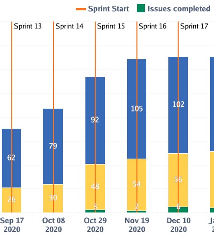
This is where I use the vertical lines and I would like them to stop at the top of the bar
I can agree that in your use-case the vertical lines would look better if they would be behind all other chart types.
I just registered a new improvement request to let users change the sequence also for the vertical line marker. We will update this community post once this will be released, but I can’t share any promises on the delivery dates.
Martins / eazyBI
Hi @martins.vanags I have case below… I cannot seem to get vertical line to display. When I Click Important Dates DWH in example below I do not see Type (as you describe in Giff above) but different pull down choices. Thanks for any help
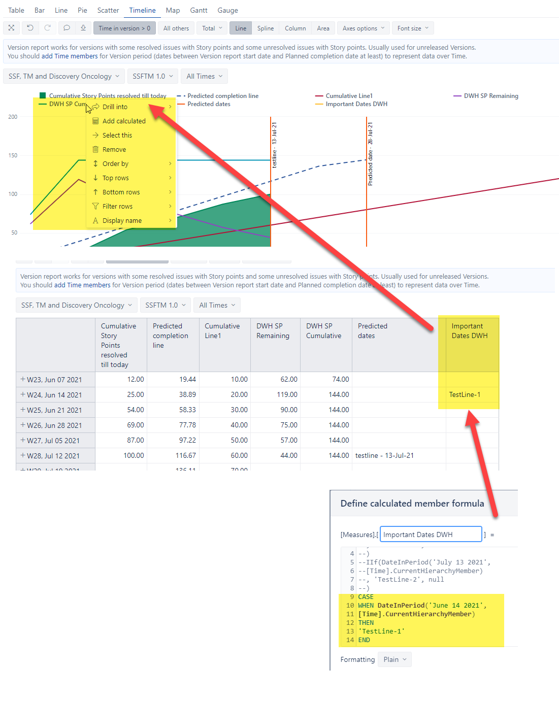
Hi DonHamp,
When you go the the graph view of the report, there are two places you can click which give you different options, one place is to click on the text “Important dates DWH”, and another place is to click on the line next to “Important dates DWH”. When you click on the line, it should show you the option to view that measure as a vertical line.
Hope it helps!
1 Like
Yup… .thanks I also finally figured that out. I just need to click a few pixels to the left. Thanks Much!
1 Like
Thanks for the great tips using vertical line in timeline chart.
Is it possible to get a series of vertical line based on the date defined in jira release field from one specific jira project?
For example, I have a few jira projects together for a program rollup, so I could have timeline chart which shows the progress from all those jira projects. I only use a program rollup project specifically to manage the program release date, and each other jira projects might have their own release defined, In the timeline chart, how can I show a series of vertical lines based on that program rollup jira project’s release date, together with the overall actual remaining work progress line?
To make thing more complicated, is it possible to then filter those list of releases and let user select which vertical lines they want to show? would that be possible?
What exactly do you mean by “release field” for a specific project?
Is it one issue with a release date field or perhaps a specific release in the project with a release end date?
Perhaps you can share a screenshot who do you enter the release date for a project in Jira.
If that this screenshot is not meant for public community, please reach out to eazyBI support and provide more details about your question.
I believe there could be way where you import new dimension just for the filter which would then let you filter report and go to the “linked” project from the “Project” dimension and then return a release date as vertical line/s in the chart, but I would want to see exactly how this release date is entered in Jira
Martins / eazyBI
Hi I want to share two ways to show vertical line
1 Like