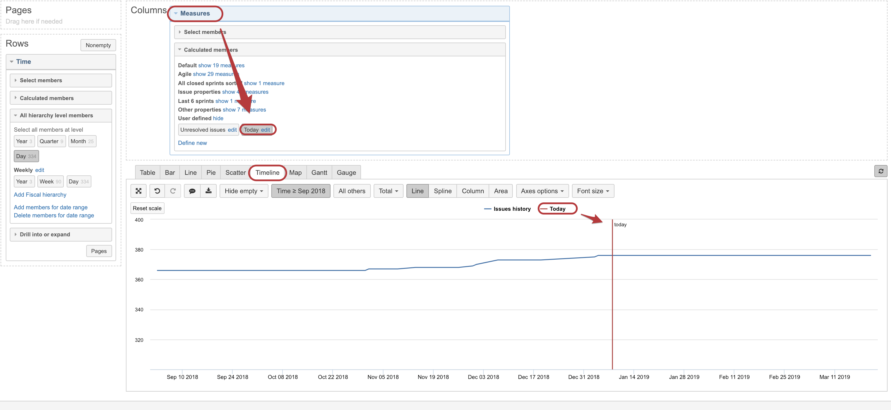
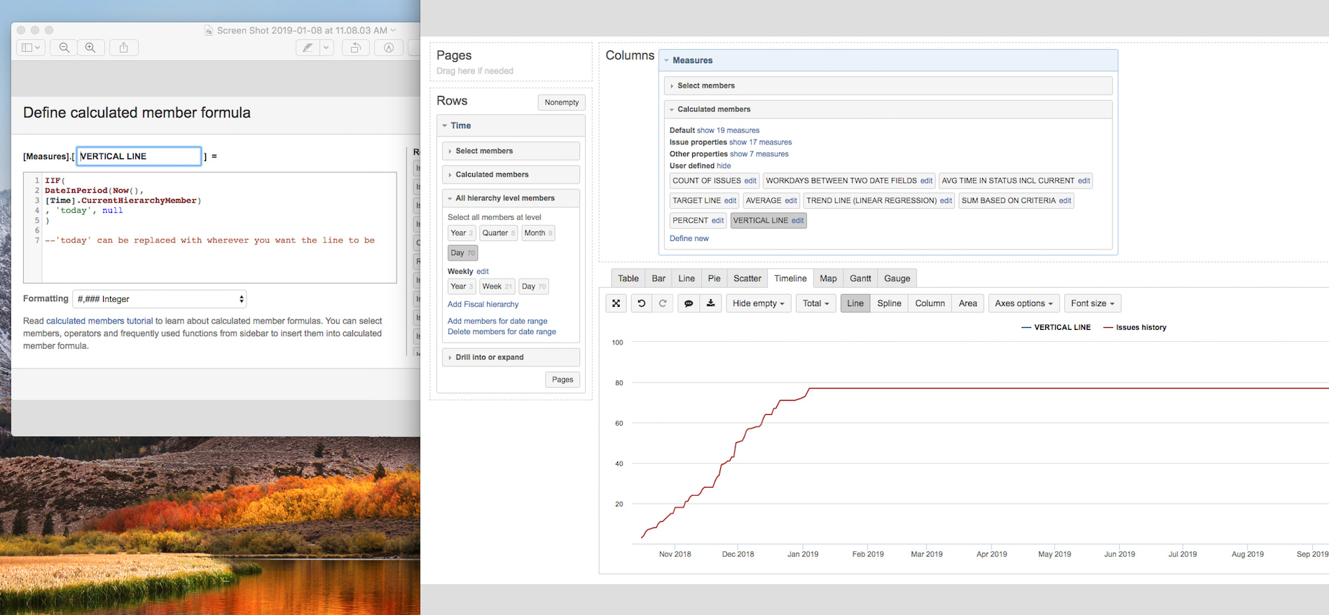
When selected, this measure could be displayed as a ‘vertical line’ after a type of the marker for this measure through legend (in a chart mode) is changed.
But be aware that it is possible only to Timeline chart in eazyBI
Hi @martins.vanags, this is a really interesting calculation but I can’t seem to get it to work when I try it. It looks like I’m doing exactly what you did in this post but I can’t get the vertical line. Do you have any troubleshooting/fixes that I can try?
Hi Martins,
This is very helpful and almost gives me what I need.
How would I go about adding a vertical “milestone” in a time series report that shows, for instance, the status changes of issues over time (e.g., an example for eazyBI demo: https://jira-beta.audible.com/plugins/servlet/eazybi/accounts/2/cubes/Issues/reports/4-created-issues-over-time-by-current-status)?
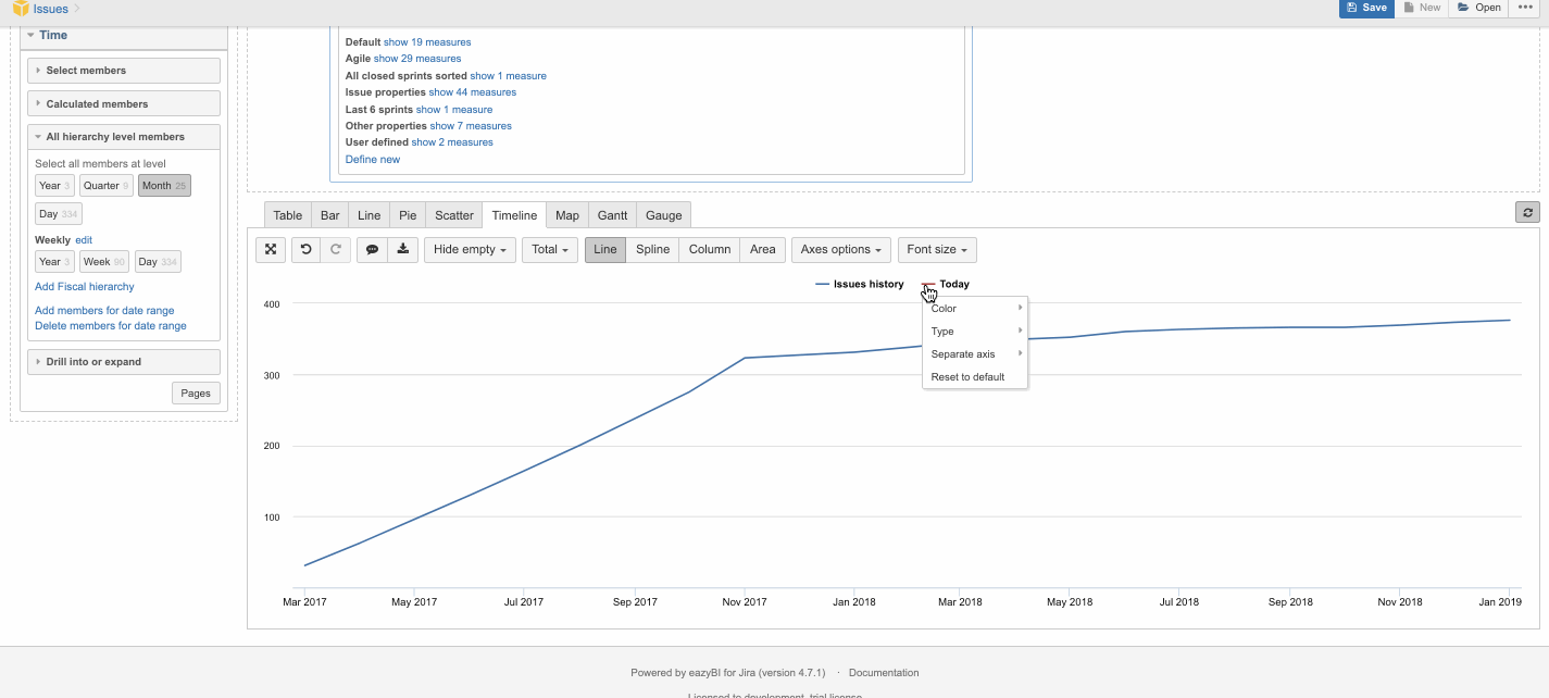
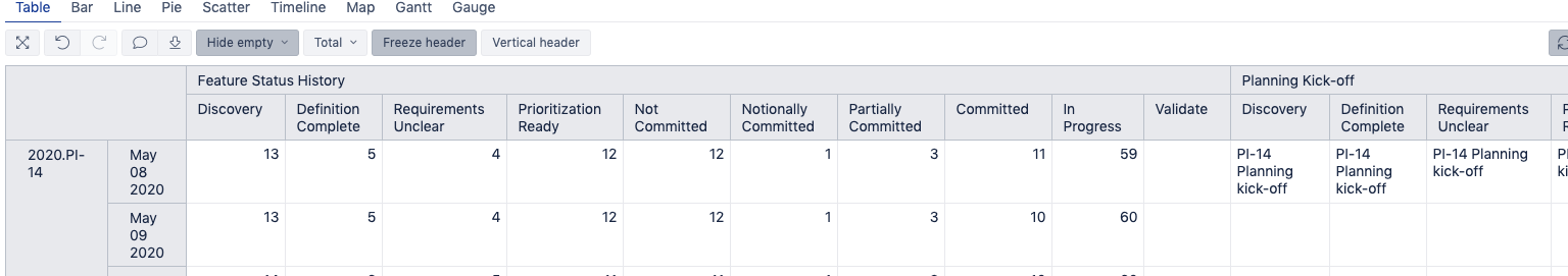
When I add the milestone date as you explained I get a separate line for each of the statuses doubling the size of the legend and pre-pending the name of the milestone with the name of the status (see image). I had to change each of them to Vertical Lines. Ideally there would be a single line (and none would appear in the legend, if possible - is that possible?).
Unfortunately, that didn’t work. Here’s two snapshots of the data table. One is with all statuses expanded, the other with the statuses collapsed so you can see the two “milestone” dates. Most of the table rows/columns are empty under the “milestones” but not completely, so hiding the emptys has no impact.
In this case, you would need to create new calculated measures using Case When and define under which of statuses the measure should / should not be displayed.
CASE WHEN
[Status].CurrenthierarchyMember.name = “Discovery”
THEN
[Measures].[Planning Kick-off]
END
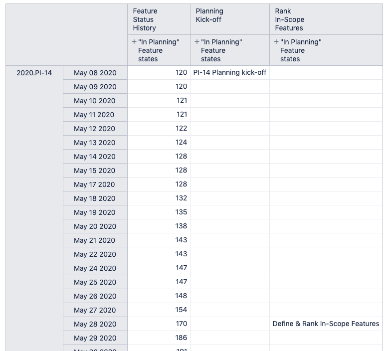
This would display Planning kick-off value only for “Discovery” status column when Statuses are expanded. In a similar way, you could create a measure also one for Rank In-Scope Features measure.
Thank you!
At first I couldn’t get it to work. [Status].CurrentHierarchyMember.name was resolving to “All Statuses” instead of the name of the status. I realized I had to use [Transition Status] instead of [Status] and it works perfectly! Now if we can get that feature added to remove/edit the legend I’d be all set!!
Thanks for the tip, I am using the code you mentioned in post#1 to draw a verical line for Today’s date.
I had a similar question. In my Jira project, there are a few milestones already defined under “fixVersion” by the project admin. It is a large project (say 100+ folks using it) and if the milestone dates move around, the date changes are handled by the project admin and it benefits everyone.
In my timeline chart, I wanted to plot some of the milestones as vertical lines similar to plotting the Today. Can you please suggest how I can do that?
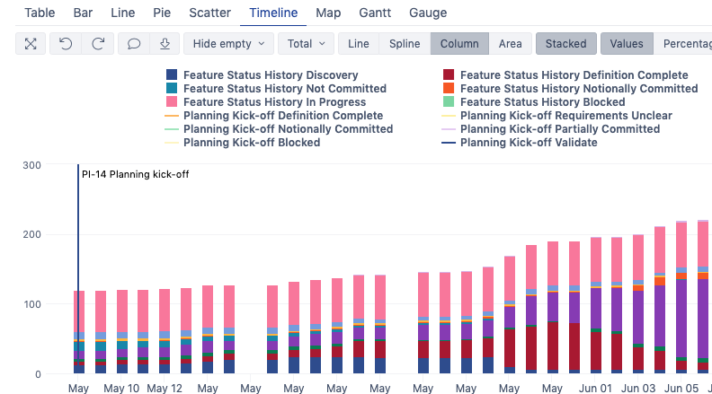
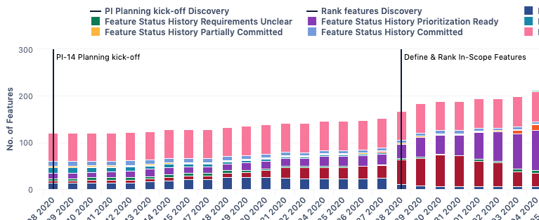
It has multiple vertical lines
You could use the same technique to draw fix version milestone dates.
Just make sure that the calculated measure returns values automatically based on imported data.
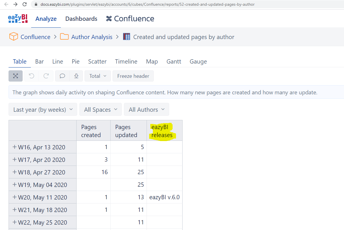
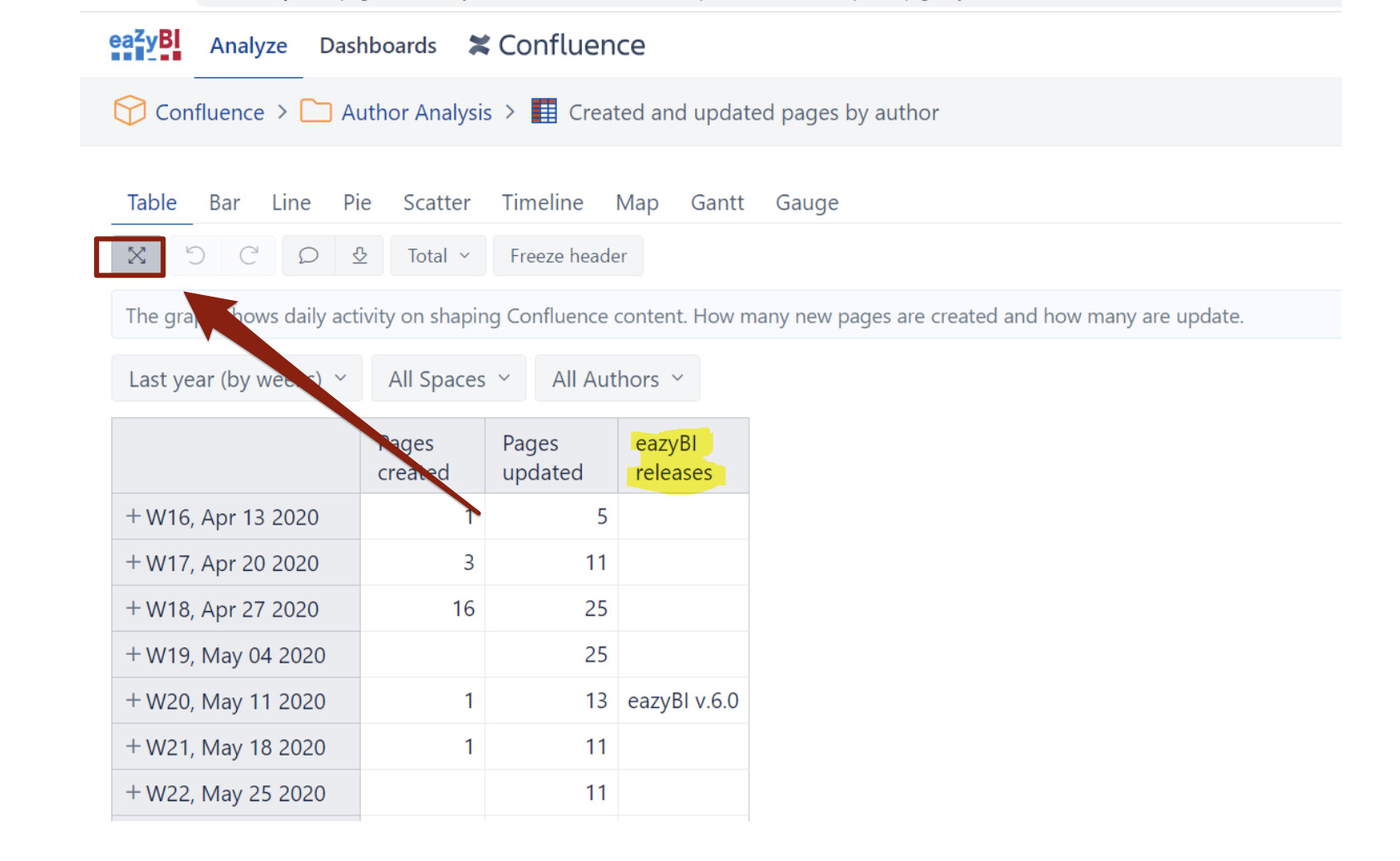
I am not able to see the dimensions or columns on the demo account, the way I see dimensions and measures in our organization’s internal eazyBI project.
I wanted to understand what type of measure is the “eazyBI releases” column in that report.
Can you please help?
Thanks!
The sample report in table form that I see on the demo account is below:
Hello,
Thanks for the hint about displaying only once the version vertical line in the legend @martins.vanags and @jrjanis!
I tried to use the same trick inside a report showing open issues and sorted by label, but unfortunately I did not succeed. This is the formula that I tried:
CASE WHEN
[Label].CurrenthierarchyMember.name = “Label_1”
THEN
[Measures].[Release date]
END
Do you know if what I want to do is feasible? If so, can you fix my formula?
Hello,
if you reorder the measures you are using, the line / bar will change how it is displayed. I have had to do this when using bars and Area types.