Hi There,
I’m trying to build the following Waterfall chart from excel into EazyBI:
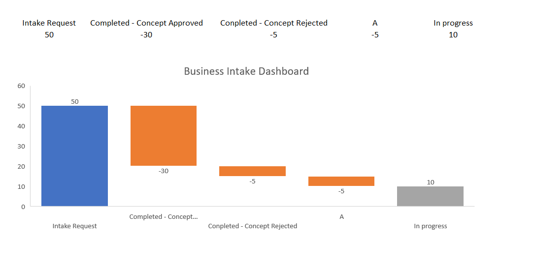
I got all the correct status and counts, but I need some recommendations on how I can replicate the waterfall chart in excel:
Thanks,
Fabian
Hi There,
I’m trying to build the following Waterfall chart from excel into EazyBI:
I got all the correct status and counts, but I need some recommendations on how I can replicate the waterfall chart in excel:
Thanks,
Fabian
Hi,
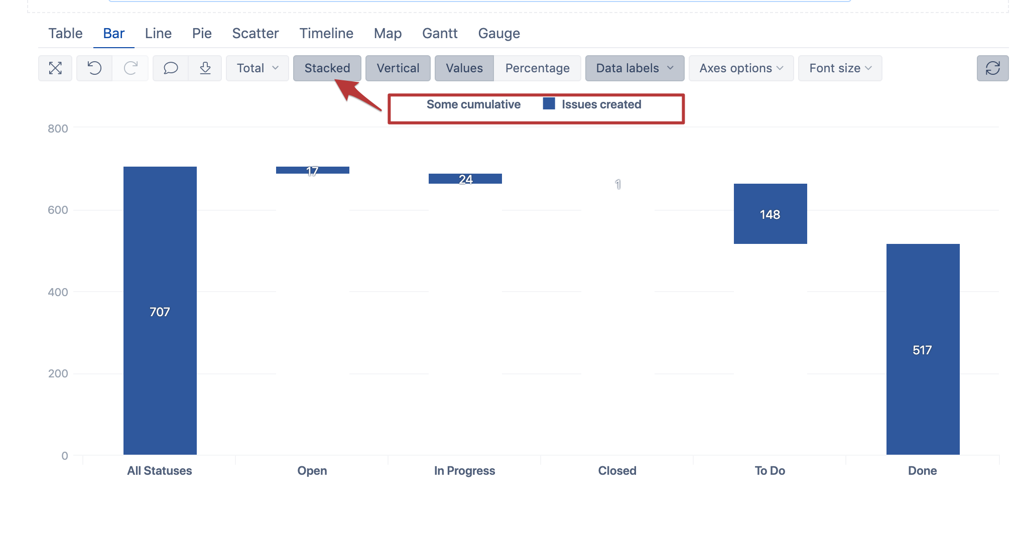
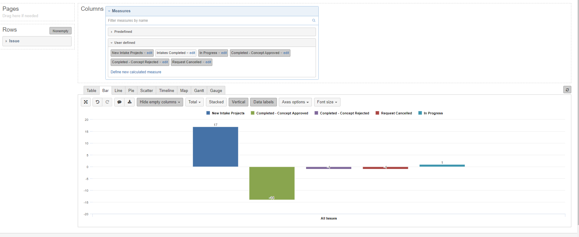
Such chart types are not supported by default; the creation of the waterfall chart requires a custom solution.
The idea is that we can build our custom cumulative measure that accumulates all the values from previous bars in the chart and apply some maths to let it grow in the right direction and from the right level. Then we can select this cumulative to show as stacked with the measures we wish to show in the waterfall chart.
Finally, we can choose to hide this cumulative by selecting the bar color the same as the background. I created the example with issues created by status:
The tricky part is cumulative; the formula completely depends on what you wish to have in your waterfall chart. In my case, it was the following:
CASE WHEN
[Status].CurrentHierarchyMember.Level.Name="Status"
THEN
([Measures].[Issues created],
[Status].DefaultMember)-

(Sum(
  Head(Filter ([Status].[status].Members,
  [Measures].[Issues created]>0
  ),
  Rank([Status].CurrentMember,
  Filter ([Status].[status].Members,
  [Measures].[Issues created]>0
  )
  )
  ),
  [Measures].[Issues created]
)
)
END
Kindly,
Janis, eazyBI support
Thanks Janis.
This is exactly what I was looking for. I would need to consolidate/group some statuses together to finalize the graph, but this is excellent.
Can you provide the export for this report? I am looking to build a Throughput report for a Kanban project.
How can I add the “All statuses” bar?
Hi all,
Here is also an example of Version waterfall report in eazyBI demo account that you can export and import into your account to see how it looks with your data: Version waterfall - Issues - Jira Demo - eazyBI
best,
Gerda // support@eazyBI.com