Hi all,
I want to display a beam between two curves.
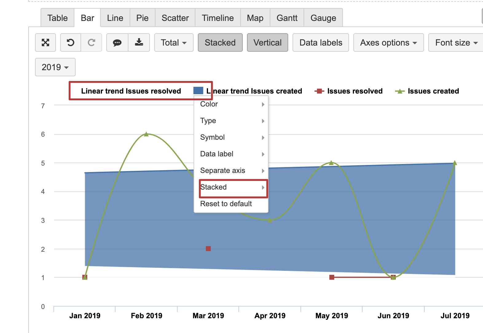
I tried to set my max value as coloured area and my min value as white one but the rendering is not satisfactory, because colours are melting (see picture).
Any idea how I could make it more aesthetic?
Thanks,
Vianney
Hi,
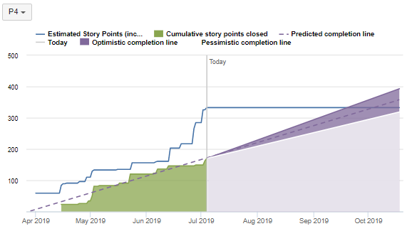
There seems to be at least partial workaround for showing beam by using the stacked bar chart.
First, you might wish to create a new measure for the difference between the Optimistic and Pessimistic lines which would be the “thickness” of the beam.
Then you can stack the measures of the Pessimistic and “Difference” as areas and select the white color for the Pessimistic (as you have it now already). This configuration would resolve the problem of transparency which is applied to the overlaying areas in charts currently:
There is a restriction, unfortunately, when you switch from timeline reports to the bar charts. The bar charts cannot show the vertical lines. We have a request in our backlog for harmonising all chart types in eazyBI.
Kindly,