Hi,
I’m having a question about how to generate a report with the following data:
- my data source is a JQL that contains all the executions from the last 12w
- my goal is to create a graph that shows all executions and their statuses vs time but I don’t have any statuses
any help pls?
Hi @Aviel_Bashari,
Can you share what JQL you are using to limit executions?
To limit your data in eazyBI data cube, the best option would be to use the import option to limit data by XRay test run, see more here: Xray Test Management
Using that option test runs are imported if they are created (test is added to the test execution) within the time limit (for scheduled test executions) or with started on date within the time limit (for completed or in progress test runs). If there is no limit set, then all test runs are imported.
Can you share which measures and dimensions you are using currently in you report? And which doesn’t have any statuses?
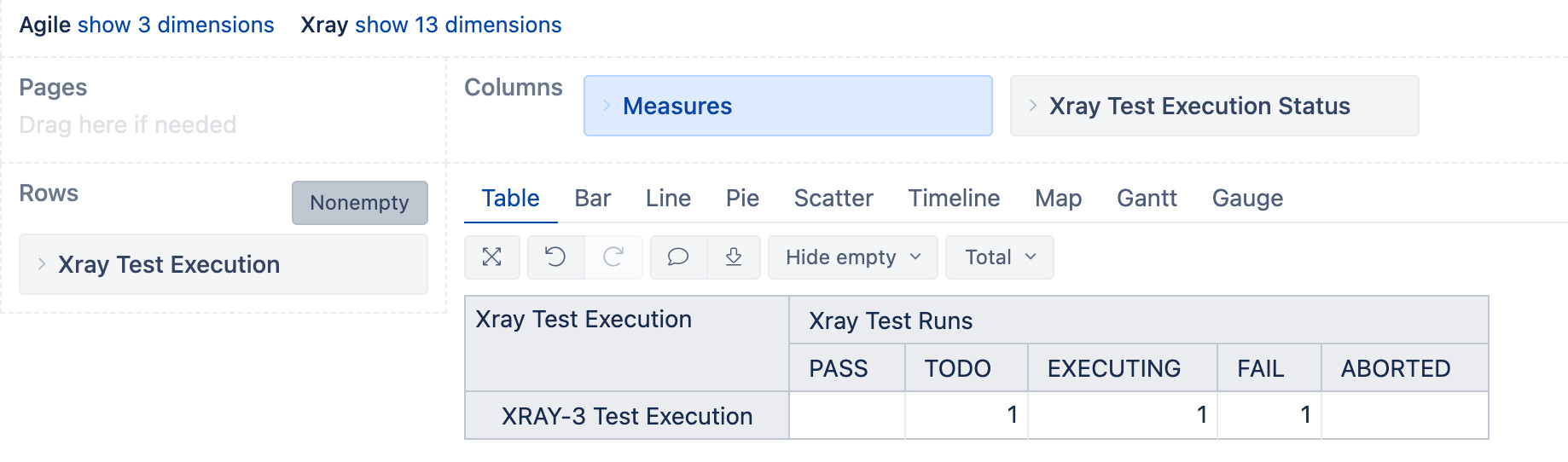
To get report where you can see executions and their statuses, you should use XRay Test Execution dimension in Rows and Test runs per XRay Test Execution status dimension:
Kind regards,
Gerda // support@eazyBI.com