I am creating a Scatter Plot which shows the number of completed issues inside a project (%) vs number of issues inside the project, and the size of the data points is determined by the estimated required number of R&D hours. Inside of this plot I would also like to add a straight line marking 50% of completed issues. Is there a way to do this inside a scatter plot?
The scatter chart’s main purpose is to represent a correlation between two different measures. And in the tab Scatter, there is no option to add other chart types.
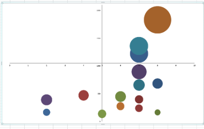
When you choose the Scatter chart, the option is to draw only dots or “bubbles” based on 2 or 3 parameters.
Choose the Bar, Line, or Timeline chart where you can combine several chart types, like lines, columns, areas, and bubbles. This training video “Scatter and Bubble chart” might give a better understanding of options: Training videos