I would like to create a Gantt Chart for Resource Allocation for project planning purposes.
The specifications for this Gantt Chart are as follows:
Resources on the x-axis
Time (months) on the y-axis
In this format, each row should represent a resource (such as a team member, equipment, or room), and the horizontal bars indicate the periods during which the resource is allocated to a specific task (Jira Ticket).
The horizontal axis (x-axis) should represent the duration of each task, while the vertical axis (y-axis) should represent the different resources. Each horizontal bar on a resource’s row indicates the period during which that resource is assigned to a particular task (Jira Ticket).
I would like to inquire if it is possible to create such a Gantt Chart for Resource Allocation in EazyBI (Server version). If it is possible, could you kindly assist me ?
If it is not feasible in the current Server version, would it be possible after migrating to Data Center?
In eazyBI, Gantt charts are quite simple and meant to illustrate scheduled tasks and their progress on the timeline.
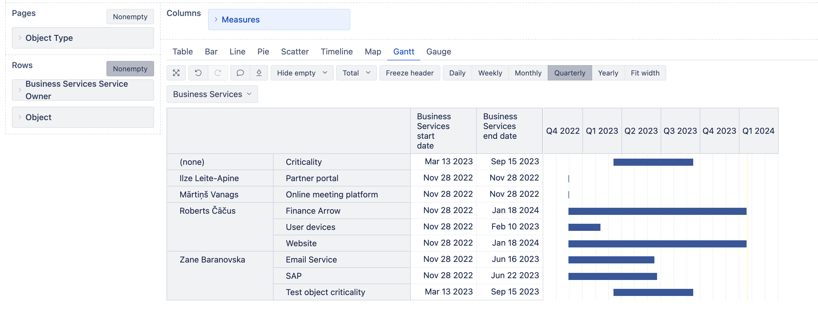
However, you may create a chart with different meaning, if you follow 3 main rules and take into account the chart limitations. I suggest starting report creation in a table view.
In rows, add a dimension that contains your resources. Most typically, it could be the Issue dimension if Jira issues define your resources; some of the users’ dimensions (like Assignee); or JSM assets (objects). All resources should belong to the same dimension to include them in one chart!
You may add another dimension to group those resources; however, each row would still be a separate bar.
In columns, two measures that display the resource’s start and end dates must be selected. They could be some standard properties (issue created date/closed date, custom dates, or object attributes), additionally imported dates (for users, for instance), or dates that you calculate in a user-defined measure. In any case, those two date fields are mandatory to build a Gantt chart.
If you also want to display the % of completion, then there must be a third measure in columns that returns this value.
Here is an example of Assets objects grouped by owners and based on their start and end dates.
Another option is to use Bar chart as a Gantt, using line type “range” between two dates. This option allows more customization options (colors, conditional formatting) and adding some additional dates. Only there you can not define % of completion. An example here (based on stories, but the meaning depends on what you select in the report rows): Blocker Story Plan (Bar as Gantt) - Issues - Jira Demo - eazyBI
How to create such a bar/Gantt report, watch a video: Training videos.