Perhaps, you can ensure that you add “dimension = true” line to your advanced settings for Javascript calculated field definition.
[jira.customfield_comments_for_issues]
name = "Comments for Issues"
data_type = "integer"
measure = true
dimension = true
javascript_code = '''
  var comment = issue.fields.comment;
  if (comment && comment.comments && comment.comments.length > 0) {
    issue.fields.customfield_comments_for_issues = comment.comments.length;
  }
'''
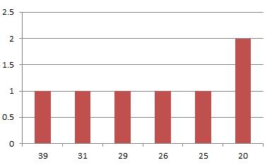
Next, you can import “Number of comments” as a separate dimension and use in your report rows with a measure “Issues created” in columns. Then switch to bar chart.