Hi there,
I really like EazyBi, you have do a great job… but still, I wish to propose you a feature that, I think, is really missing.
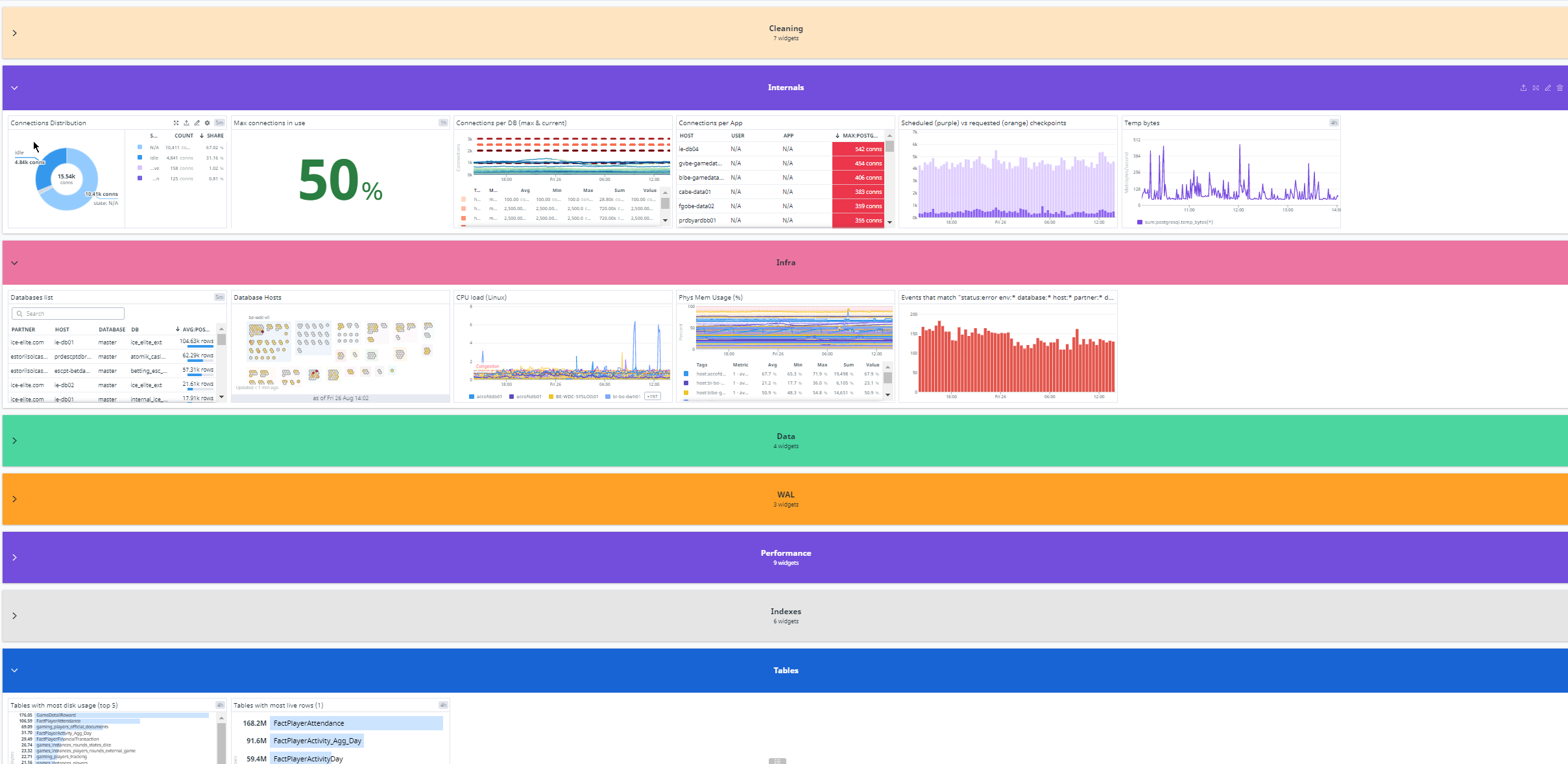
I use other graphing tools, it is my main job and what is missing is a grouping widget.
When we have a lot of graphs into a page, it is very hard to read, so, creating some “sections” will help a lot to organize the pages.
I join a visual example, done with another tool (See the colored horizontal bar). I have a lot of graphics, but they are grouped by topic.
That way, we have a more readable page and it help a lot to find the right graph.
By example, having the possibility to add some other widgets like a “note” (aka postit), or a sidebar (horizontal or vertical), simply a box/colored/with text/expandable etc… will be great. Adding something else than a graph can be useful for a lot of purposes.