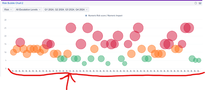
I want to remove or hide or change the color from x axis without removing the actual column from the table from where the chart has been prepared
Guys I really need this quick help if anyone got any hack to disappear/hide these issue keys from X axis … it would be really appreciated
Hi @ysharma,
You can slightly modify the axis labels; for example, show only issue keys or specify the limits and steps for numeric values (see the documentation: Customize chart).
The axis labels are not intended to be removed, so users can interact with the report and see what information it represents.
Howevere, I understand your desire to have more options to modify the report’s look. I add this use case to our improvement backlog for further consideration.
Best,
Zane / support@eazyBI.com
@zane.baranovska Thanks a lot for your response however, Exactly, We dont want to remove it and just want to hide/invisible as it does not look good when we have lot of issues on x axis,
And its not the data lable, its the x axis values, so we need to be able to customize those or have options to create the bubble chart in exactly the way we do in excel like requested in below post
I want to create the Scatter Bubble chart for Risk management - Questions & Answers - eazyBI Community
