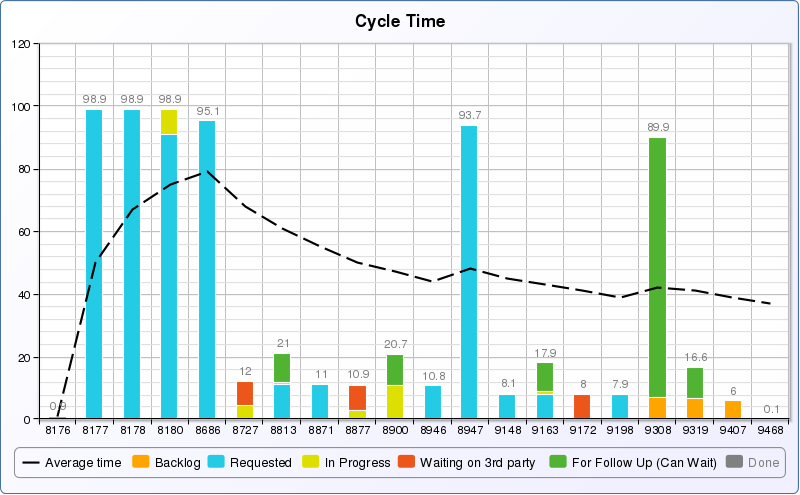
You might want to consider a Cumulative Flow Diagram (available in JIRA but you can replicate in easyBI). CFDs are a good starting point but deal with averages so you need to be careful in reading too much into them. Histograms of cycle time are a good place to make sure you are not ignoring the fat tail of the distribution f cycle times. A good percentile is 85. See Dan Vacanti’s book Actionable Agile Metrics for all the deep details.
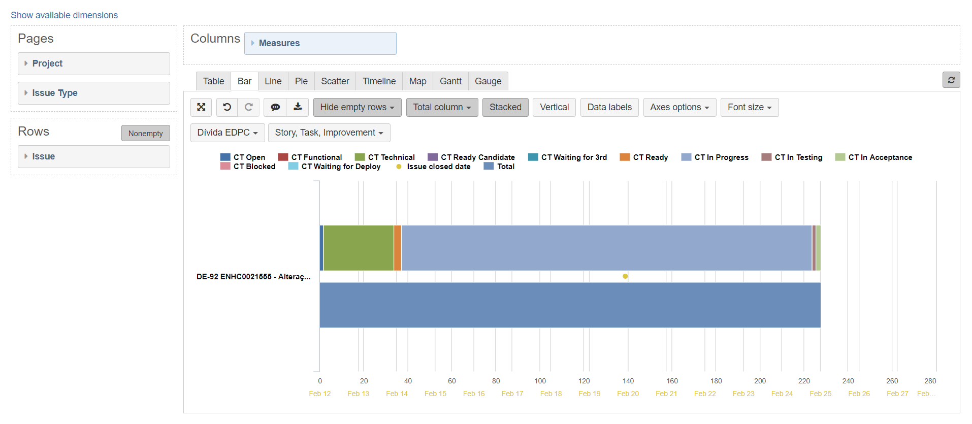
CFD: Use Aggregation in Transition Status to match the states and the order they appear on you board.
{
“cube_name”: “Issues”,
“cube_reports”: [ {
“name”: “CFD”,
“folder_name”: “Flow Metrics”,
“result_view”: “timeline_chart”,
“definition”: {“columns”:{“dimensions”:[{“name”:“Measures”,“selected_set”:["[Measures].[Issues history]"],“members”:[]},{“name”:“Transition Status”,“selected_set”:["[Transition Status].[Column Order]"],“members”:[{“depth”:0,“name”:“Column Order”,“full_name”:"[Transition Status].[Column Order]",“calculated”:true,“drillable”:true,“expanded”:true,“drilled_into”:false,“removed”:true}],“bookmarked_members”:[]}]},“rows”:{“dimensions”:[{“name”:“Time”,“selected_set”:["[Time.Weekly].[Week].Members"],“members”:[],“bookmarked_members”:[]}],“filter_by”:{“conditions”:[{“expression”:"[Time.Weekly].CurrentHierarchyMember",“operator”:“between”,“value”:“6 months ago, now”,“value_type”:“date”}]}},“pages”:{“dimensions”:[{“name”:“Project”,“selected_set”:["[Project].[All Projects]"],“members”:[{“depth”:0,“name”:“All Projects”,“full_name”:"[Project].[All Projects]",“drillable”:true,“type”:“all”,“expanded”:true,“drilled_into”:false},{“depth”:1,“name”:“XXX Development Projects”,“full_name”:"[Project].[XXX Development Projects]",“drillable”:true,“key”:“XXX”,“parent_full_name”:"[Project].[All Projects]"}],“bookmarked_members”:[],“current_page_members”:["[Project].[XXX Development Projects]"]},{“name”:“Issue Type”,“selected_set”:["[Issue Type].[All Issue Types]"],“members”:[{“depth”:0,“name”:“All Issue Types”,“full_name”:"[Issue Type].[All Issue Types]",“drillable”:true,“type”:“all”,“expanded”:true,“drilled_into”:true,“drill_level”:"[Issue Type].[Issue Type]"},{“depth”:1,“name”:“Story”,“full_name”:"[Issue Type].[Story]",“parent_full_name”:"[Issue Type].[All Issue Types]"}],“bookmarked_members”:[],“current_page_members”:["[Issue Type].[Story]"]}]},“options”:{“nonempty”:“columns”},“view”:{“current”:“timeline_chart”,“maximized”:false,“timeline_chart”:{“series_type”:“area”,“stacked”:true,“series_options”:{}},“table”:{}}}
} ],
“calculated_members”: [{“dimension”:“Measures”,“name”:“Issues history”,“format_string”:"#,##0",“formula”:“Cache(\n NonZero(Sum(PreviousPeriods([Time].CurrentHierarchyMember),\n Cache([Measures].[Transitions to]\n - [Measures].[Transitions from])\n ))\n + [Measures].[Transitions to]\n - [Measures].[Transitions from]\n)”,“annotations”:{“group”:“Default”}},{“name”:“Column Order”,“dimension”:“Transition Status”,“formula”:“Aggregate({\n [Transition Status].[Closed],\n [Transition Status].[Warranty],\n [Transition Status].[Ready For Release],\n [Transition Status].[Testing],\n [Transition Status].[Test Ready],\n [Transition Status].[Integration Test Prep],\n [Transition Status].[Execution In Progress],\n [Transition Status].[LOE Complete - Pending Execution],\n [Transition Status].[Pending LOE Approval],\n [Transition Status].[In Progress],\n [Transition Status].[Committed],\n [Transition Status].[Ready],\n [Transition Status].[On Hold],\n [Transition Status].[Triage/Analysis],\n [Transition Status].[Refining],\n [Transition Status].[New Intake],\n [Transition Status].[Open]\n})”,“format_string”:""}]
}
Histogram: Will show in software the distribution is not normal (control chart assumes that) but more a Weibull distribution k = 1.5
{
“cube_name”: “Issues”,
“cube_reports”: [ {
“name”: “Cycle Time Histogram”,
“folder_name”: “Flow Metrics”,
“result_view”: “bar_chart”,
“definition”: {“columns”:{“dimensions”:[{“name”:“Measures”,“selected_set”:["[Measures].[Issues closed]"],“members”:[]}]},“rows”:{“dimensions”:[{“name”:“Resolution interval”,“selected_set”:["[Resolution interval].[Resolution interval].Members"],“members”:[{“depth”:1,“name”:"(none)",“full_name”:"[Resolution interval].[(none)]",“removed”:true}],“bookmarked_members”:[]}],“nonempty_crossjoin”:false},“pages”:{“dimensions”:[{“name”:“Project”,“selected_set”:["[Project].[All Projects]"],“members”:[{“depth”:0,“name”:“All Projects”,“full_name”:"[Project].[All Projects]",“drillable”:true,“type”:“all”,“expanded”:true,“drilled_into”:false},{“depth”:1,“name”:“EAD Development Projects”,“full_name”:"[Project].[EAD Development Projects]",“drillable”:true,“key”:“XXX”,“parent_full_name”:"[Project].[All Projects]"}],“bookmarked_members”:[],“current_page_members”:["[Project].[EAD Development Projects]"]},{“name”:“Issue Type”,“selected_set”:["[Issue Type].[All Issue Types]"],“members”:[{“depth”:0,“name”:“All Issue Types”,“full_name”:"[Issue Type].[All Issue Types]",“drillable”:true,“type”:“all”,“expanded”:true,“drilled_into”:false},{“depth”:1,“name”:“Story”,“full_name”:"[Issue Type].[Story]",“parent_full_name”:"[Issue Type].[All Issue Types]"}],“bookmarked_members”:[],“current_page_members”:["[Issue Type].[Story]"]}]},“options”:{},“view”:{“current”:“bar_chart”,“maximized”:false,“bar_chart”:{“stacked”:false,“vertical”:true,“swap_axes”:false,“data_labels”:false,“series_options”:{“Critical”:{“color”:"#DB843D"},“Major”:{“color”:"#A47D7C"},“Minor”:{“color”:"#89A54E"},“Trivial”:{“color”:"#B5CA92"},"$total;$total":{“type”:“scatter”,“symbol”:“diamond”},“All Priorities”:{“type”:“scatter”,“color”:"#3D96AE"},"(no priority)":{“color”:"#4572A7"},“Blocker”:{“color”:"#AA4643"},“Issues resolved”:{“color”:"#AAC458"},“Issues closed”:{“type”:“bar”},“Hours spent”:{“separateAxis”:1,“type”:“line”},“Average resolution days”:{“separateAxis”:2},“AVG hours spent of resolved issues”:{“type”:“line”,“separateAxis”:1}}},“table”:{“row_dimension_headers”:{}}},“description”:“Time to Market as a Histogram in days”}
} ],
“calculated_members”: []
}