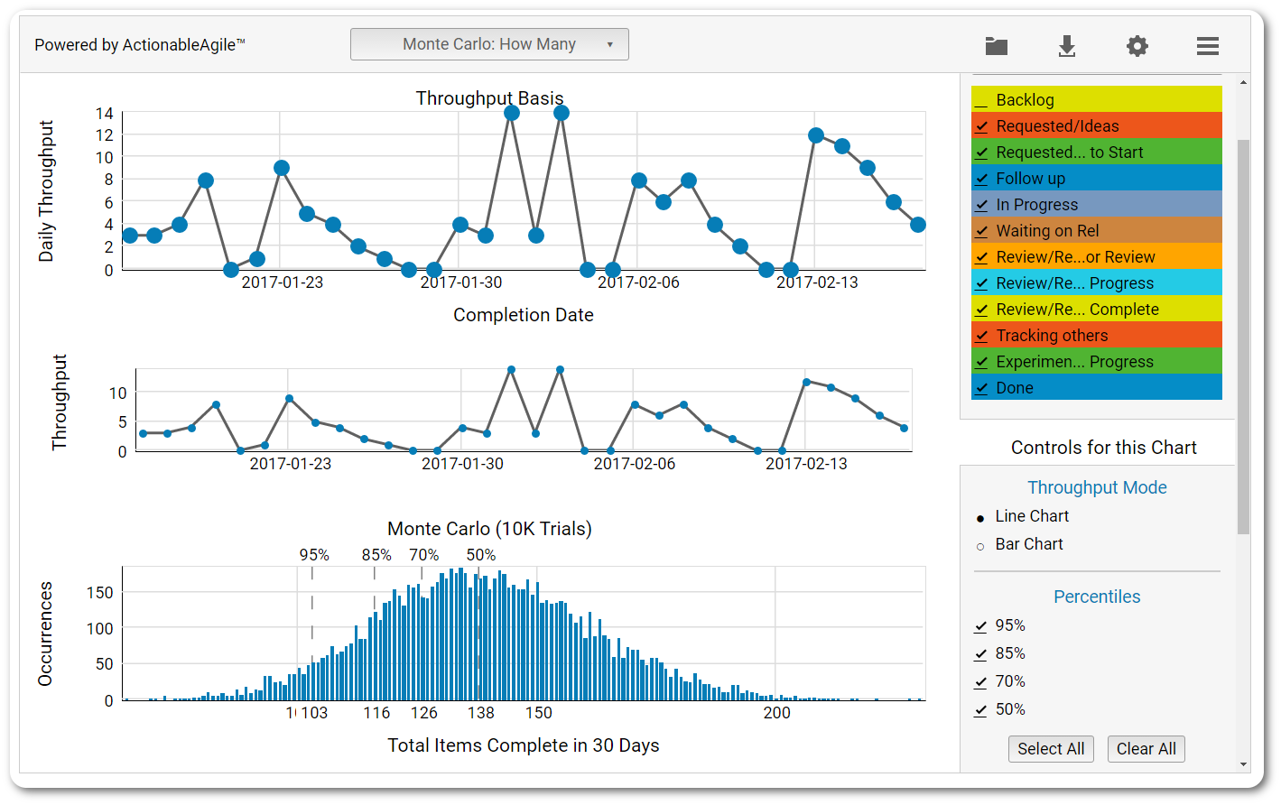
Hello, I would like to create a simulation with Montecarlo chart, ¿is it possible with eazyBI?
An example is here:
Thanks in advance,
Juan
Hello, I would like to create a simulation with Montecarlo chart, ¿is it possible with eazyBI?
An example is here:
Thanks in advance,
Juan
Hi Juan,
It is possible to create a similar chart using the custom interval dimensions in eazyBI. The interval dimensions allow grouping the number of items by the ranges of a measure.
In my example, I am using the standard “Resolution interval” dimension, which counts the issues by the time how much it took to resolve. It can be any other numeric measure.
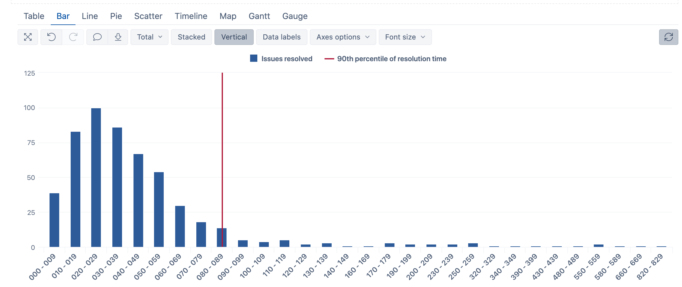
I can create a report like this to show the distribution of the issues:
Now I can add the calculation to find a percentile and reflect that on the chart.
The following formula can calculate the 90th percentile of the resolution days from all issues:
Percentile(
  Filter(Descendants([Issue].CurrentMember,[Issue].[Issue]),
  ([Measures].[Issues resolved],
   [Resolution interval].DefaultMember)>0
  ),
  ([Measures].[total resolution days],
   [Resolution interval].DefaultMember),
  90
)
Now, with a bit of tinkering, we can create the measure to show up in the respective interval:
CASE WHEN

Val(ExtractString([Resolution interval].CurrentMember.Name,
  "(\d+) - (\d+)",2))<
Percentile(
  Filter(Descendants([Issue].CurrentMember,[Issue].[Issue]),
  ([Measures].[Issues resolved],
   [Resolution interval].DefaultMember)>0
  ),
  ([Measures].[total resolution days],
   [Resolution interval].DefaultMember),
  90
)
AND

Val(ExtractString([Resolution interval].CurrentMember.NextMember.Name,
  "(\d+) - (\d+)",1))
>
Percentile(
  Filter(Descendants([Issue].CurrentMember,[Issue].[Issue]),
  ([Measures].[Issues resolved],
   [Resolution interval].DefaultMember)>0
  ),
  ([Measures].[total resolution days],
   [Resolution interval].DefaultMember),
  90
)

THEN
"90th percentile"
END
Kindly,
Janis, eazyBI support
¡Thanks a lot! With this tip I can improve my chart
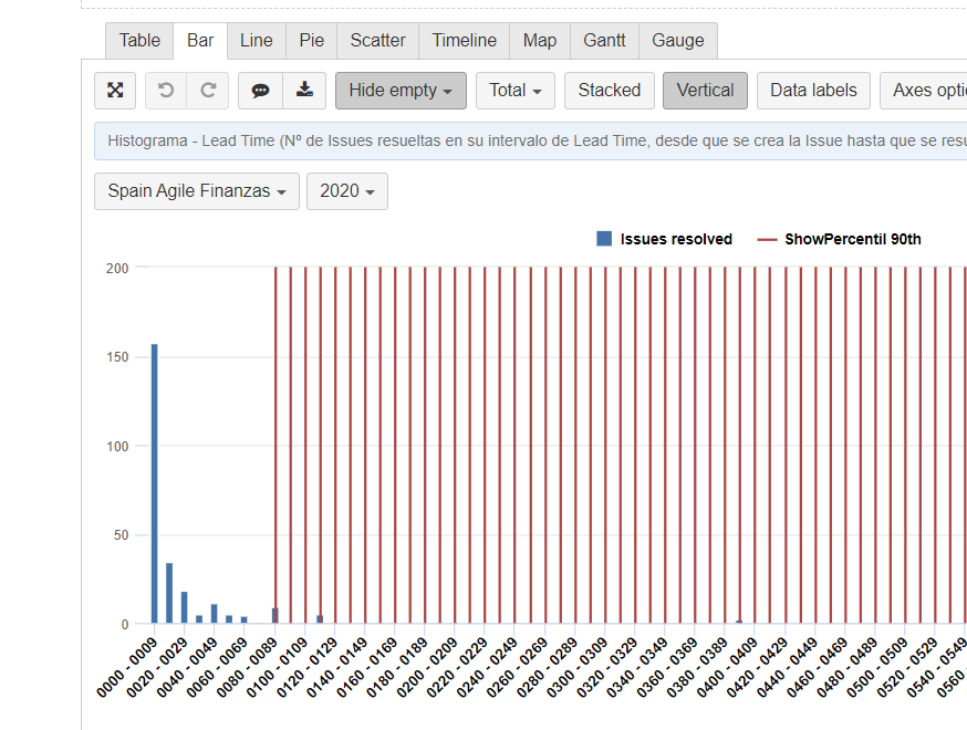
Hi Janis, I’ve tried to create a chart, and i can’t. I make anything wrong.
I have created a measure (as I show you here: Percentile|690x388 , but the chart shows like the image
Thanks again!!
Hi,
It seems that you are using both calculations in the same formula.
Sorry for a too-quick explanation, the solution in my screenshot is achieved with the second formula only. So, please, use the code starting from the CASE expression for showing the percentile as a vertical line in the respective interval.
Kindly,
Janis, eazyBI support
Thanks, The chart is already ok.
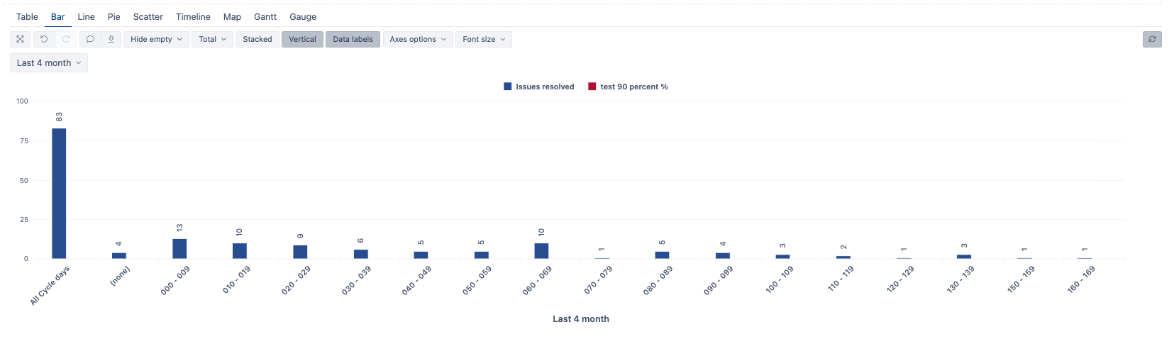
Hello, excuse me, the chart has been messed up again. you can help?
I use the measures ‘issues resolved’ and ‘90th percentile’ (the measure to show up in the respective interval) according to your query
Doubts:
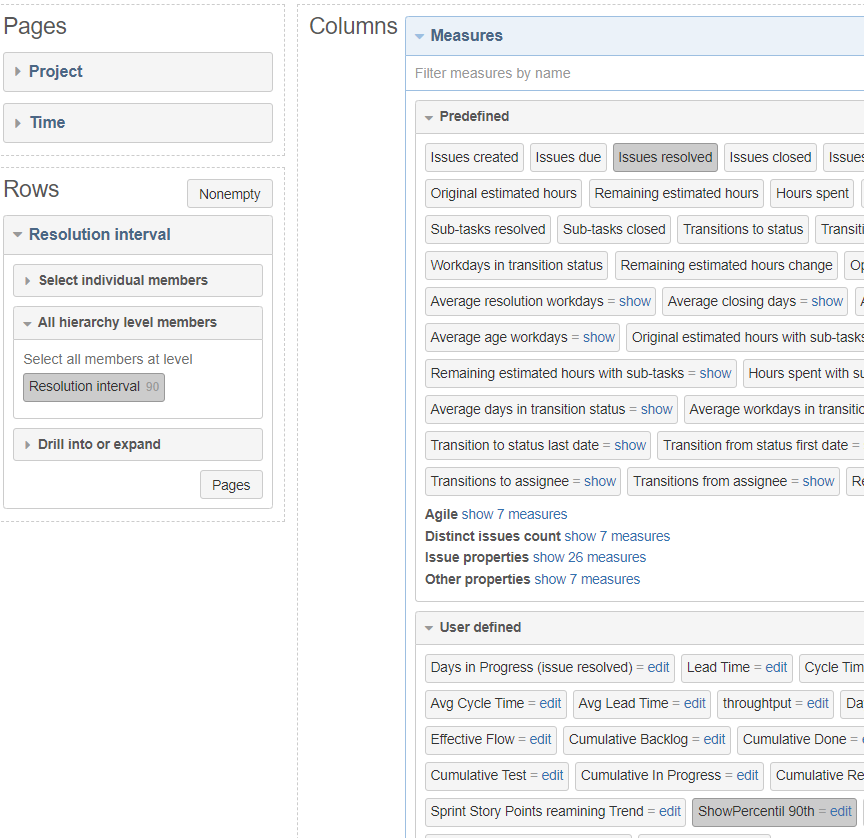
This formula, where do I have to calculate it? As measure? as part of ‘resolution interval’ dimensión?
Percentile(
  Filter(Descendants([Issue].CurrentMember,[Issue].[Issue]),
  ([Measures].[Issues resolved],
   [Resolution interval].DefaultMember)>0
  ),
  ([Measures].[total resolution days],
   [Resolution interval].DefaultMember),
  90
)
the graph has been working, but now I get as seen in the photo. I can’t edit ‘Resolution interval’
Thanks in advance.
Hi,
Please, send the report definition to the support.
There seem to be some more details to check.
Kindly,
Janis, eazyBI support
There is an example of the MonteCarlo chart in our Demo account:
https://eazybi.com/accounts/1000/cubes/Issues/reports/559656-monte-carlo-chart-resolution-days
Best,
Janie, eazyBI support
This chart is fantastic. I will analyse it
Thanks!

