(Potentially) Complicated Chart

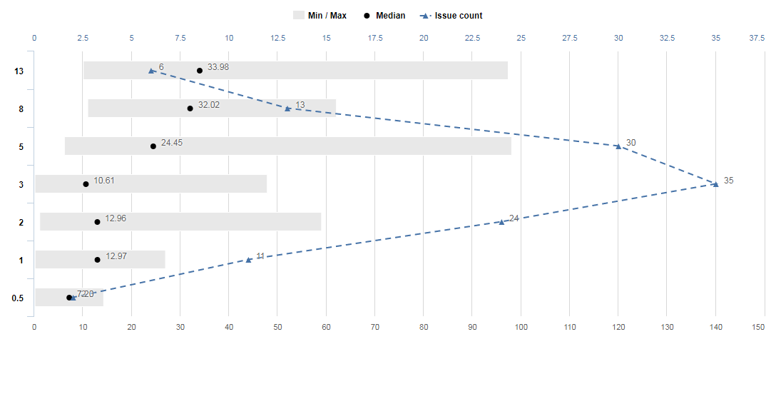
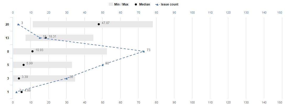
I’ve been trying to generate a chart that would look like the following:

I’m trying to visualize the estimate spread for agile teams. Basically, if a team is estimating well, there should be a fairly significant differential in the estimate size. A spread of 1pt stories should, generally, take less time than a spread of 3pt stories, 5pt stories, 8pt stories, etc.

The three dots for each point spread are the Minimum time in days for a jira issue with that story point, the Median time in days, and the max time in days. Visualized below basically:

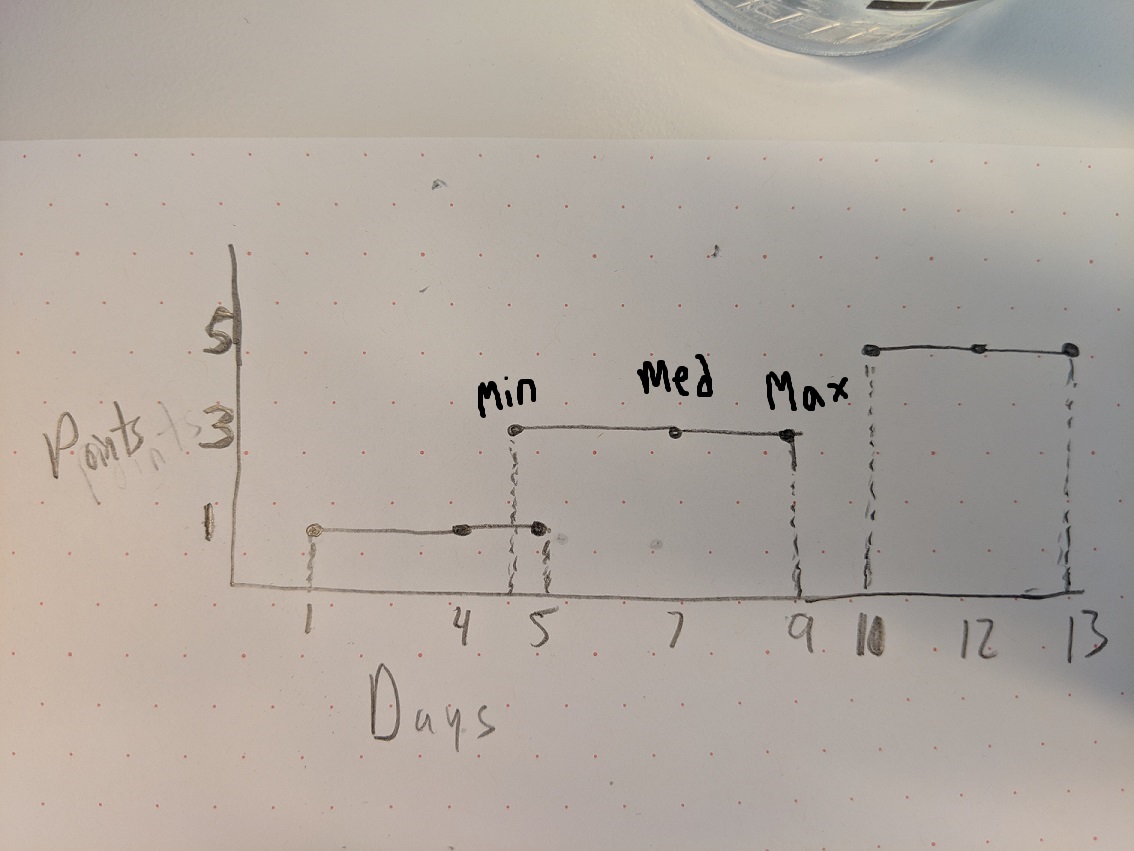
So in this example, the cluster of all 1pt stories has a median resolution of 4 days, a max resolution of 5 days, and a minimum resolution of 1 day.

The cluster of all 3pt stories has a median resolution of 7 days, a max resolution of 9 days, and a minimum resolution of 4.8 days.

The cluster of all 5pt stories has a median resolution of 12 days, a max resolution of 13 days, and a minimum resolution of 10 days.

I have tried to create this kind of report in several variations but nothing gives me what I’m looking for, so I’m not even certain if this kind of box plot / histogram-style report is even possible.

Days would be in Rows, generated automatically based on the available days data points for each point spread.

Points would be in columns, likely a separate calculated measure for each distribution (0, 0.5, 1, 2, 3, 5, 8, 13, 20, 40, 100)

Nothing I have tried works, and I’m not sure if EazyBI is even the best tool to try and create something like this. Any help would be greatly appreciated.

– Malik Graves-Pryor

Hi Malik,

I will guide you through how to create the chart you are looking for.

  1. To use Story points on Y-axis and group issues by Story point groups, you would need to import Story point custom field as a dimension. This is not offered by default, but you can specify that you would like to import this custom field as a dimension in eazyBI advanced settings (https://docs.eazybi.com/eazybijira/data-import/custom-fields/advanced-settings-for-custom-fields)

    [jira.customfield_NNNNN]
    measure = true
    dimension = true

  2. After importing the Story points as a dimension, you can select it on rows and add Average resolution days measure to see how much days in average issues with each Story point value take to resolve.

  3. Further, add two new calculated Measures to get Min and Max resolution days in each group with following formulas

Min:

Min(Filter(
  Descendants([Issue].CurrentMember, [Issue].[Issue]),
  [Measures].[Issues resolved] > 0
), [Measures].[Total resolution days])

Max:

Max(Filter(
  Descendants([Issue].CurrentMember, [Issue].[Issue]),
  [Measures].[Issues resolved] > 0
), [Measures].[Total resolution days])

You can then display these in Bar chart specifying that there should be a range from Min to Max value. See an example chart below (with very poor Story point estimation and resolution day correlation in my test data :slight_smile: )

I hope this is helpful, let me know if you have further questions!
Lauma / support@eazybi.com

1 Like

/head smack

I was trying to calculate the story points and days as opposing measures. Story points as a dimension makes this so much simpler.

Oy, thank you!

– Malik Graves-Pryor

1 Like

Hi Lauma,

So I’ve tried a variant of this leveraging [Average days in transition status] rather than total resolution days as I’d like to instead show the min/max/avg of issues in some state of progress. In other words, cycle time rather than lead time.

I added the status dimension to pages and selected the specific “in progress” statuses while leveraging the Average days in transition status measure in the Min/Max calculations, as well as using it to replace the Average resolution days measure.

However, I’m not getting what I expect.

Really I’m trying to aggregate the collective “in progress” time for min/max/avg. Hope this description helps, and what I’m doing (or not doing), to get it to work appropriately.

Thanks!

– Malik Graves-Pryor

Malik,

Yes, after my reply to you I also started to think that total resolution days might not be the right measure to compare with story point estimates. The historic days in transition status (see https://docs.eazybi.com/eazybijira/data-import/jira-issues-import/import-issue-change-history) would represent this a lot better!

Instead of Status dimension, that gives issue current status, please use the Transition status dimension that gives the historic statuses and links the ‘Average days in transition status’ measure to them. You can either aggregate some specific statuses or use “In Progress” Transition status category (this category comes from Jira configuration).

Min average days in transition status for resolved issues could be calculated as follows:

Min(Filter(
  Descendants([Issue].CurrentMember, [Issue].[Issue]),
  ([Measures].[Issues resolved], [Transition Status].CurrentHierarchy.DefaultMember) > 0
), [Measures].[Average days in transition status])

Max :

Max(Filter(
  Descendants([Issue].CurrentMember, [Issue].[Issue]),
  ([Measures].[Issues resolved], [Transition Status].CurrentHierarchy.DefaultMember) > 0
), [Measures].[Average days in transition status])

And for the Average use the Average days in transition status measure.

Let me know if that helped!
Lauma / support@eazybi.com

2 Likes

Much better, that looks like what I was expecting to get. Thank you!

–Malik Graves-Pryor

1 Like

Just a few tweaks / corrections.

The Min and Max filters should leverage [Measures].[Days in transition status] instead of [Measures].[Average days in transition status]. The Days measure will give the full range from which to pick Min and Max from. I also added two resolution statuses that I did not want included in the calculations (Duplicate and Withdrawn) as no work was likely completed on those items.

I also created another measure to get the median rather than the out of the box Average days in transition status. The median filters out the noise and provides a report that shows the full spread of values and where they are largely clustered.

Finally, I added in the number of issues that were estimated in each range so that I can see a curve of where the teams largely estimate.

Replace Min with Max and Median for the other two variants.

Cache(
Min(
	Filter(Descendants([Issue].CurrentMember, [Issue].[Issue]), 
		([Measures].[Issues resolved], [Transition Status].CurrentHierarchy.DefaultMember) > 0
		AND [Measures].[Days in transition status] > 0
	),
[Measures].[Days in transition status]
))

And then I did the following for an issue count for each estimate aggregate:

Cache(
Count(
	Filter(Descendants([Issue].CurrentMember, [Issue].[Issue]), ([Measures].[Issues resolved], [Transition Status].CurrentHierarchy.DefaultMember) > 0
		AND [Measures].[Days in transition status] > 0
	)
))

I am seeing the following results as expected. These are for two different teams.

I have Project, Time, Issue Type, Transition Status, Status, and Resolution in pages. These are showing the results for two different teams in aggregate for the past 3 quarters, for only Stories, Spikes, Bugs, and Tasks (ignoring Epics and Sub-tasks), and only for issues that transitioned to one of the in progress states during that time period (In progress, Peer review, Ready to deploy), and were resolved with an appropriate resolution during that time period as well.

Thank you again, this is a great report!

1 Like