I’m pretty new to eazyBI and wanted some help creating a comparision report. The report needs to show for each month how many tickets were closed last year, in comparision to the amount of tickets closed each month this year.
I’ve managed to setup the report to show the comparision however, it shows the tickets for each month of the year. Is there a way to show a bar side by side for each month (one bar for 2017 and another for 2018) instead?
Hopefully this is something that can be done. As it stands, unless I’m missing something, it cannot be without manually creating the custom calculated members for each time aggregate which would be horribly painful.
@malikgp linked solution is a little bit specific as the time baseline there is the previous year (2017) and the calculated measure shows the current year. But it is close to the solution you need. Please create a calculated measure with the following formula:
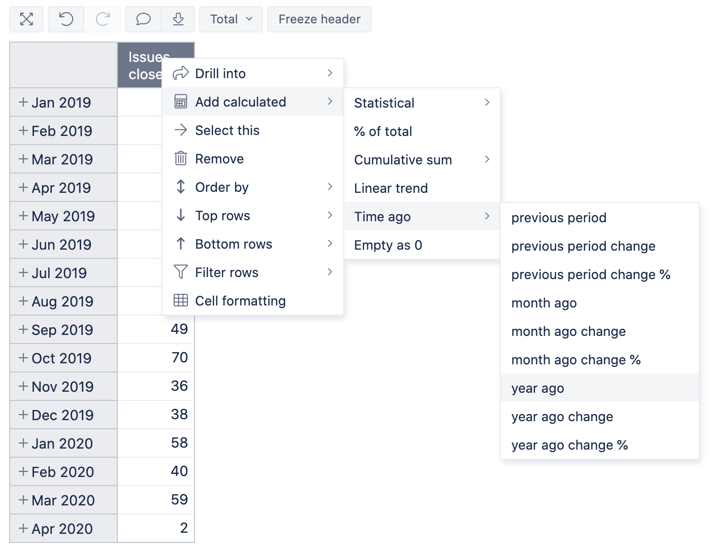
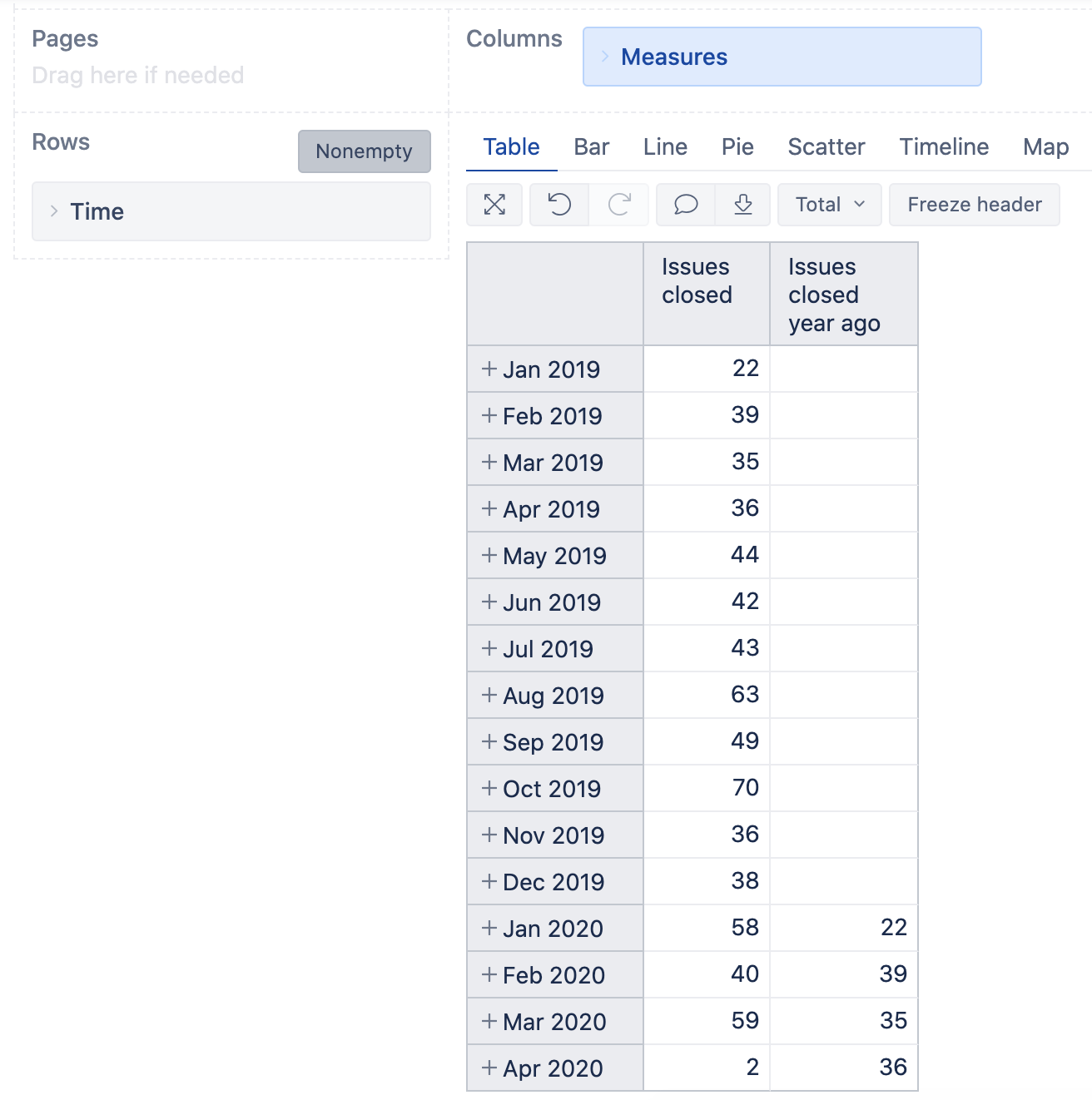
With eazyBI version 6.0 we added default calculations to compare data to previous periods. You can click on header of the measure Issues closed and select option: Add calculated>Time ago>year ago. This will create a new calculated measure (report specific) with the name Issue closed year ago
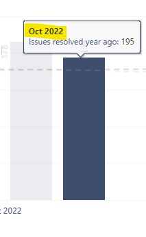
Late to the party, but can anyone tell if it’s possible to have the ‘year ago’ comparison show the correct year as a “header”?
For example. I’m showing all issues created in the last three months and comparing to last year using the ‘year ago’ functionality. Data is displayed as a bar chart. So I have one bar for the issues created in Oct 2022 for example and next to that issues created in the same year one year ago. All great but, the year ago bar has a “header” of sorts as: “Oct 2022 - issues created year ago” - where the part “issues created year ago” is in smaller and lighter font on a different row.
Is there any way I can make that “header” reflect the actual year of 2021 in this case?