I am attempting to build a report that illustrates a comparison between the Current backlog average age today and the same time last year i.e. is it up or down .
I am using the current calculation for issues resolved change, but I don’t think it shows the average age…
CASE WHEN NOT IsEmpty([measures].[Issues resolved])
Then
CASE WHEN CatchExceprtion(
[Measures].[Issues Resolved] -
( [Measures].[Issues Resolved],
[Time]. CurrentHeirarchyMember. PrevMember)
) > 0
THEN
",i class='far fa arrow-up' style='color:green'> </i>"
ELSE
"<i class='far fa arrow-down' style='color:red'> </i>"
END
END
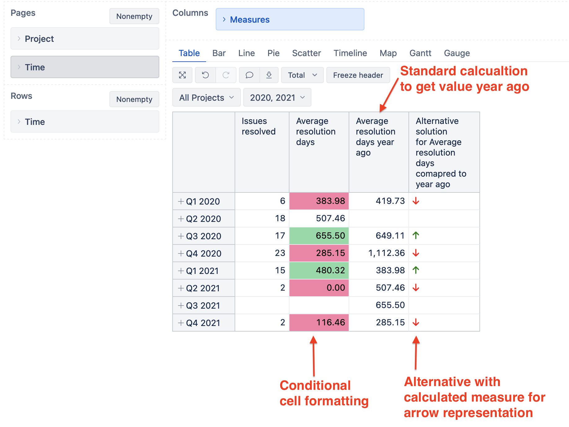
You should choose the measure “Average resolution days” to see the average resolution time for resolved issues in each period.
Then, add standard calculation to see the same measure value one year ago. Click on “Average resolution days” column header → Add calculated → Time ago → year ago.
More details in the documentation: Add standard calculations based on a selected measure.
Now yuo have two options.
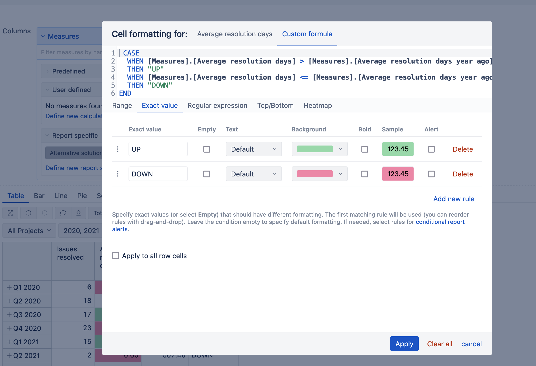
Use conditional cell formatting to color rows based on both values. You might want to choose the option with the custom formula to compare column values. More details here: Conditional cell formatting
The formatting rules might look like in the picture below.
CASE
  WHEN [Measures].[Average resolution days] > [Measures].[Average resolution days year ago]
  THEN "UP"
  WHEN [Measures].[Average resolution days] <= [Measures].[Average resolution days year ago]
  THEN "DOWN"
END
An alternative solution is to create a new calculated measure that would compare data in both columns and show arrows up or down based on both values.
CASE
  WHEN [Measures].[Average resolution days] > [Measures].[Average resolution days year ago]
  THEN "<i class='fa-solid fa-arrow-up' style='color:green'></i>"
  WHEN [Measures].[Average resolution days] <= [Measures].[Average resolution days year ago]
  THEN "<i class='fa-solid fa-arrow-down' style='color:red'></i>"
END
Note that you can refer to font awesome icons to show them in the chart. Copy the reference for the icon to ensure you are using the valid/supported icon.
More details on calcauted measures and logical expressions are here: Calculated measures.
Both solutions in the report might look like in the picture below.