Is there a way to generate a chart that shows cycle time on the y axis and story points on the x axis? Specifically, I would like to use this report in order to better understand the maturity of different teams when it comes to accuracy in pointing stories.
This type of report is a standard feature of Rally but I haven’t found a good way to do this inside Jira yet.
To group results by Story Points size, you might want to import Story Point values as dimension.
Please see community topics on a similar use case and how to do this:
Hello @zane.baranovska Hope you can help again please because I’m conscious your response was 4yrs ago so I’m hoping it’s a lot easier than the workarounds above. If not, please let me know.
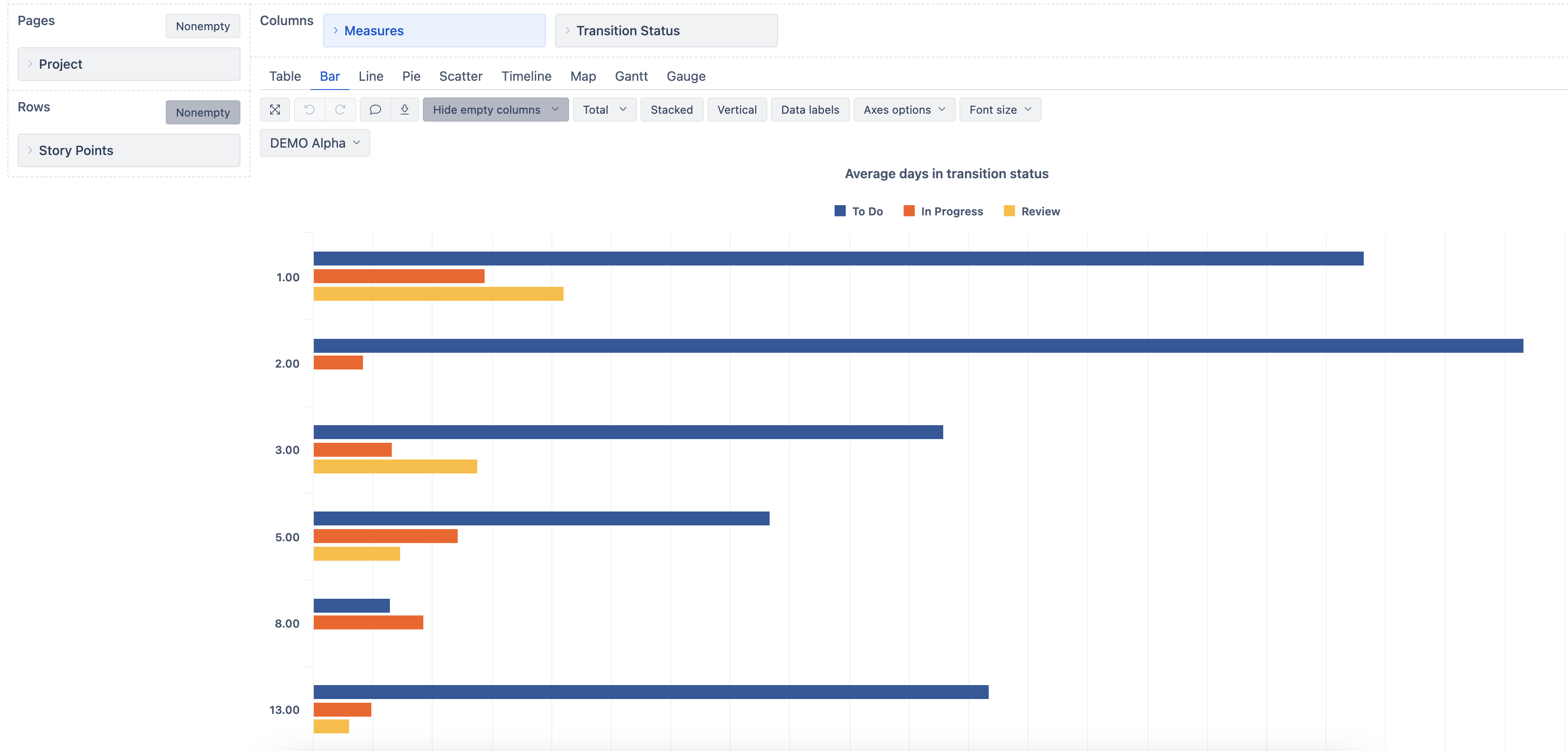
Very similar to the first post, I would like to have the different Fibonacci story points on the y axis (i.e. 1, 2, 3, 5, 8, 13, 21 etc) and then on the x axis, the number of days to transition from a specific status to another. This will then reveal, hopeful in a control chart kind of graph outliers for each story point but an average for the majority of the tickets with that specific story points value.