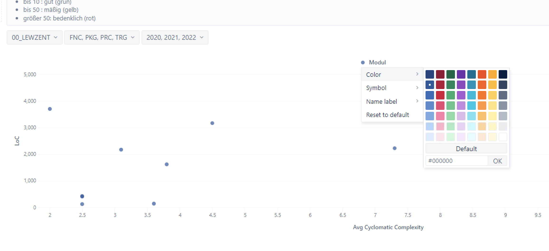
Lets say I have a Scatter plot, x axis from 0 to 100, y axis from 0 to 50.
Now all values below x:10 y:10 should be green, all below x:60 y:30 should be yellow and all above should be red.
How do I do this?
Lets say I have a Scatter plot, x axis from 0 to 100, y axis from 0 to 50.
Now all values below x:10 y:10 should be green, all below x:60 y:30 should be yellow and all above should be red.
How do I do this?
Hi @maxweissboeck,
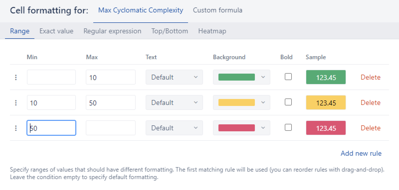
You can use chart conditional formatting to color the range of values on the scatter chart. If you would like to compare the value range for two parameters, a custom formula with regular expression could be the correct method. Please see the documentation for more details and several examples: Charts conditional formatting.
For inspiration, on the eazyBI Demo account is a collection of report examples with conditional formatting:Customized Charts - Jira Demo - eazyBI.
Best,
Zane / support@eazyBI.com
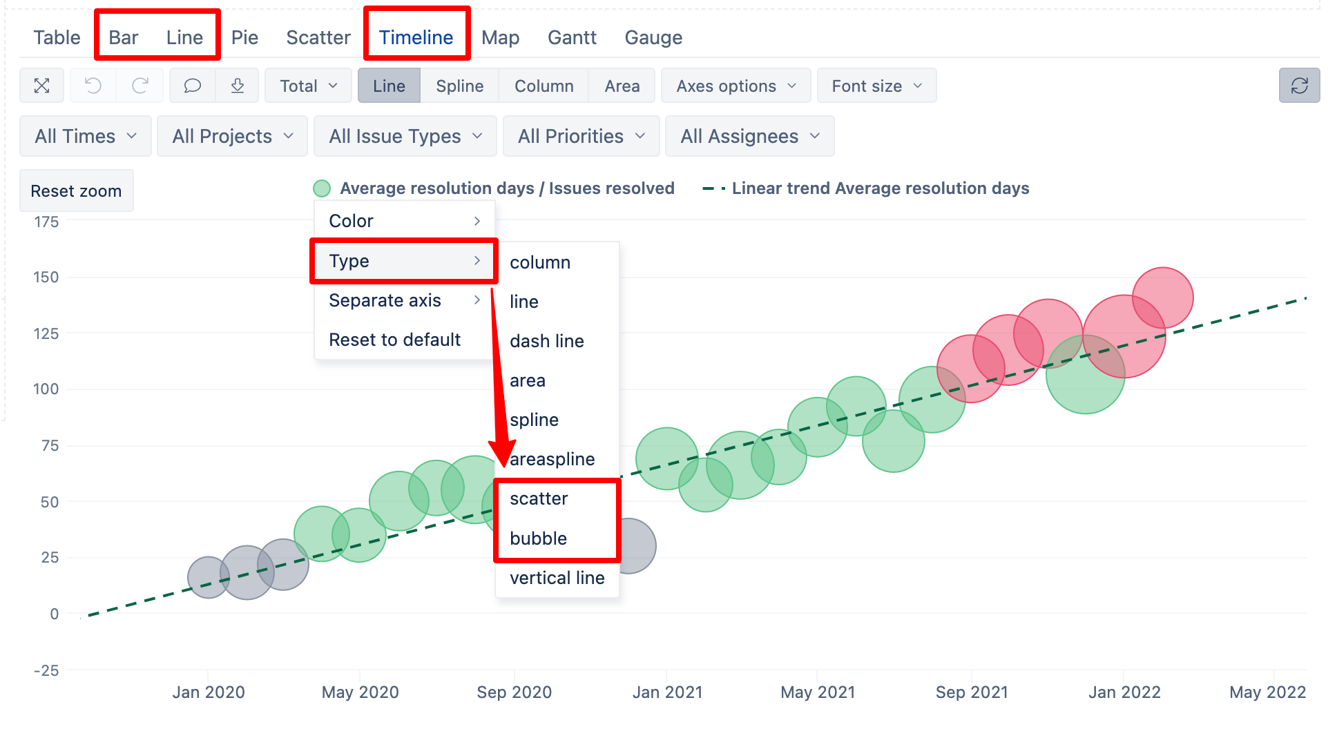
Conditional formatting is supported for Bar, Line, and Timeline chart options. For those charts, you can choose data visualization type as scatter or bubble.
On the other hand, if you switch to the Scatter chart type, conditional cell formatting is not available.
More details are described here: Charts conditional formatting.
If you can modify the report for representation on Bar chart, then you can apply condition formation there.
Best,
Zane / support@eazyBI.com
Ok, thanks for clarification
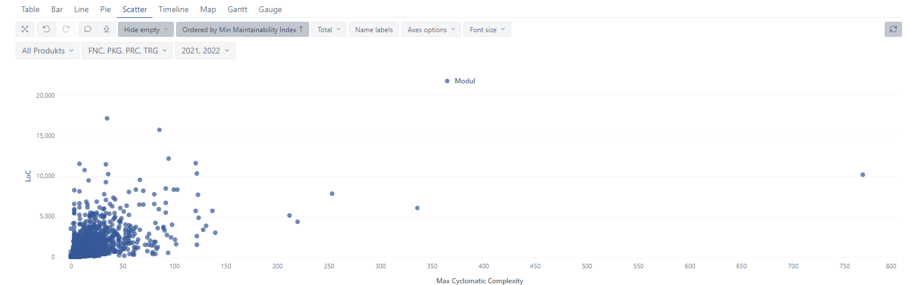
Displaying as Bar Chart is not possible, there are too many Values to be displayed and the Bar Chart also gives not the visual insights we need.
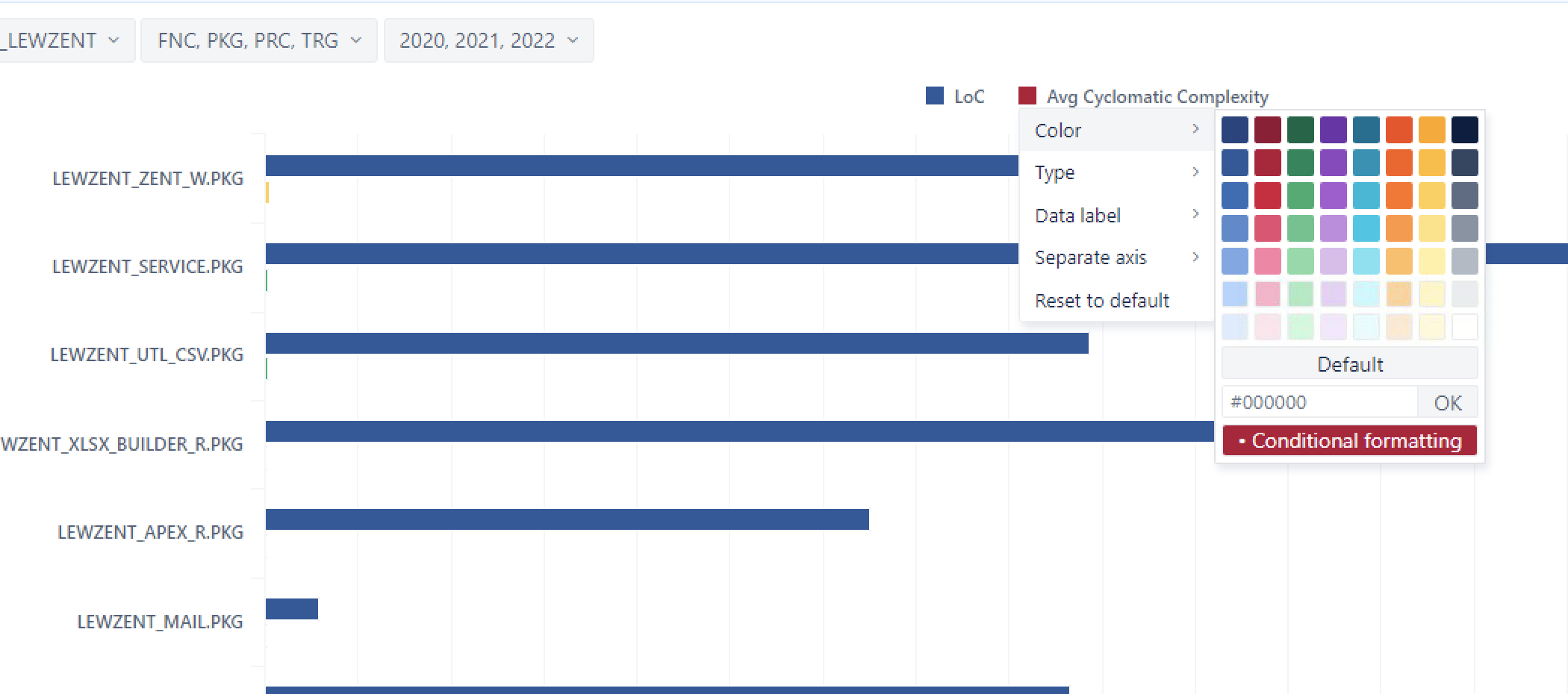
It would be very helpful if the same colouring schema that exists for Tables is also available for Scatter Chart.
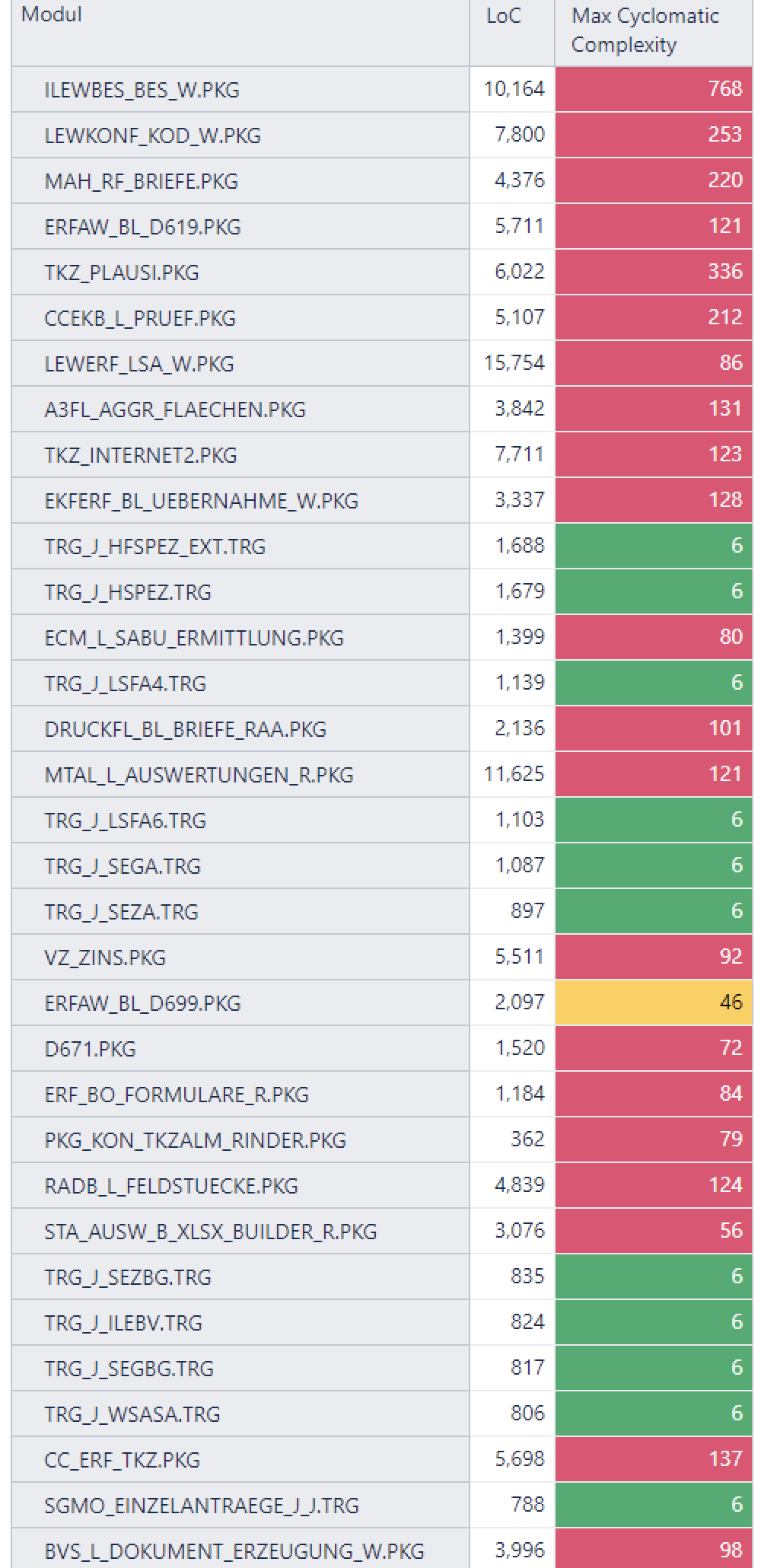
For the Table we use this color cell formatting
Thats who the Table looks like
But we need a Scatter Chart of this, to understand the meaning of the data
So please, please can you support colouring of Scatter Chart at along the X and Y values in the same way as it is done for Tables?
Thank you very much!
Max
@maxweissboeck, thank you for more details.
I added a new feature request to support conditional formatting also in Scatter chart view and added your use case to it. I can not give any estimates of when this could be available, will post an update in this community post.
Thanks for the idea!
Any news on this? I still have the problem.
Hi @maxweissboeck,
The feature to color scatter chart is still on the backlog, and we listen to if there is any interest from the customers. Only a few people have shown any interest so far, and it is not on our roadmap giving place to other improvements.
Best,
Zane / support@eazyBI.com
I have the same problem… and I think more people too… but it’s hard to find your backlog to vote on this feature. I know a lot of people (another agile friends) that want this feature too… so priorize, please!
Hi @Kananda_S_Silveira, the eazyBI backlog is not public, as many tasks and improvements require more context to understand the backlog items. Anyhow, the votes from Community posts and individual conversations with eazyBI Support are added to the eazyBI backlog by the eazyBI team so we can send out updates when the feature is available.
I added your vote to conditional formatting for the scatter chart feature as well and will post an update in this Community when there is any progress.
The Community section “Feature Requests” is the public backlog where eazyBI users can add their ideas and suggestions: Feature Requests - eazyBI Community. We are keeping an eye on it and consider those topics when choosing the features to work on.
Best,
Zane / support@eazyBI.com
Thank you @zane.baranovska ! ![]()
@zane.baranovska ,
We are also using the enterprise 7.2 version and in desperate need to have conditional formatting in the Scatter chart… Please tell me where to vote and if you can expedite/prioritize this feature is very much appreciated
@ysharma this is the right place to add your vote ![]() Your voce is noted.
Your voce is noted.
Best,
Zane / eazyBI Support
@zane.baranovska
Thank you so much for your quick response… Please confirm us once it is available.
Also, while you I got your attention, if there is anything you could help us with below two things as mentioned one below…
1)https://community.eazybi.com/t/how-to-hide-remove-or-change-the-color-to-make-it-invisible-x-axis-values/18961
2) https://community.eazybi.com/t/i-want-to-create-the-scatter-bubble-chart-for-risk-management/18968
I’d like to add my vote for this feature, too. Thanks
Your voice is noted ![]()
Best,
Zane / eazyBI Support